Consistency and Standards
May 16, 2024

Users should not have to wonder whether different words, situations, or actions mean the same thing. Follow platform and industry conventions.
—Nielsen Norman Group
Picture this: you’re browsing through a website and decide to buy something, but you can’t figure out how to complete your purchase. There’s no “Add to cart” button or shopping cart icon in sight. You click on some text that wasn’t underlined, but somehow you land on a different page. The font size and colour scheme changes from one section to another. Sounds like a nightmare, right? 😱
Well, that’s inconsistency for you. This phenomena is not terribly common in the e-commerce world, but it certainly is in complex software! Inconsistency in enterprise UX design frustrates and confuses users, and results in a lot of wasted time and loss of work.
Consistency is a crucial aspect of design because it addresses one of the main goals of design: reducing cognitive load and helping people complete their task. This is one of the bread-and-butter issues affecting enterprise platforms, as these tools tend to be highly complex and may already have a steeper learning curve to begin with.
When things look, sound, and behave in a consistent way, you reduce the learning curve and users know what to expect, trust the system, and can get their work done much more efficiently.
Now without further ado, let’s jump into everything you need to know about consistency and standards —including when to break the rules. 🚨
Let’s think about when consistency has the highest impact so we can leverage it wisely rather than apply the principle for #allthethings. You need to know the rules before you can break them. First, we’ll consider when it makes the most sense to follow industry standards.
There are many benefits to designing a new product in accordance with best practices and industry standards, especially when aiming to reduce costs and time to market.
When you’re working on a high-risk project or want to release a new product before everyone else, it’s probably not the time to start arguing about every little design decision. For example, you don’t need to create 14 different versions of a radio button, you just need one version because you don’t need to innovate in the area of radio buttons.
Following standards can help streamline the design process by allowing designers and the entire team to leverage existing patterns and solutions rather than reinventing the wheel. Doing so also lowers the risk of creating a confusing or frustrating user experience that could alienate potential users.
Performance is huge in enterprise UX; efficiency and productivity are often top priorities. A high-performing application allows users to complete tasks more quickly, reducing time wasted waiting for screens to load or actions to complete. Standards typically provide guidance for streamlining code, structuring layouts, and managing assets. Sticking to guidelines often means being able to make something that works smoothly. And this is critically important at work.
Keyboard shortcuts and versioning, for example, might be expected to work roughly the same for all tools within a certain industry, and deviating from it can cause users to hesitate during their workflow execution.
Maintaining large enterprise software is also expensive. Adhering to standards and keeping things consistent will benefit any organization in the long run by making it easier to fix bugs, add new features, and update existing ones. Users won’t struggle to navigate the complex hierarchy and multiple services and products. Plus, the training program for new employees will be less intensive.
Next, let’s examine the main standards to consider when creating interfaces to avoid a dysfunctional user experience.
Visual design is usually the first thing that comes to mind when talking about consistency, like having a unified colour scheme representative of the enterprise’s identity. But there’s more to consistency than that.
For example, consider colour scheme consistency from the perspective of accessibility. Colour denotes meaning, so if it looks like a leprechaun threw up on your UI, you’re not just offending peoples’ aesthetic sensibilities, but you might actually create confusion that has real consequences on readability. Keep accessibility in mind by avoiding colour combinations that are difficult to distinguish between, and instead opt for high-contrast colours.
And which comes first, the feeling or the colour? Is your goal to evoke feelings of warmth and familiarity or to appear corporate and professional? In a scenario where users are responsible for managing large amounts of money, any errors or inaccuracies could result in significant financial losses or other negative consequences. One wrong click could lead to costly mistakes. 🤯


.png)
In the end, we should design colour schemes that are not only aesthetically pleasing, but also functional for the intended audience in light of the prevalent usage and individualized or cultural preferences.
Consistency doesn’t only mean using no more than two fonts, and standards don’t imply using the same typeface as the company brand. For example, you might want to use serif fonts with small serifs like Times New Roman or Georgia to make a dashboard more readable and scannable. Using clear and legible fonts with appropriate spacing and line height will also make the text more effective at communicating information.
.png)
.png)
Like with colour choices, there’s an aesthetic sensibility aspect and a functional communication objective that fonts need to satisfy. There are a lot of decisions to be made around font type, size, weight, line height, and how the text is laid out. All these aspects of visual hierarchy send signals to users about what is related, and what is more or less important. When items are close together on a page, for example, that means they’re related to one another. And words presented in a larger font are perceived as more important.
We use the consistency and standards heuristic when discussing iconography, symbols, layout, and imagery. For example, you want to select icons that closely align with how other sites or products represent the same concept, as Jakob’s Law states that people spend most of their time using digital products other than yours.
But beyond just making everything look the same, this heuristic is about making sure the product’s design meets its intended users’ needs and expectations; you want to know how the product will be used and who will be using it. When you meet users’ expectations, you help to build confidence and trust.
To ensure users feel comfortable using your product and know what to expect, consider what mental models they’re already familiar with. The interaction behaviour —for functional cornerstones like saving, deleting, and permissions— must be consistent to avoid disorienting users.
For example, let’s say you have a form in one place that autosaves, but in another place, you don’t tell people they need to save manually. This inconsistent saving behaviour would mean a lot of lost work for people and an erosion of trust in your system.
Inconsistent log-in behaviour would also be problematic. Imagine you had a suite of finance products and one receipt app lets you log in with Google, but another app requires you to log in with an email and password. This inconsistency would hurt users’ productivity, and leave them confused, frustrated, and totally blocked.
One of the most important heuristics in UX design is content. Understanding how language is perceived enables designers to determine what information must be communicated to users and how it can be organized to create a logical flow of information.
Let’s say the button at the end of a form says, “Save as draft.” In the same software, another form says “Save temporarily.” Are these buttons going to be treated differently or the same? What will they affect in the system? The words in your design matter; inconsistencies in terms of labels or other wording is extremely confusing for users.

The use of technical jargon or complex terminology that users may not be familiar with is another example of how language can negatively affect the user experience of enterprise software.

For example, “payroll” is a financial term that’s used differently by finance and human resources. For the finance department, payroll is the total amount of money paid by a company to its employees for a specific period, including salaries, wages, and bonuses. But in the context of human resources, “payroll” refers to the process of calculating and distributing regular salaries and wages to employees, including the deduction of taxes, social security contributions, and other withholdings.
A unified dashboard accessible to all that’s centred on the term “payroll” could lead to confusion, frustration, and ultimately reduce its overall usefulness. Consider how frequently this term could appear in errors or notifications. A user would have to figure out what the message meant or what action is really required.
Keeping a consistent information architecture (in terms of navigation and page structure) is an important aspect of reducing confusion for users. Inconsistencies in navigation can quickly lead to frustration and decreased productivity.
For example, imagine you’re using a project management tool: you select a project from a list, and depending on which project you select, you end up in a different set of workflow steps —even though all the projects are conceptually equivalent. This lack of predictability and unclear logic creates a sense of mistrust for users.
Maintaining consistency in enterprise UX is usually the smart choice. But in some cases, the status quo might be flawed and you could potentially hinder innovation by sticking to standards. We need to be thoughtful about when to apply the concept of consistency and standards and when to disregard it.
It’s unfortunately quite common for enterprise tools to introduce (consistently) bad conventions that are difficult to remove. Design processes in enterprise UX can often involve multiple rounds of approval and decision making, or design by committee, which can slow down the design and development process and lead to design compromises to satisfy everyone’s preferences. This lag can result in out-of-date design choices, missed opportunities, and convoluted, inconsistent, or overly complex design that fails to prioritize the end user’s experience.
When a team is given a mission to explore and learn, it’s the ideal time to deviate from bad UX conventions and standards. If your product introduces a novel concept or interaction model that challenges existing UX conventions or involves testing hypotheses about user needs and preferences, deviating from established standards may be necessary to create a unique experience. You may be less likely to explore new or unconventional ideas that could lead to innovative solutions if you adhere too strictly to conventions during exploration.
Keeping in mind you might sometimes want to deviate from standards, here’s a list of tools that can help you be more consistent.
A design system sets up an organization to collaborate across design and development to build consistent experiences across the board. It helps keep everyone on the same page with a big project, application, or service. By providing one source of truth for everyone in your organization, a design system ensures teams stay consistent.
As your organization grows, you naturally reach a state of entropy in your suite of software. Front-end developers might be doing whatever they feel like, and designers might constantly be reinventing the wheel, not talking to each other. This is where a design system comes in; it enforces discipline and intentionality that wasn’t there before.
Brand guidelines help ensure your enterprise comes across as professional and reliable. They’re a blueprint for maintaining brand consistency across all channels, both internally and externally —whether you’re sharing content on social media or onboarding new employees.
Voice and tone is the language you use in your organization, application, or service to connect with your audience. Having tone of voice guidelines helps ensure consistency in all your communications. By being intentional with what you say and how you say it, you can earn and keep your audience’s trust.
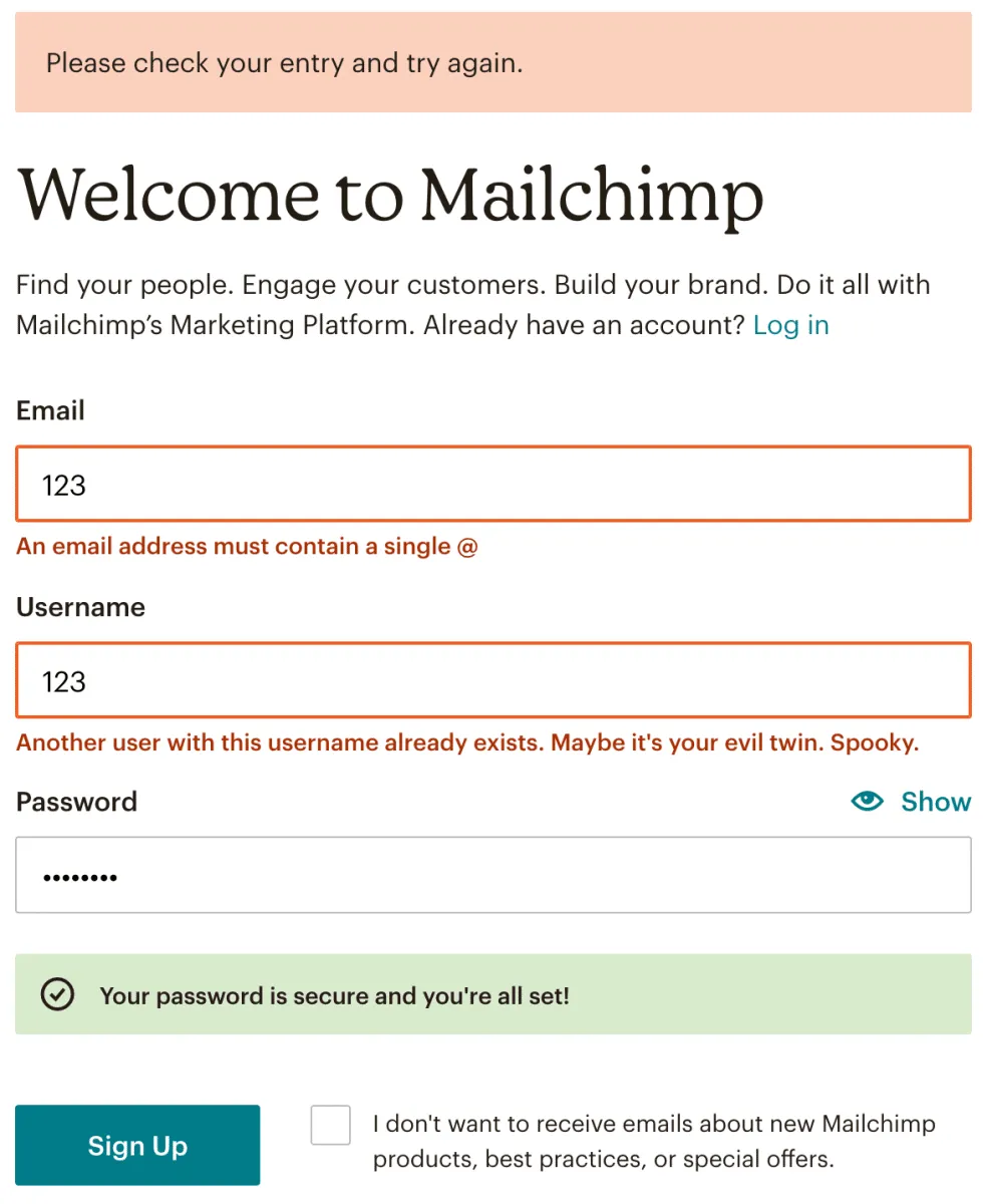
For a great example of voice and tone guidelines, look to Mailchimp. The company illustrates how they would approach different situations that users could encounter in their day-to-day work. For instance, Mailchimp will use a hearty joke and celebration emoji for a successful task, but it won’t fool around when a user encounters a problem. The messaging will be very clear, concise, and understanding.
Applying consistency and standards isn’t an excuse to skip user testing and gathering evidence of how effective your solutions are. Consistency in your product largely depends on users’ behaviours and past experiences. Just because something has worked for certain users in one project doesn’t mean it can apply identically to another project or situation. That’s why user testing is a must.
When building enterprise software, there’s a bit more room to venture out of the consistency realm and break convention to see what could be gained.
Consistency doesn’t always need to be the de-facto thing you must do. You want to avoid consistency for consistency’s sake, and for this heuristic to eclipse all others (like visibility of system status, match between system and the real world, user control and freedom, etc.).
Instead, when creating enterprise interfaces, ask yourself: “Will the user’s current knowledge help them understand how to use what I’m designing?” At the end of the day, you’ll want to break convention if doing so will improve efficiency.
We know the challenge that analyzing heuristics can be, but presenting those usability findings to your entire team in a neat report is a whole other ballgame. Check out our UX Heuristic Report Template Kit!
Do a mini UX audit on your table views & find your trouble spots with this free guide.

Be the first to know about our upcoming release!


.webp)


.webp)

