Visual Hierarchy in UI
October 4, 2022

Ceara Crawshaw

User interfaces, by and large are focused on the experience users perceive with their eyes – visual perception of information is a multi-dimensional thing which serves to give users the cues they need to interact with the UI as well as the ability to parse and understand the data they see, so that they can make informed decisions. The requirements of user interaction as well as perception of information is amplified in enterprise software applications, as they serve complex use cases, workflows and datasets.
Definition of visual hierarchy (in UI)
The visual relationships which communicate the relative importance of elements within an interface using proximity, colour, contrast, alignment, whitespace and separation.
Interestingly, most of us don’t learn the ‘visual language’ like we do the spoken or written word, so when we create digital experiences without this basis, sometimes we miss out on opportunities to make things easier to understand from purely the visual perspective (i.e. everything other than the interactions themselves, words, organization of information, etc).
nterestingly, most of us don’t learn the ‘visual language’ like we do the spoken or written word, so when we create digital experiences without this basis, sometimes we miss out on opportunities to make things easier to understand from purely the visual perspective (i.e. everything other than the interactions themselves, words, organization of information, etc).
When the visual hierarchy on the page is performing well, it hits these two major points:
There are a few aspects of visual hierarchy that are worth wrapping your head around as you venture into a visual improvements to your SAAS product or enterprise screen.
How close items on a page are together. When they are close together, that means they are related to one another.
How large or small things are compared to one another. Often times things that are large take up more space and are more important than other things. Keep in mind that everything is relative and balanced, if everything is ‘big’, nothing appears to be more important than anything else.
How dark, vibrant or noticeable something is on the page. In the sense of accessibility, contrast is key to people being able to read words. For example, a grey background with more grey writing must be high enough contrast to be perceived visually.
Alignment is basically how things line up – good alignment draws relationships adds to UI polish, bad alignment is one of the first things people spot (maybe because we are such pattern recognition, that one thing looking a bit different pops out at us). Things can be left aligned, right aligned, centre-aligned, top-aligned and bottom-aligned.
AKA blank space, AKA space. Whitespace draws relationships between items in a UI by creating blank space on the page. This approach ‘let’s things breathe’ in your UI and when used correctly gives an uncluttered feeling in your interface. (FYI – even though it’s called whitespace, it doesn’t literally always have to be white in colour, even in a dark mode UI a person would refer to ‘whitespace’).
AKA delineation. This is the ability to separate items from one another, in UI we use background colour, containers, horizontal/vertical rules, even headings separate sections from one another.
The concepts of visual hierarchy are relatively simple to understand, the trick is wielding these concepts in your product, to achieve balance and the right eyeball direction ⬅ 👀. Interestingly, you don’t have to bring the UI ‘razzle dazzle’ to achieve huge improvement to the visual hierarchy. You can start with just whitespace for example.
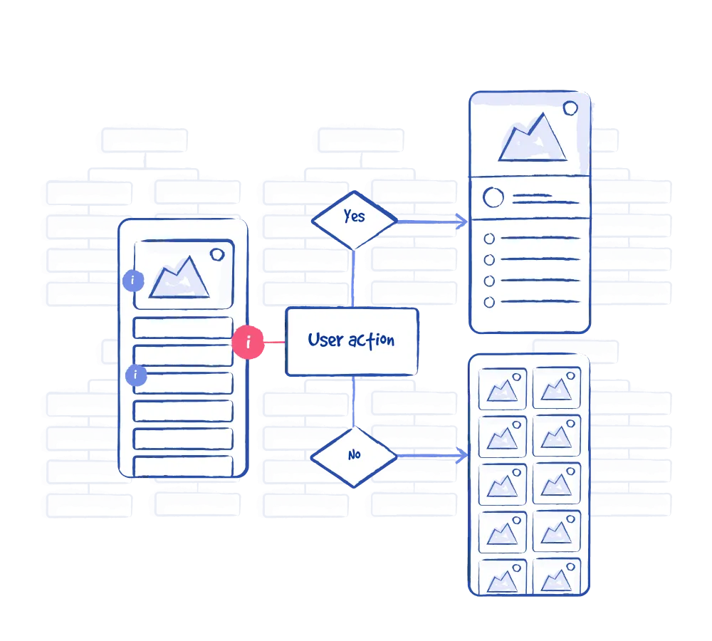
Now, imagine you have a table view, with basically no visual hierarchy. In this context behind it:
This is our starting point:
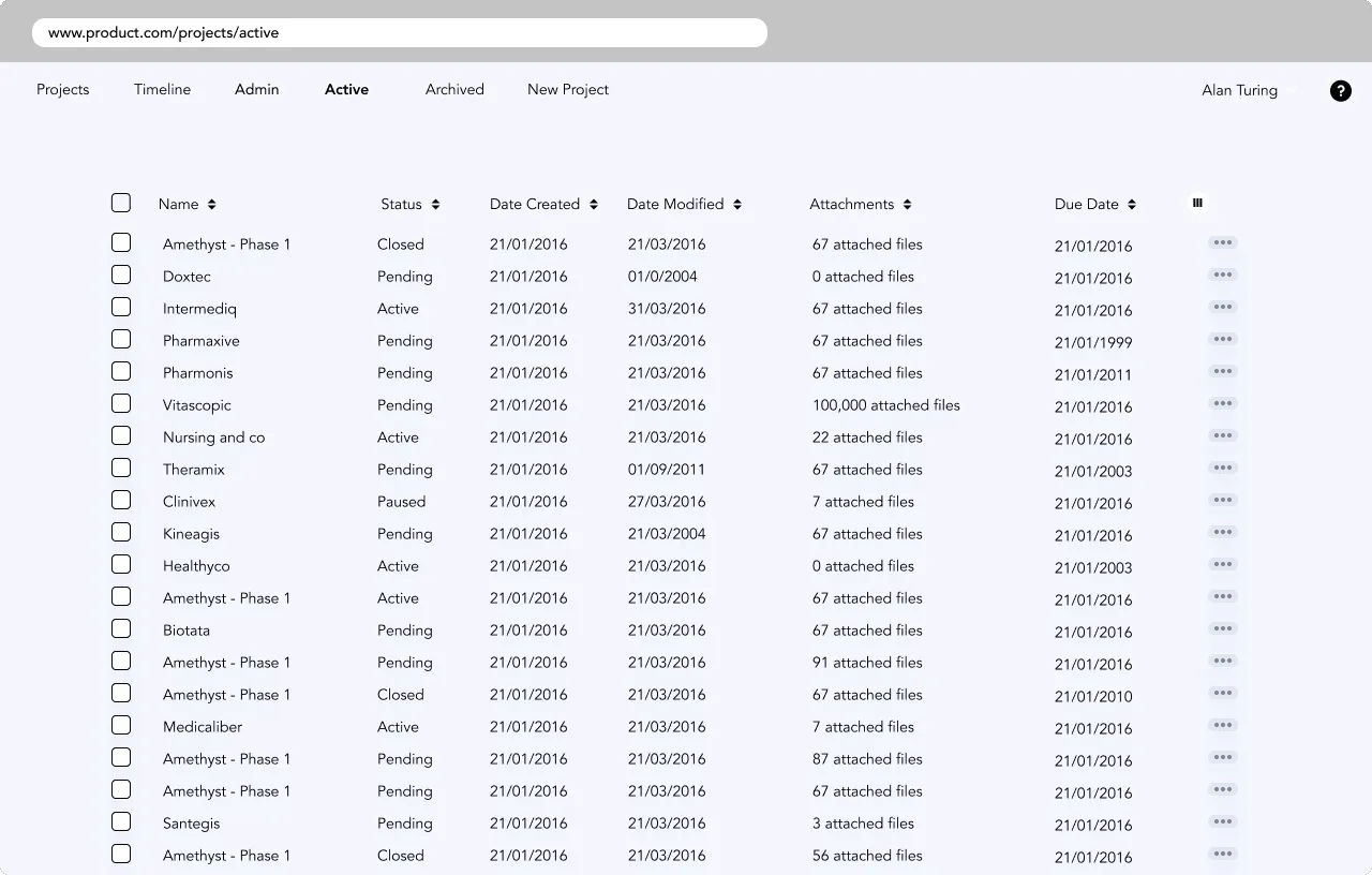
What’s wrong with this picture? Here, you can’t tell the most important button, you can’t scan the table data very easily. Do you feel claustrophobic looking at this screen? We do! Never fear, it will be ok we promise.
See the impact just white space and proximity makes:
.png)
.png)
.png)
📺 See visual hierarchy in action – and feel yourself go from cringe-city to smile-ville! (This is live on our youtube channel)
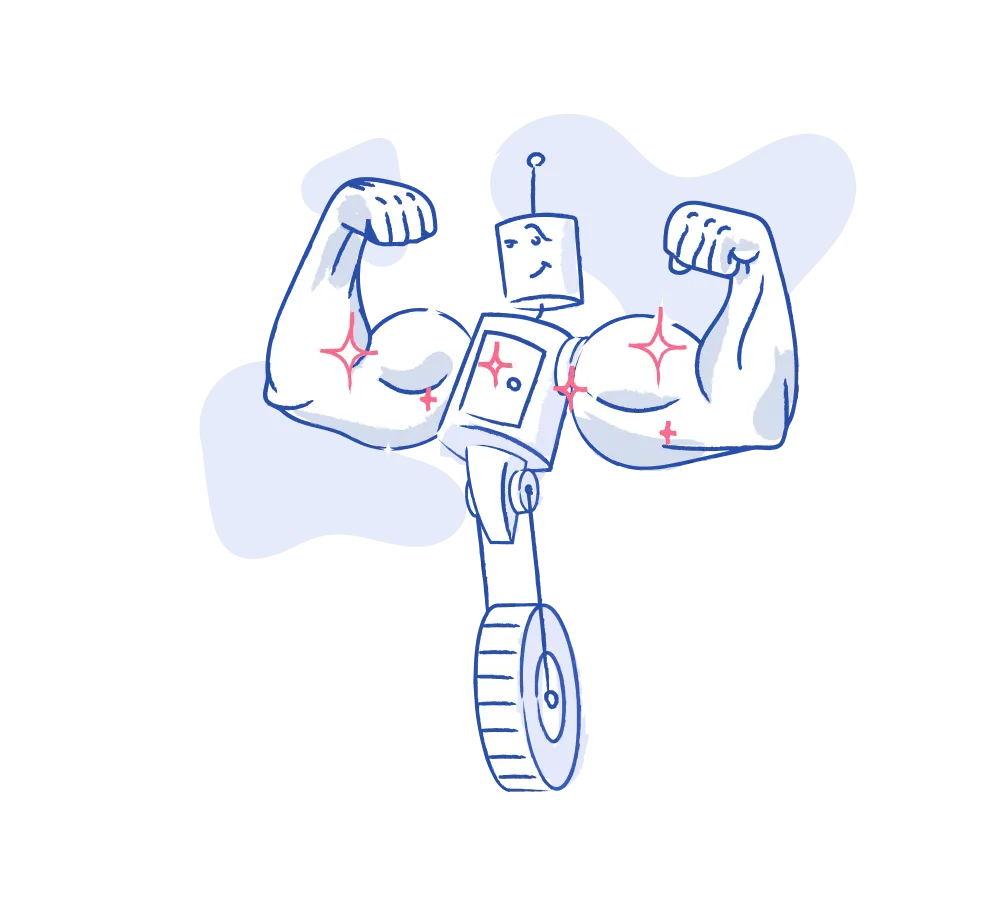
Sorry that you can see visual hierarchy now 🥺, we did warn you that you can’t un-see it once you get the hang of it. For a while your screens or product might drive you nuts, as you figure out how to wield the tools to your advantage💪. But don’t worry, with practice you’ll get there. Even super experienced designers and front end people have their own visual hierarchy blind spots.
Pair this skill with some robust usability research, and your product will be better than ever!
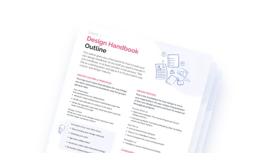
Do a mini UX audit on your table views & find your trouble spots with this free guide.

Be the first to know about our upcoming release!


.webp)

.webp)

