
Fumbling through design is no fun, unlock our secret way to make the design process half as messy (at least!)

Data tables, filters, dashboards and search are incredibly difficult to design right—Not only do they demand more interaction than your average feature, they also require expert data considerations.
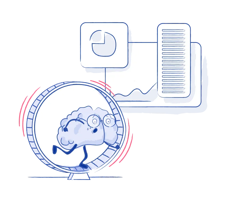
There's a ton of confusion that tends to arise around the core material: the data. We've lived this experience, and maybe you've come across these struggles too:
As a designer, you feel a little dumb and silly, and as a collaborator, you feel like your insights are falling on deaf ears.

Unsatisfied with the level of messiness we dealt with when building these features, we went to the drawing board to look at how we can improve this sub-par workflow and collaboration method. How can we unlock better designs faster, and show our data and design prowess in the process?
Once we unlocked this methodology, everything changed. Our initial designs were way more on point, the realism of the work was higher, and our design check-ins more productive (and fun)!
Clients also felt more at ease (and even excited!)— they feel like they’ve chosen the right crew, people who understand the technical stuff and "get it". Now we've set out to unleash this simple process to the world! 🎉
Some brands using our resources:
We'll take you through the step-by-step process of how to hold this workshop, including how to hone in on the right data professional to talk to, the kind of documentation you can look at to lay the groundwork, how to concretely distill relevant information about the data, and how to package it up as a useful frame of reference for yourself and your team.
Your final output will act as an essential reference throughout your design process, and will establish a valuable collaboration rhythm with the data professionals that will inform and enrich your designs.


Having to blindly Roomba your way through a problem is never a great way to solve it. Conducting this data workshop helped me extract the most relevant data that I had to account for in my designs.
It was invaluable for getting stakeholders to align on definitions and understand the overall scope of information. Now that I have this workshop in my tool belt, I have the confidence and techniques to de-risk assumptions and extract important details from future projects so I’m not spinning my wheels creating designs not aligned to the problem landscape.


Learn how understand the data landscape you're working with and extract the relevant information so you can design with greater impact and establish yourself as the pro you are! With step-by-step breakdowns, templates, a video walkthrough and plenty of examples, we'll take you through our secret recipe and equip you with a process that sets you up to tackle any data-rich project. Ready to unlock great UX for data-rich features?


.webp)