Loading Feedback
May 24, 2022

Fanny Vassilatos

Ceara Crawshaw


On the Internet, loading is inevitable. There are so many factors at play that you may have the fastest software out there, there’s always a chance that your user will find themselves waiting in front of a screen.
In dreamworld, online systems have absolutely zero delays, everything is snappy as can be. (Imagine!) But in the real world, when loading happens, you get the chance to reduce the perceived wait time for your user and increase the perceived value of your system.
No longer can you get away with just slapping a loading spinner on the page, and hoping the user will not table flip. This article is meant to help designers, developers, QAs and product people consider both the user’s and the system’s context before building the appropriate loading pattern.
Loading states are just that — small pockets of time that should be judiciously used to provide the user with visibility on what the system is doing. This is key in helping users feel in control, making them aware of the context at all times, and reassuring them that the right task is effectively being worked on.
A good way to approach loading states is to think of them as a way to play with users’ perception of time and turn it to your advantage.
Loading indicators are all about balancing perceived time and perceived value. In other words, the loading time should equate to the perceived value of the task at hand. For high-stakes operations that are done occasionally, you might consider making tasks seem longer, as if more important, than they actually are. Whereas for quick actions that are done regularly, your goal really should be to make the wait time seem as minimal as possible.
Loading states are also a good opportunity to set expectations of users in your product. They can be used as a communication device to reduce uncertainty for the user by explaining what’s happening or preparing them for what’s coming up next.
Before knowing which user expectations to set, you must be aware of the technical reality of how your data is likely to load. Here are some technical prompts to discuss with your team:
Follow these prompts along with your team as you embark on tackling loading UX. These prompts should help you think about how you want to apply loading best practices to your specific scenario.
Is the loading done upfront?
You might be dealing with an upfront loading situation, for example when the user first loads a page and expects to see existing content show up. Here, you need to set expectations as users might not be familiar with the page that’s about to be displayed.
Is the loading user-triggered?
Or you might be creating a loading interaction that follows a user-initiated action like them submitting a form or requesting to export a large document. In this case, immediate feedback is primordial. You want to inform them that the request has been understood by the system before displaying an appropriate loading pattern to show progress.
Do you need to block out the whole screen?
It’s important to ask yourself exactly how much space does this loading interaction deserve.
If it’s something unobtrusive that doesn’t require user input, they would naturally expect this to be done quietly in the background.
If it’s a critical task that, even if it’s easy for the system to manage, is a high-stake operation in the user’s context, then a full-page loading mechanism might bring a sense of security and trust for them.
Can we predict the timing of the content to load?
How much visibility do you have on the amount of time the task requires to complete? Can you estimate it accurately? Is it valuable to communicate that to the user? What’s the expectation for how long it should take to load?
Can we initiate different behaviours based on timing thresholds that we set?
You might want to consider breaking a long loading task into smaller chunks with different messaging or visuals.
What is the range of objects that need to be loaded?
What’s the scope of the end result? A list of 3 cards requires a different reflection for the loading experience than a 10,000-item table that potentially involves pagination or a “Load More” button, etc.
How does the server return the info to the page?
Ask yourself what makes the most sense to return to your user. Maybe it makes sense to bring the content up as it loads, one by one. It might make more sense to extend the loading experience until you have, say, 12 items ready to show. Keep typical user scenarios in mind when thinking about this. You know your users and your content best.
Is data synchronized? Or do we need a refresh mechanism?
Something to factor in is how and when the data is fetched. Is it always kept in sync in the background? Does the page have to be manually refreshed by the user every now and then? Think of loading feedback mechanisms that are appropriate for the frequency and user involvement of the event.
What’s the frequency of updates or changes?
Does your data tend to be updated every few seconds? Every few hours? Once a day? This affects the logic you want to put into your loading experience in terms of real estate and user flow interruption.
Have you considered the mobile experience?
Have you thought about how the mobile experience might be impacted? This can be a unique scenario because mobile devices have UI patterns and may have different connection speeds and data transfer rates depending on the location and moment in time.
You will need to spend time understanding how to best marry your data structure and your users’ expectations to figure out the logic of your page rendering. Loading states can be passive or active, and depending on the scope of those two factors, you want to design an appropriate feedback experience.
The scope depends on the amount of data being processed and consequently, the perceived importance of the task.
Now that you’re more aware of the context of your desired loading experience, let’s dig into some common use cases:
How large is the amount of data you’re loading? How large are the individual pieces of data? For example, loading a page of complex cards each containing images, icons, text and a button needs a different loading consideration than loading a table made of lightweight text-based rows.
For more complex and richly formatted components, loading and showing them one by one makes sense in most cases. The goal is to reduce the perceived wait on the user’s side. If you can get away with one item at a time without it being confusing for the user, it’s a no brainer. You’re giving them something to work with right away.

For lighter components that exist better as a group, say, a table, it makes more sense to load and show them all at once or at least, in batches. Now for what happens while they’re still loading, we’ll touch on specific loading patterns shortly.

Webflow uses the approach to show all contents at once
No matter the complexity of your components, if you have a large number of them, you will want to opt for lazy loading. This reduces the amount of data needing to be loaded upfront. You only have to fill a bit more than your user’s viewport height can afford. At least until they hit the bottom and ask for more.
Lazy loading simply means you’re postponing the loading to trigger only when it’s needed.
This can happen in three ways.
1. Infinite scroll is the automatic, or passive, way. When you detect your user has reached the end of the list or page or is close to reaching it, that’s your trigger to pull more content.

2. Another way is to let the user decide by making them click something like a “Load More” button. That way you’re not unnecessarily bloating the page unless they expressly ask you to.

3. This is where pagination comes in. Pagination is lazy loading happening on different pages. You’re letting users decide when they want to view more content and also limiting its scope to a reasonable amount visible per page.

Pagination also creates a sense of place for the user. In time, they start building a mental map of which object is on which page and this is helpful for findability and future reference. Another advantage there is that the user can link a ‘place’ with an object – ex. “My favorite option was on page 3”.
How often does this upfront loading occur?
If your content is always kept in sync automatically, you want your loading feedback to be very minimal.

Google Drive uses a very subtle indicator to constantly inform users that the document is syncing or up to date
When changes on the page are more rare, and refreshing has to be initiated by the user, make sure you communicate it as soon as something new is available.
This type of loading interaction needs a bit more real estate than with automatic syncing, so something like a full-width top banner or a toast can effectively catch your user’s attention.
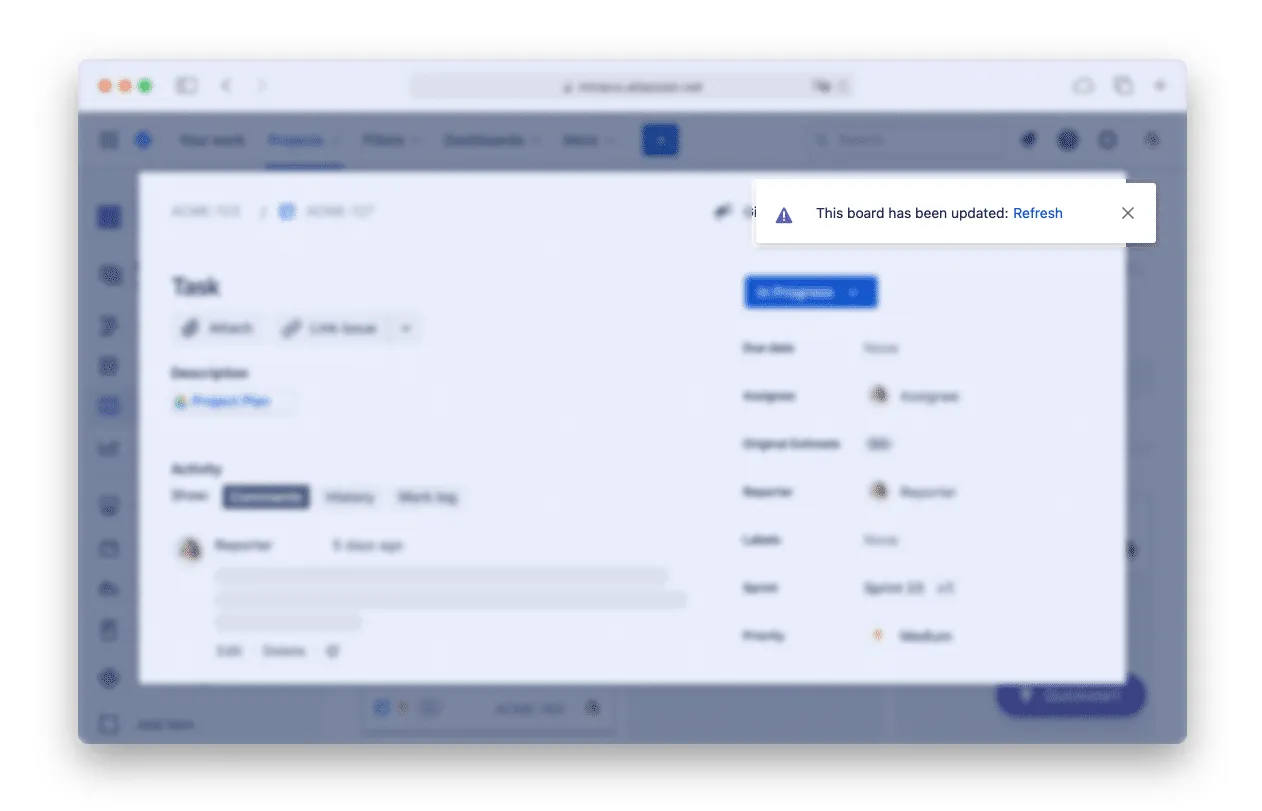
Jira uses a notification toast to inform users that the page needs refreshing
In the world of loading patterns, there are basically two types of loading indicators that serve a variety of use cases.
Determinate progress indicators communicate a sense of duration. They have a start point and an end point. They give users more information on how much time they can expect to wait.
Indeterminate progress indicators have an uncertain duration. A common example is a looping animation, or a spinner. They are less informative, but are sometimes inevitable.
Now let’s look at the wide array of loading patterns you can use for different use cases of active loading — i.e. loading triggered by user actions.
When you manage to get stuff loading in less than 0.1 second, this is considered instantaneous and not noticeable to the user.
Good job, display the result.
However, if it’s a task that represents the final step of a tedious workflow, you might want to consider this pattern:
Also known as the labor illusion or benevolent deception
It’s an opportunity to create a bit of breathing room to appreciate the effort that has been put in the task. This gives the impression of the machine “working hard” for large tasks or saving content even though it’s practically instantaneous. (Read more about this here)
It is considered a determinate progress indicator because you get to set the delay that makes the most sense for the scale of the task. You can also factor in typical user reaction times if you provide an undo mechanism. This is often seen when sending emails where you get a 5 second window to reverse your action.

When sending an email, Google forces a 5 second wait to allow users to undo
This delay is expected for online software and is barely noticeable for the user. Make sure you do not try to “fill that time” with a spinner or an animation. Chances are your users will end up more confused than not.
“For anything that takes less than 1 second to load, it is distracting to use a looped animation, because users cannot keep up with what happened and might feel anxious about whatever flashed on the screen” — via NN Group
As soon as you pass the 1 second mark, the wait becomes noticeable to the user. Consider your options.
Full page loading spinners are to avoid as they provide no sense of progress especially because they are looped and indeterminate. If you are aware that the task at hand is going to take more than a few milliseconds, consider using another loading pattern.
However, spinners can work well on a smaller scale. You can use it for more concise components like the contents of a table row or on a button after it’s just been clicked.

Also known as Ghost elements or Greeking. Skeleton screens are indeterminate and are the new norm for full-page loading situations. They consist of immediately showing a wireframe-type loading screen before real content shows up. You’ve probably already seen this on the websites and apps you use daily.
Skeleton loading screens give users something to look at while they wait, it sets the expectation of what the screen will broadly look like. This loading feedback takes up all the space compared to a loading spinner, it’s an entire loading screen.


.png)
Optional: Shimmer effect (by Facebook)
You can add a shimmer effect to your skeleton screens. The added movement takes users’ attention away from the wait and effectively reduces perceived wait.
Optional: Pulsing animation
An equally effective animation device is pulsing. It also plays a role similar to what a typical spinner is meant for. An added distraction, you might say.

Optional: Use of dominant colour
Another variant of the skeleton screen is the use of dominant colour. If your UI allows for it, why not let images guide the colour palette? This brings some eye-catching dynamism to the page.
Of course, don’t just pull random colours if your UI is mainly text-based.
Unsplash uses a blurred dominant colour effect
After 2 seconds, we enter the realm of more informative progress indicators. Here are some options.
On the development side of things, it’s hard to estimate loading times precisely in minutes and seconds. You also don’t want to set expectations you can’t guarantee you’ll meet. Instead, go with something general like “This can take a few minutes” just to set expectations and let the user decide if this is a good time to quickly switch apps to check something else.

Progress bars are a go-to and they are determinate. They work well both inside components as well as at the page level.

For the user, this breaks down the wait into smaller chunks. They might not know exactly how long each step takes, but it’ll help them estimate the total. This pattern is indeterminate.
If the system is processing multiple items, give the user visibility on how many items have been completed.
If you don’t have such granular visibility or it’s not relevant to the user, go with more general messaging explaining what’s currently happening. “Cleaning up duplicates”, “Connecting to server”

For these larger scale tasks, you really want to give control to the user. Whether that be clear visibility on how much is done, or the ability for them to switch to another task with the guarantee that the system will keep working. Here are some options.
Showing a percentage of completion might not give users the exact amount of minutes until the task is done, but it effectively gives them a sense of scale so they are able to estimate the total duration and then act on it.
Examples of this are progress bars or circles filling up.
For even larger tasks, you might consider a “Come back later” type of interaction. A huge benefit of this is that there is no in-app perceived wait at all on the user side.
These are good for when you cannot approximately estimate the loading time. You give users total control of what they do with their time and they’ll trust that they can pick up from where they left off later in the day.
The notification itself can be done in-app or prompted via email.

Another way to deal with large tasks is to give the running task visibility in a smaller part of the screen without interrupting the user’s workflow.
A good example of this is when you upload a large file or set of files in Google Drive. The system gives you immediate feedback and executes the task in a drawer that lets you navigate the rest of the app.
Instant feedback, progress visibility, uninterrupted workflow; the perfect trifecta!

The key thing to keep in mind is that loading states give users visibility on the system status. To decide on the best way to do that, you need to take into account the way your data is structured, the context of your user’s workflow, and the perceived value of the task being executed.
Loading patterns are essentially communication devices for various user scenarios. Make sure you leverage these opportunities to provide tailored feedback, infuse some brand personality and cultivate a sense of trust in your system.
Do a mini UX audit on your table views & find your trouble spots with this free guide.

Be the first to know about our upcoming release!


.webp)

.webp)


.webp)

