Now recruiting for a Senior UX Design Freelancer! Click here for more information →
UX Pattern Analysis

Empty states

September 6, 2022
Written By:
Fanny Vassilatos
Ceara Crawshaw

Is this product broken? Or have you just forgotten to put in an informative empty state? Empty states are relevant across your UI at key moments throughout the lifecycle of your user from noob learner to expert power user.

In the context of web apps, SAAS products and enterprise software the UI that’s implicated is far reaching. Users will create new stuff in an empty place, fill up existing fields like in a form or table, or bring data over from somewhere else – this means that we have entire empty state ‘views’, as well as objects like lists, filters, cards etc. Empty states, in a nutshell, can apply anywhere data is ‘supposed to be’.

Empty states, much like errors or other interactions, follow levels of quality of mastery they can reach (see our article on microinteraction quality). At the very least, your empty state assures people nothing is broken. As the UX improves, the user becomes informed and even empowered to take actions. At the highest level, empty states are enjoyed, actioned and even provoke a sense of satisfaction (or dare we say delight glee).

Empty state anatomy

An empty state typically includes:

  • Informative copy – assures users what ‘should’/will be in this space
  • Informative visual – reinforces message and//or brings attention to the empty space
  • Action – urges users in a direction where they can take action to make the state not empty anymore or learn more

Things to consider when designing empty states

Things to consider when you’re designing for empty states in your SAAS application – use these prompts with your product crew to think through your empty states and suss out what needs to be done to make your empty state UX amazing.

What are the screens, flows and components that deserve an empty state (and can technically ‘be empty’)?

  • It’s helpful to get a detailed inventory if possible, so you can make sure that the empty state pattern you end up developing is consistent across different parts of your complex application.

What kinds of empty states are we dealing with?

  • There are different situations when it comes to empty states, ones we’re urging users to action, rather than ones where an empty state is favorable (like inbox 0).

Where do we want to allow for empty states to happen?

  • Especially when there is the onboarding of new users to the platform, many companies opt to avoid ‘empty’ containers, and put in dummy content or onboard people, urging them to click things and create things in the process, so ‘empty’ doesn’t actually happen.

Can this real estate be used for learning?

  • There may be some nice knowledge base articles, tips or descriptions you can do that can help users learn more and set expectations about what will happen later once data is in the system. Often, empty states serve as learning opportunities when they are ‘empty’ then they become places the data appears or updated information to communicate your system status more clearly.

Can we leverage artwork or branded components in any way?

  • This is a moment where you have some real estate to work with, there’s the use case of ‘taking up space’ which is rare in web applications. This can be a moment where visual embellishment in your UI can make people feel good. If you can make it cute, why not make it cute?

Types of empty states

Because empty states are so overarching and apply to entire pages all the way to granular components or small containers, this means they have a few ‘types’ which have different purposes.

  • 📖 Information-focused – these empty states are serving to inform the user that the container is empty, rather than letting them assume the system is broken. You can even take this to the extreme, and pack your empty containers with onboarding content and other learning opportunities.
  • 👟 Action-focused – these empty states urge users toward action, specifically to take actions which will fill up the space.
  • 🎉 Celebration focused – most rare, this empty state is actually a good thing, so the purpose of the UX is to communicate this and celebrate with the user. In this situation, the empty state almost becomes ‘success feedback’.

Empty state patterns you can use

Basic empty state

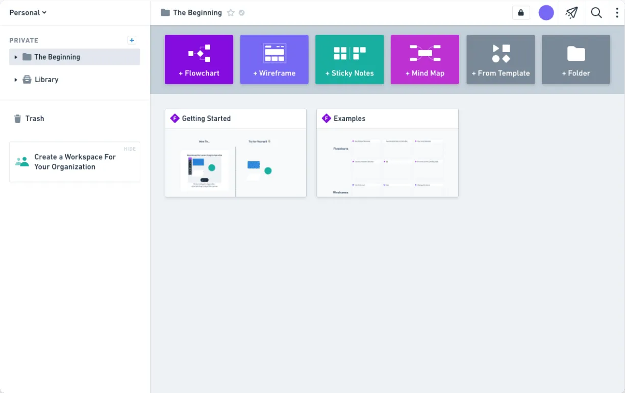
This most generic or basic example is a little bit of everything. We have an informative message, a graphic or visual embellishment and an action the user is urged to take.  Utilizing empty states (in all kinds of different components or page layouts) comes into play when you want to expose an interface to let people see all the possibilities.

empty state google currents
Google Currents empty state features a decorative visual, informative text and an action

Starter content empty state pattern

This might not work for all enterprise applications, but providing starter content (or dummy data) is a great way to give users something to explore instead of anxiety-inducing white space. (Remember that ‘no’ interaction can make people feel like the system is broken? Well this is a great example of that.)

This way, you reduce friction and get them to break the ice while providing in-context examples of all the functionality you offer.

Empty state example with dummy data and helptext:

Empty state example from whimsical featuring dummy content.
Whimsical provides starter as part of their onboarding experience. This starter content shows that’s possible and is informative as well.

🛳🏃🏻♀️ Onboarding: it’s worth noting that empty states and onboarding or walkthroughs are not the same thing (although empty states may be used in your overall onboarding experience).

SAAS products take different approaches to designing their onboarding experiences, in fact empty states may be prevented all together, by forcing users through a directional flow, making them create as they go, or by utilizing dummy data like we see above.

Empty states can be used for learning purposes in general and not be tied to an onboarding experience at all.

No search results pattern

Empty states also occur when a search query returns no results, like say on a search results screen, table view or dashboard view. This is an example of an empty search screen in a popular enterprise application, Slack.

Empty state example no search results form Slack
Slack’s no search results pattern.

UX tip: Guide user towards action

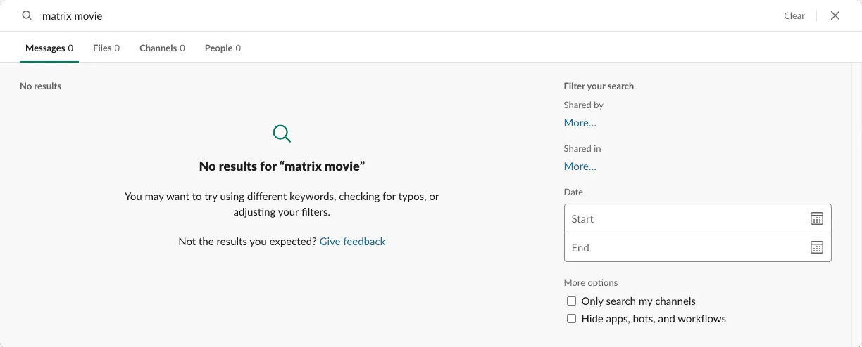
Similar principles apply here. You want to avoid users from feeling like they’ve hit a wall and have to start over. Empty search results should never actually be empty. You have the opportunity here to present options for “the next best thing” (if you’re able to analyze their search query and suggest related content).

You can also guide them towards other types of resources like your support documentation or an FAQ. In any case, don’t just leave them hanging. They’ll probably get very sad.🥺

📝 A quick note: loading UX patterns are closely related to empty state, because they typically will work in a sequence to communicate two stages: the system is loading/processing, and here’s your result. It could also be argued that an empty state can also be a success UX pattern of sorts.

Clear all pattern

Another type of empty state happens when it’s the direct result of the user clearing the content. For example, if they select all rows of a table and bulk-delete them, we’re back to square 1.

Wherever you provide an option to “Clear All” or “Reset”, you are allowing the possibility for this component or page to jump back to a default state.

But! Keeping in mind the context of this empty state’s occurrence, we can react differently:

clear all empty state
This table example shows filters applied such that there aren’t any results. Assuming users want at least 1 result, this CTA asks users to clear their filters.

Inbox zero pattern

In some cases, a user-triggered empty state is actually an intended goal and use case. Let’s say they’ve completed all tasks of a complex workflow, or they’ve finished reviewing all the attachments of a specific project. This is an opportunity to positively reinforce their work. This is a good place to consider some gamification principles.

The use of imagery (especially images of nature, read more about the biophilia effect) does a great job to reduce stress and put a smile on people’s faces, even if for a short second. It acts as a nice surprise after a complex cognitive task.

Empty state example from Spark (inbox 0).
This inbox zero example from Spark uses imagery to create both UX feedback and a positive sentiment for users.

Empty state examples

Empty state example from Restream
Empty state example from Restream featuring artwork.

Empty state example on Patreon
Empty state example on Patreon which urges users to the next step.

Empty state example showing dummy data from Monday
Empty state example showing starter project management content .

Empty state example from Invision.
A basic empty state example from Invision, featuring artwork.

Empty state example from Dovetail
A Inbox 0 empty state example from Dovetail (applied to their notifications panel).

Wrapping up

Hopefully at this point, we have a shared understanding that failing to consider empty states is a stone cold bummer in your application. Think about the feeling where you take out a blank page and stare at it. Imagine you have to use a type of writing implement you’ve never seen before and have no mental model on how to use it. Now layer in the fact that the blank page has caused you mega frustration in the past. How successful do you think you’d be in this situation?

Empty states are your UI’s time to shine and a great opportunity to use (often ample real estate) to communicate with people

Get your empty states dialled in, and your users will thank you. You can avoid making your users feel stunned and instead make them feel jazzed and empowered to go forward in your application. Cheers all around! 🥂

UX Heuristic Report Template Kit

Spend your time and life force on capturing heuristics problems rather than endless visual fiddling. Meganne Ohata will guide you the whole way, so you can propel your work and become their most trusted advisor.

$79
$59
Learn more
ux heuristics series

Download our Table UX Audit Checklist

Do a mini UX audit on your table views & find your trouble spots with this free guide.

Available in a printable version (pdf), plain text markdown, Apple Keynote or Microsoft Powerpoint.

Please fill in the form below and it will be in your inbox shortly after.
Thank you! Your submission has been received!
Oops! Something went wrong while submitting the form.
letters

Want to dig deeper on flow diagrams?

Be the first to know about our upcoming release!

If you found this intro content useful and find yourself needing to express yourself more efficiently on your software team, this training is for you. Our new flowchart training includes real-life enterprise stories and examples for using flowcharts for UX. You’ll get tips on how to make your diagramming efforts successful, how to derive info for the flow charts, and how to get others to use and participate in the diagramming process.
Thank you! Your submission has been received!
Oops! Something went wrong while submitting the form.
Get to know us
“Your article made me realize our tables suck.”
Matthew S.
Mazumago
Previous Post
Success UX
Next Post
Design Rationale Documentation