Error Message UX, Handling & Feedback
October 25, 2024

Meganne Ohata


Make no mistake, errors matter. Think of the last time you’ve ranted passionately about an enterprise platform—was it because you received an incredible success message full of confetti? Or was it because of an inscrutable, confusing error message that did nothing to lessen the pain of the error itself, or even shed the tiniest modicum of light on what actually happened in the first place? Look, errors are going to be inevitable. As humans, we know it can’t always be rainbows and butterflies. Things happen! But what you do to handle errors makes all the difference. Your user could table flip and cry out to the heavens, or you might turn the situation around and perhaps add to their trust and understanding. What’s it gonna be?
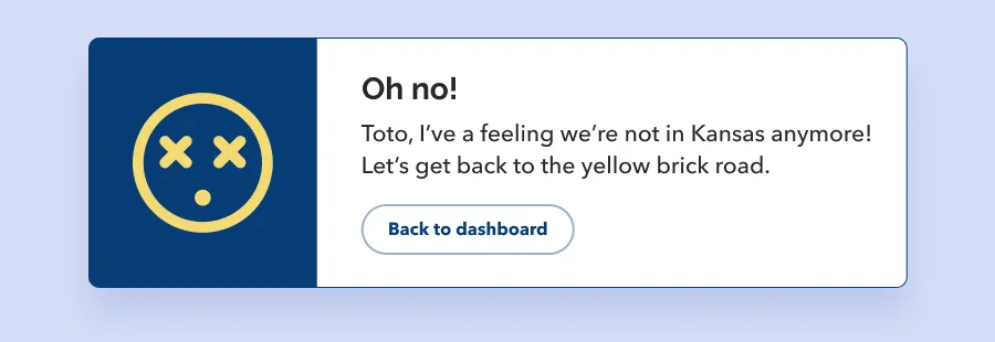
Error handling UX requires special thought, especially in enterprise software.
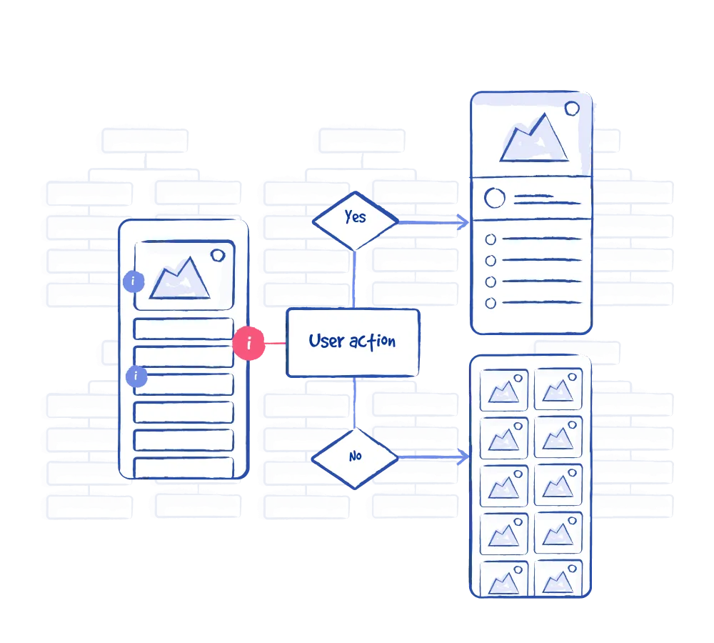
Here are some prompts to consider with your team when creating feedback error UX, whether that’s determining when to display an error message, or what form the error feedback will take in the UI.
To start with, make sure that you as the designer fully understand what happened in this error so that you’re on solid ground when crafting your error message.
Use the opportunity to give the user information on why the error occurred, what the impact is, and what they can do to avoid or rectify the situation. People don’t like being interrupted to hear that something’s gone wrong, but with the right clarity and context, you might be able to turn it the moment into a thoughtful experience that actually boosts their trust and satisfaction instead.
Think about when the right time is to communicate this particular error, and at what point of the interaction it should be triggered. Some UIs over-rely on error messages and end up with a very reactionary and negative tone in the interface.
Make sure the UI you use is up for the task, and don’t fall into the trap of blindly depending on blanket solutions just because “it’s what the library provides”! Is it a modal window, toast, banner or inline feedback? How much context does the error need? Make sure you don’t overshoot it, but don’t underplay it either—If the error is super destructive or causes some major blocks in the workflow, feel free to make a scene.
We already know that poor error messages are confusing and unhelpful, but let’s consider the audience to figure out what that means (of course we’re gonna say that 🙈). So who’s on your platform? You might have native and non-native English speakers to consider, or different familiarity levels with the platform or technology in question. There might be specialized content or multiple interpretations of the same thing.
Avoid displaying raw content that the layperson doesn’t understand, like stuff the database spits out or actual code. This doesn’t mean fully omitting the data if it’s relevant—you could have links or expanding interactions to accommodate it without putting it at the forefront.
We at P&P obviously love humour as much as anyone—and maybe we like to go heavy with the emojis and pop culture references too🤭. However, it’s clear there’s a time and place for everything. In enterprise, you might find yourself designing platforms that deal with medical imaging, airline traffic monitoring, financial crime and compliance, fleet management and shipment delivery…and more. Save the humour for other scenarios: errors are not where it’s at! Don’t make the user guess what went wrong and how your message is supposed to help, instead keep it clear and useful.
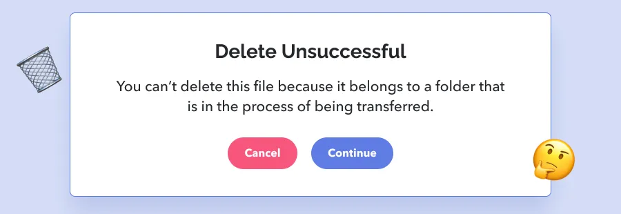
Okay hold up a minute, what’s up with the “cancel” and “continue” buttons in this example? 🤔Doesn’t this message mean that the file didn’t get deleted and there’s nothing else to do? Or do the existence of these two buttons mean that the user can cancel the transfer of the folder and thereby delete the file they wanted to delete? Or is that what “continue” is for? What is going on! 😱Messages like these can throw the user for a loop, and that’s if they take a second to read and think about it carefully. If they just hit the primary button without thinking about it too hard, the consequences could be drastic.
We mentioned how error messages can take multiple forms—they can be toasts, modals, in-line and more. What makes an error message useful and successful isn’t solely in the UI format (though that’s a big part of it!) but in the information that’s included.
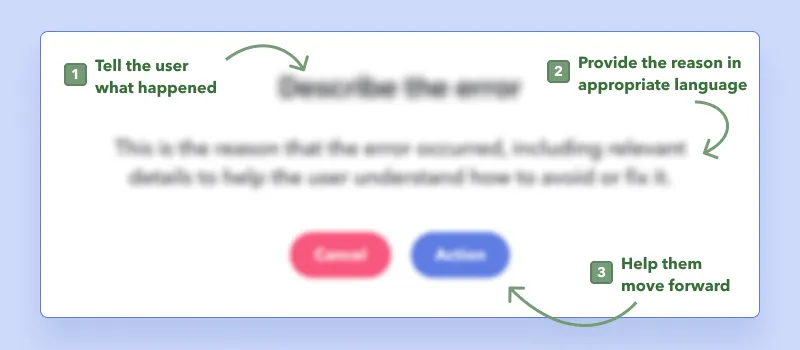
…and this doesn’t mean titling your message “Error occurred” or “Action failed”! 🤭Tie this back to the user—what action was the user trying to execute, and in what particular way did it fail? If you can provide specifics, then the user can more easily link it to what they may have misunderstood or overlooked.
Share details about what happened and what impact it might have had. Consider “appropriate language” here once again—what is relevant and insightful to the greatest swathe of users? You may choose to include more technical information, but the spirit of the message should be able to stand even if the user is unable to parse through the “bonus” content.
Let the user know what they can do to move ahead—maybe they want to retry the action that failed, or to undo their last action. Anticipate their needs and step the game up! And if there’s a situation where there’s nothing to be reasonably done, tell them that too.
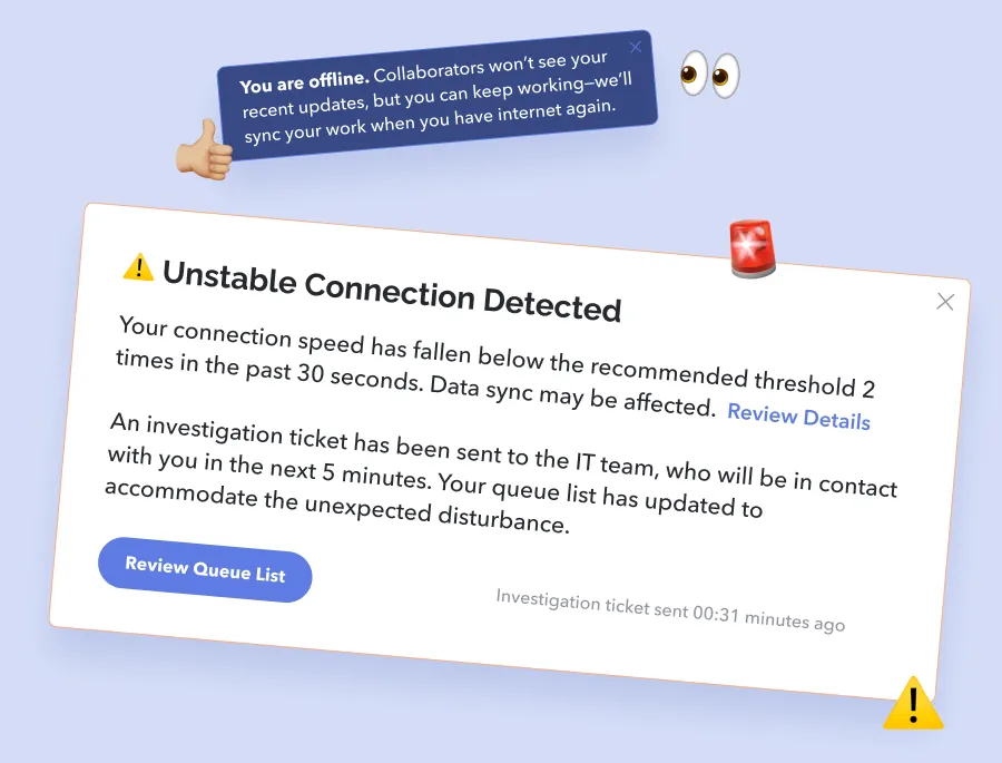
These errors come from unintended issues within the system. For this type of error, it’s particularly important to explain context to the user, because these probably feel like they popped up out of nowhere. The user needs to understand that they didn’t actually trigger something due to their actions. The messages should also frame whether anything can be done on the user’s end, and what these options might be (if any). Below are some examples.
Connectivity might be affected due to bandwidth, ISP outages, or even just the weather outside. Depending on their particular situation and workflow, the user might need to be notified about how their connectivity is affecting their work and data, so consider it in context.
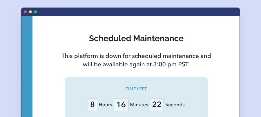
It could be that an application temporarily exceeds the server memory’s limits, a server was misconfigured, the system is down for maintenance, or there was an issue in the script. Regardless of the source, these reflect poorly on your product and can damage trust and confidence. Craft copy to bring the user peace of mind. Let them know what’s happening and when things are expected to be back to normal.
These are tricky situations where you’ll be looking at how to mitigate communication between the API and the user. First of all, the API error will need to be caught and interpreted by the system—it’s a good one to talk to your developers about. What’s possible, what can be detected, customized, and returned?
These errors come up when the user has an incomplete or inaccurate understanding of the tools they’re using—they may end up getting lost, losing data, or redoing work. These kinds of errors can leave users feeling alienated, like it’s “me versus the platform” rather than “me and the platform working together to get things done”. Ideally, great design will avoid this kind of error altogether due to error prevention strategies.
A few examples…
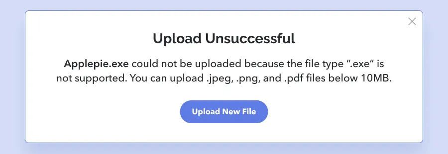
The user might try to upload something that isn’t accepted. In the ideal scenario, they’ve already been educated as to the file types and max size that’s acceptable. Once this error occurs, you can use the opportunity to reiterate and explain how this item breaches the limits.
The user may try to do something that they don’t have permission for. Ideally, these kinds of items are hidden to begin with, or perhaps visible but with some indication that it’s inaccessible. If the user continues to attempt it, then the error message that appears should explain why (ie: They’re level 1 and only users level 3+ have access to it) and what to do next (ie: request permission from the owner of the file, Jane Smith janes@acme.co).
There are a variety of error possibilities when it comes to forms: incorrect input type, a required field got skipped, or the value doesn’t match what is expected (such as confirming a password). Regardless of the scenario, here are a few form-specific tips:
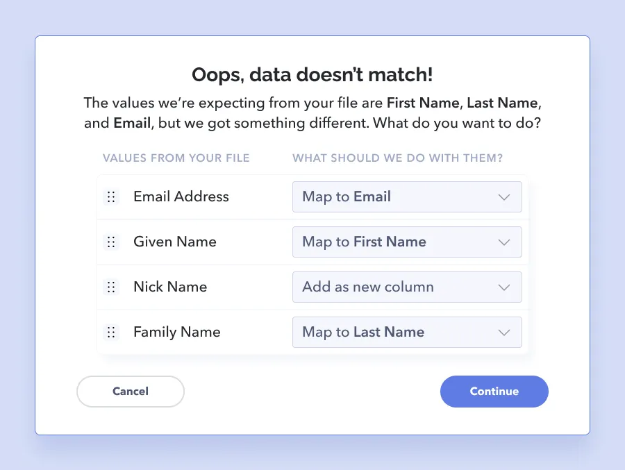
These errors crop up when the system has mapping issues or otherwise can’t resolve the data it receives to what is expected. The important takeaway for these use cases is to design for flexibility as part of the error message to maximize the chances that the data can be processed in a useful way. For example, if the user uploads a spreadsheet containing values that differ from what the system expects, what UX opportunities are there to optimize their workflow?
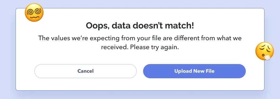
Instead of blocking the user so they need to re-open their spreadsheet, manually delete the unexpected fields and then try uploading again, you can assist them in moving forward. Explore options like allowing them to omit the additional values, add a new column, or adjust the mapping method.
In cases where permissions aren’t the issue yet security can’t be validated, clarity about what to do next is the highest priority. Imagine how frustrating it is to know that you’re supposed to be able to get in, but somehow, you can’t? One example is if the user is trying to access a part of the platform that requires a decryption key.
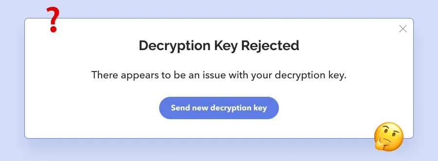
They enter their key in but for some reason, it’s rejected as invalid or corrupted. They double check that everything was entered in correctly, and might even request another decryption key so that they can try again. If it’s rejected again and again, they’re totally blocked. So rude! So awful! So frustrating! 😡What clarity looks like should definitely go beyond “contact your admin”—otherwise their annoyed face might turn ultra-angry as they think, “Who the heck’s the admin, what’s their contact info?!” Be as detailed as possible!
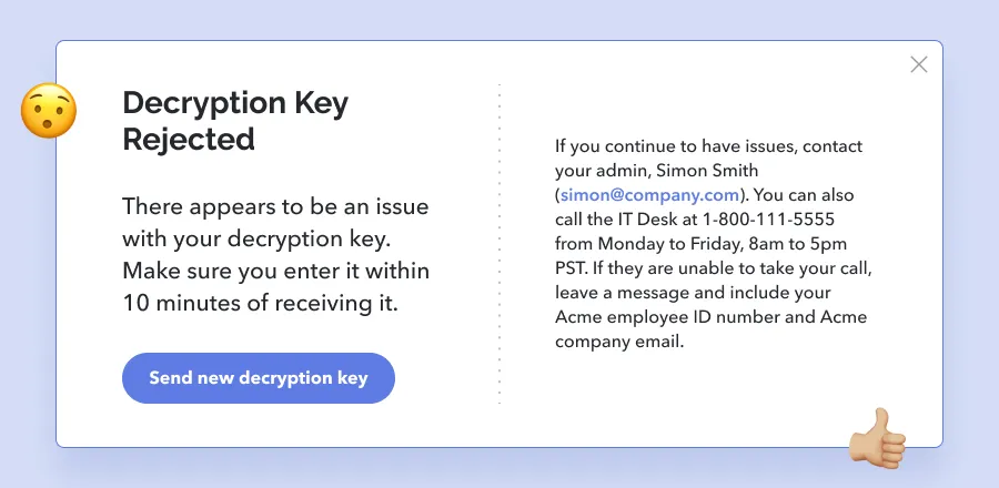
Where relevant, educate users about how the error occurred so that they can potentially avoid triggering the same error again.
Tell users what they can do to recover from the error, and even better, provide them with functionality that accommodates them where they’re at.
.png)
.png)
.png)
Use simple and direct language to explain what went wrong and why. Niche humour, pop culture references, or technical speak should not take center stage—aim for verbiage that serves the lowest common denominator of users.
If technical information, code snippets, or other detailed data is relevant to diving into the error further, provide a way for the user to dig in. It can be a link, an option to expand the message, etc.
.png)
.png)
Make sure there’s a way for the user to either dismiss the error message or (if it’s pertinent to continue showing the error until it’s otherwise irrelevant) to automatically remove the error as soon as the issue has been rectified.
Don’t wait for users to finish all 8 steps of a workflow before you let them know something that they did on step 1 actually means they have to re-do all their other work. Likewise, on a form return all server errors as soon as there’s communication to the server—don’t reveal them one by one. Input validation errors can be shown with even faster turnaround.
Some errors can be reasonably communicated in-line, while others should take over the entire screen. Design for what the situation calls for—what’s the level of risk that this error is tied to? Explore various UI options, not just what comes out of the box.
Document the errors and their frequency to get an idea of what you can do to reduce their occurrences, or even fix them permanently. Getting statistical visibility will help identify things to keep an eye on—ie: maybe 80% of spreadsheet uploads get rejected the first time, and the next upload attempt is always over an hour later. That might be something to dig into at the next user interview and hint at potential feature adjustments that can save users time and effort.
The best case scenario is where users don’t ever get to see an error message! Think about hiding content or actions that aren’t accessible by the user. Choose form inputs that minimize the possibility of incorrect formatting, such as a date picker instead of a plain text field for dates. Include information about requirements and constraints up front, and make use of help text, placeholders and tool tips. Enterprise platforms can be quite intricate, with a steep learning curve. Doing what you can to soften that curve can reassure users and build that trust.
Error messages are often an overlooked opportunity, sometimes even (let’s be honest!) treated as an afterthought despite their prime UX potential. By helping the user out when they need it most, we can increase their confidence in the platform, protect their work or data, and give them the tools to minimize disasters. Strong UX microcopy, thoughtful context, and going the extra mile in predicting and accommodating “a way forward” make all the difference. It’s not that users expect perfection and zero hiccups ever in the history of all time, it’s about throwing them a lifeline (maybe even a lifeboat🛶) when the waves get rocky.
Do a mini UX audit on your table views & find your trouble spots with this free guide.

Be the first to know about our upcoming release!


.webp)


.webp)

