
Breadcrumbs in the UI sense are fascinating. On first inspection, breadcrumbs seem easy peasy, but don’t be fooled. Many a hapless website and product person have gone from “hey maybe we should do this” to existential product crisis faster than you can say “acceptance criteria”. Breadcrumbs UX isn’t for the faint of heart, whether you’re a designer, developer, product manager or QA person!
In this article, we’ve got a plan to save you from the inevitable brain melt that comes with breadcrumb design…or maybe just help you manage and embrace the melt. First, we plan to tell you all about what a breadcrumb is ‘made of’, then we will share the complexity and subtypes of breadcrumbs, we’ll dive into where breadcrumbs get weird, and of course, we’ll talk through this in the context of enterprise software and complex products.
We’re coming to this topic with a little less of the ‘website’ context and are taking a more software or SaaS-oriented approach to our exploration of this topic. As such, we’ll dive more deeply into the data implications and how this ties in with other interactions and common ‘gotchas’ when making heavily interactive experiences.
As with any substantial feature or functionality, it’s important to get the conversation going with your product team to start wrapping your heads around how this could work.
At a high level, the anatomy of breadcrumbs UI couldn’t be simpler!
Origin: This is where the breadcrumb path begins
Levels: These are the entities between the origin and the current
Delineator: clearly distinguishes between each page/object/task
Current: This is the terminal point in the path

Placement wise, they are typically placed at the top of a web page or application, near the header or main navigation. The placement of breadcrumbs can vary depending on the specific design and the needs of the users, but it is generally recommended to place them in a prominent and easily accessible location that is consistent throughout the application or website.
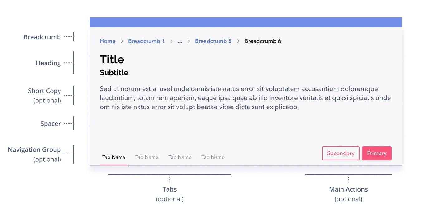
Breadcrumbs in this example are displayed above the page header, but in practice, they are often nested within the context of a workflow or data dashboard, as shown here. We won’t delve too far into layouts in this article. There are a lot of great placement and layout suggestions in the article Designing Effective Breadcrumbs by Smashing Magazine.
Breadcrumbs can be built in two ways.
If we were talking strictly about casual website browsing, maintaining context about the user’s exact path would rightly be banned – as it is in NN Group’s article. However, use cases within our enterprise software are typically more complex and optimized for performance and task completion which means that some of the strict guidelines suggested by NN Group may need to be expanded upon. When the user experience is tailored towards efficiency and productivity like it is in enterprise UX, preserving the user’s sense of place and understanding of the current state is paramount. Sustaining context in various ways gets super important because users are expending a lot of brainpower already and the stakes may be very high– any opportunities to keep this context can be very beneficial to users.
In brief, digital experiences are wildly varied and complex, so losing context or ‘history’ may block us from delivering a great experience. (Sorry, we’ve got this edgy take Norman, but we think you’ll understand.)
So, if breadcrumbs aren’t simply depictions of the data architecture of your product, then how can breadcrumbs be structured? What are the types of breadcrumbs overall?
In short: show the user where they are in within the site’s static hierarchy. This is the most common type of breadcrumb. They are typically displayed as a series of links separated by a delimiter, such as a right arrow, and represent the hierarchy of pages that the user has navigated through to reach the current page.

In short: show the user the dynamic path they took to get to the content. Path breadcrumbs in user interface design are similar to location breadcrumbs and serve a similar purpose. Path breadcrumbs display the hierarchy of pages that a user has navigated through to reach the current page, but instead of showing the actual page names, show the path the user has visited. This preserves context of the user’s journey.

In short: show the user the attributes they’ve chosen while conducting a faceted search and navigating around from there.
Users can get assistance understanding the exact attributes or characteristics of the object they are viewing using a navigation system tool called attribute breadcrumbs. They are elements of navigation that serve as interactive meta-information to characterize different aspects of the experience.
In this type of breadcrumb, we see filter or sorting criteria that the user has applied to the content.

In short: show the user the progress they’ve made in an application. This type of breadcrumb design allows the user to see what they’ve done in an application. It offers a brief yet informative summary of the user’s journey up to this point. They provide a visual depiction that clarifies the current location, the actions taken to get there, and the means to return to a previous state.

To make good design decisions about breadcrumbs, regardless of the type of breadcrumb you have, requires a robust understanding of your data. This is the part they don’t mention very often on double diamond design frameworks😉. This is the scrappy, collaborative and downright nerdy part of the equation. We can say with confidence that you cannot design a halfway decent breadcrumb experience without deeply understanding your data.
Understanding data is a key enterprise UX skill, and is essential for designing other interactions in your software like data tables and data dashboards, so face the music and get your hands dirty. You’ll have to collaborate with a data architect, back-end developer, or even a data analyst/scientist type of person to fully understand how things are put together in your product. We suggest reviewing documentation, reading up on databases and drawing or mapping out your data.
An important part of the breadcrumbs conversation, when you’re depicting a hierarchy, is zeroing in on where to start. It may sound like a simple question, but it’s a little more complicated than that, as it always is in the software world.
Take the example of a software suite – on one hand, you may say “oh! Home” that’s where we start, in reality, from the home screen where people launch, they may go to product A, B or C. They may even switch back and forth between them. This calls into question your overall navigation and breadcrumbs come along for the ride.
In the example above, we see the difference in how the structure is represented especially at different “origins”, in the first example, we have a literal interpretation of location breadcrumbs, which creates the potential for a lot of redundancy. The first example doesn’t take the whole layout into consideration and thus creates redundancy in what’s shown. Within the top header and the left hand navigation, these places state the location of “where you are” in themselves, and are a glance away (look at the left hand side navigation).
In the second example, we exclude the first 3 layers, and focus on the context from the starting point of “Active clients”.
Considering the origin of your breadcrumbs is always important, but is especially important when the hierarchy of your paths is quite deep.
Figuring out the right origin for the situation takes special consideration. Make sure that you think this through in terms of the user journey, what people are doing and of course, the amount of context that’s useful to maintain.
Using path-based breadcrumbs at first might seem like ‘hey, just use the browser back button man!’ but actually, that’s not good enough. Like the fairy tail, Hanzel and Gretal needed to find their way back home. Does that mean they took the most direct route? Maybe not, as curious children they wander and explore as they go, forming quite a circuitous, meandering route.
Think about the research ‘rabbit hole’ use case, where you use information to leap frog from one important concept to another. Our brains work in different ways at different moments, but think about how important it is to you to connect ideas and ‘way find’ as you navigate complex things. Why would we miss out on the opportunity to preserve this curiosity? Maybe even reignite a train of thought from an earlier branch?
Say you’re conducting academic research, most of the time the only thing you can do to emulate your path being preserved is to open new tabs from thing to thing. But there, you miss seeing how your search terms evolve and thus your thinking about a topic. If there was more preservation, you could appreciate where your logic or curiosity evolved at different points.
Now that AI is rapidly becoming a part of our industry, there are several crucial factors that need our careful consideration. Information-seeking is becoming a machine-human dance. If we’re retaining context for people, using breadcrumbs to not only “display” what’s been done, but “by whom,” could improve AI transparency and reduce the “black box” experience.
For example, as chatbots can be integrated into websites or mobile applications to provide users with quick access to information, answer questions, and direct them to relevant content, how can we keep the context and use breadcrumbs to keep users oriented?
Artificial intelligence (AI) can also be utilised to recognise the context of a user’s journey and keep track of user’s preferences and actions over time over time and make relevant or personalized recommendations. How do we demonstrate that the user made some but not all of the navigational choices?
In order for breadcrumbs to fit into a small space, they are frequently truncated, or compressed.
The most typical truncation method is the ellipsis, represented by three dots “…” to show that some levels have been cut. This makes sense when the information behind the ellipsis is discretionary and only shown when the user specifically requests it.
Truncation is, oddly enough, quite a dense topic which deserves deep consideration of your users, data and use cases. In enterprise software for example, data may be very long, and each character might be relevant or perhaps just particular chunks of information are relevant. 🧓☝️Don’t assume that simply throwing an ellipsis at the end of a string will sustain the usefulness or meaning of the information. Nu huh.

As we gauge the amount of context we can sustain for people, designing the behaviour of shortening your breadcrumb is important:
Depending on the type of data different approaches might be useful, here are some truncation approaches to consider, each focused on maintaining meaning:


In this case, we see the words within the breadcrumb being truncated first as they grow. This is great to use when the entire context is relevant for users.

In this case, we see the beginning of the path and the last part of the path shown. This allows users’ memories to be jogged about where they started and where they ended up. The amount of terminal breadcrumbs shown should be determined based on the screen real estate as well as the relevancy and utility of what’s shown.
This is a method used to scale the breadcrumb experience and it can have several benefits for you the user experience.

Space optimization: When there’s multiple levels of navigation, breadcrumb can take up a lot of space. Using a dropdown can conserve screen real estate while still providing access to all the levels of navigation. If you think about the back button on many browsers, they employ this method.
Improved visibility: in a drop-down, the breadcrumb remains visible even on small screens or with limited space i.e. on mobile device.
Scalable: Useful for complex navigation structures, a dropdown allows for easy scalability as the number of levels increases.
Increased accessibility: For users with disabilities, a dropdown is easier to navigate (compared to horizontal scrolling for example).

With the increase of mobile usage where users can be productive and effective, regardless of location or device, breadcrumbs need to be designed for every usage, including on small screens.
Things to consider in a limited screen real estate (like mobile devices including phones and tablets) is to:
Consider the important role breadcrumbs play in interface accessibility. They can provide screen reader users with a very nuanced navigation experience. As a result, the tab order and overall positioning on the page must be taken into account.
Allow keyboard ‘tabbing’ to access your breadcrumb navigation. Use the tab key to move between breadcrumb items and enter to activate a link. The benefits for power users are also substantial (say for example, those doing data entry or other heavily key-board oriented workflows). And if the breadcrumbs are dynamically changed, they should be announced by the screen reader so the user is aware of their current position, new route, or other relevant information.

As we dive deeper and deeper into the conceptual framework around any component, the lines begin to blur (the same things happen with atoms we’re pretty sure).
For example, navigation items vs filters, at a certain point, is a main category in your application, simply a filter rendered in it’s own cute navigation package?

Just looking at the definition of the different types of breadcrumbs should provoke questions about the blurry line that arises between breadcrumbs and other parts of your interaction. Take progress indicators and filters as prime examples. Even the architecture of your application itself comes into focus. The relative amount of “pages” in your software may directly affect the usefulness of breadcrumbs themselves. Maybe you leverage other containers, drawers and layouts to keep context.
Existential product crisis or not, breadcrumbs invite us to some really interesting territories of design, even through breadcrumbs UI is deceptively simple. Asking ourselves the fundamental question of what context needs to be maintained for this moment in my application, is a big one. Breadcrumbs may serve an important role in this objective, but at the very least they must get you wondering and enquiring about how your users think, where they might get disoriented and how you as a design decision maker have opportunities to help.
You may opt to avoid breadcrumbs all together, and use other tools to orient people, like maintaining their session, choosing great defaults, using transient screen real estate at the right moment. There’s a huge opportunity to get this right, especially for knowledge workers navigating complex things to make decisions, don’t ignore it because it’s “hard”. Dive into the chaos and make it simple again!
Do a mini UX audit on your table views & find your trouble spots with this free guide.

Be the first to know about our upcoming release!


