Navigation UX Best Practices For SaaS Products
December 3, 2022

Fanny Vassilatos

Ceara Crawshaw
.webp)

In UX, ‘navigation’ includes all functionalities and visual cues that people use to orient themselves in any digital product. When we think of all the digital places we go, navigation is the way finding system that makes or breaks someone’s understanding of where they are, where they can go, and how to get there. It’s critical (and we aren’t using that word lightly) to treat navigation as a keystone of your product because it speaks to basic human needs like clarity and safety— essential preconditions to getting anything done at all. In this article, we’ll share the navigation UX best practices, structure, and information architecture and ways to think differently about your product’s nav.
By definition, navigation is a process rather than a single thing. Think of a road trip… your product’s navigation is, all at once, the GPS, the road network and the car. Navigation in products is both pointers to places as well as the places themselves.
When navigation is well-designed, a user can find delight in how much time they can save by using your product. Conversely, when navigation is poor, somebody might be trying to complete something stressful and end up feeling they are in an abyss making them even more stressed.
By their nature, SAAS and enterprise products are biggies; they house a ton of information and functionalities for a diverse group of users. This is complex navigation UX to create. What is more, enterprise products are supposed to enhance the productivity and efficiency of a team. It should go without saying that wasting time just navigating is an important problem to solve and avoid. For example, a manager uses an HR platform to view analytics about her team’s vacation time while her employee uses the same platform to request vacation time. A well-designed SAAS navigation UX will help both these people complete their task quickly so that they can move onto something else.
It’s important to avoid using confusing labels in a navigation. This might sound basic to you, but we often encounter products whose navigation labels seem to make sense together and sound nifty (ex: Build, Manage, Learn) or on-brand (ex: Ignite, Imagine, Inspire), but totally miss the mark on making enough sense to users.
It’s impossible to label your navigation elements properly without understanding how your users navigate these concepts in their mind. Take a non-tech example: your roommate might think it’s helpful to group your spices into categories by cuisine or region, but imagine how it might feel for you to navigate that when your mind is just looking for the word “cinnamon.”
Therefore, be careful and empathetic when it comes to labeling. Your multi-departmental enterprise users might find it more natural to use nouns like Settings, Employees, Analytics instead of verbs like Build, Manage, Learn.
Some features in your product might benefit greatly from being surprisingly delightful, but navigation does not. During a user test, you might ask someone to tell you where they think a navigation item will lead them, and you want them to be right every time – especially when we’re talking about a back button, my dears. Given that enterprise products often touch fundamental matters like the financial projections of a business or someone’s identity and tax records, you’ve got to make people feel safe as they navigate and execute functions.
Poor predictability occurs often in products that are designed to help people go through complex navigation workflows. For example, we worked on a project management product for enterprise where each stage of the user’s project is explained with a ‘wizard’ progress indicator. In the product, when you click on a project, you would either end up in the most recent place you were, or you’d end up on a results page (with a generic design across projects, no less). Users found this logic really unclear; the unpredictable behaviour in the navigation created a sense of mistrust for them.
It’s okay for a product to mature over a long period of time, but this can sometimes lead to weird navigation problems. For example, we often see a mix of navigation styles originating from different eras of a product, like a new nav on top of old software, or, worse, opening up an iFrame of new software inside an old platform. These issues are normal to come across, given the emphasis that our industry places on prototyping and low-effort solutions, but beware of letting these Frankensteins linger. And, just in case you need to hear this: you can let go of your legacy navigation.

Designing navigation is complex, whether you’re looking at global navigation, secondary navigation, in page navigation or basically anything in a b2b product.
Follow these prompts as you embark on designing and building your navigation with your team (or yourself), using best practices for SaaS.
The first step of our approach to mapping out information architecture is to take inventory of all your content across places and functionality. With all your content mapped out, you can do a consistency-check:
Now that you’ve made a map of your information architecture (the ‘what’), the next layer is about who is using what, and to what degree. This step will help you uncover any hotspots of activity or other insightful patterns for particular user personas that might otherwise be overlooked. For example, the content on an analytics page might need to be categorized or organized in such a way that it serves distinct user mindsets like a manager vs. an employee.
Take the pulse on your product’s usage analytics. Pay a visit to the Fullstory’s and Mixpanel’s you’ve got setup.
Pull out the support tickets you received over the past 6 months that sound like they’re about navigation issues. Gathering that quantitative and qualitative data can be a good first source of gold to identify recurring pain points.
All this mapping will help you see tricky areas in your navigation that might require a bit more design attention. For example, there might be two functions that logically exist in totally separate areas of your product, but are otherwise very closely related in one very popular case. Design challenges like these are important to identify early and treat with care.
Having trouble finding these tricky spots? User interviews are an obvious win, but you might already have access to plenty of insights if you look for any commentary relating to confusion or time wasting in your user feedback and feature requests. These problems are likely navigation-related.
Finally, it’s time to take everything into account and make sure everything is labelled in a way that people will appreciate. Here are some prompts to guide your thinking:
Labels can be especially difficult in enterprise software because we have to use an abstract term to refer to something—and that something is inherently abstract and technical. For example, we were working on a settings feature set. The settings were related to an automation in the software, it allowed you to specify if you wanted a file automatically attached, or manually attached. We came up with ‘attachment method’ for the label, but could have used words like “mode” or “style”. We decided “mode” had too much overlap with mode switching in the UI, and that “style” made it into a psychology term “attachment style”.
All this to say: make sure that you don’t use any synonyms willy nilly when working with abstract language. A basic understanding of the label is fragile enough in the first place—even a slight deviation can erase a person’s understanding totally.
There are 3 fundamental approaches to designing navigation: object-oriented, task-oriented and workflow-based. With a solid understanding of each, you’ll be able to mix and match when appropriate.
The difficulty with nav is knowing when to break your rule and when to keep your rule in a way that maintains a coherent way of thinking across the whole thing. We know how good it feels when design follows simple and coherent rules in the face of complexity, but the right nav—that is, the most human-centred and efficient one—will likely require more than one of these 3 approaches.
It’s really up to you to create the most human-centred way to make them all work, to think through the experience of transitioning between navigation styles and to reassess your navigation as your tool grows.
Notice how the exact same elements can be remixed from a task-oriented structure to an object-oriented one.
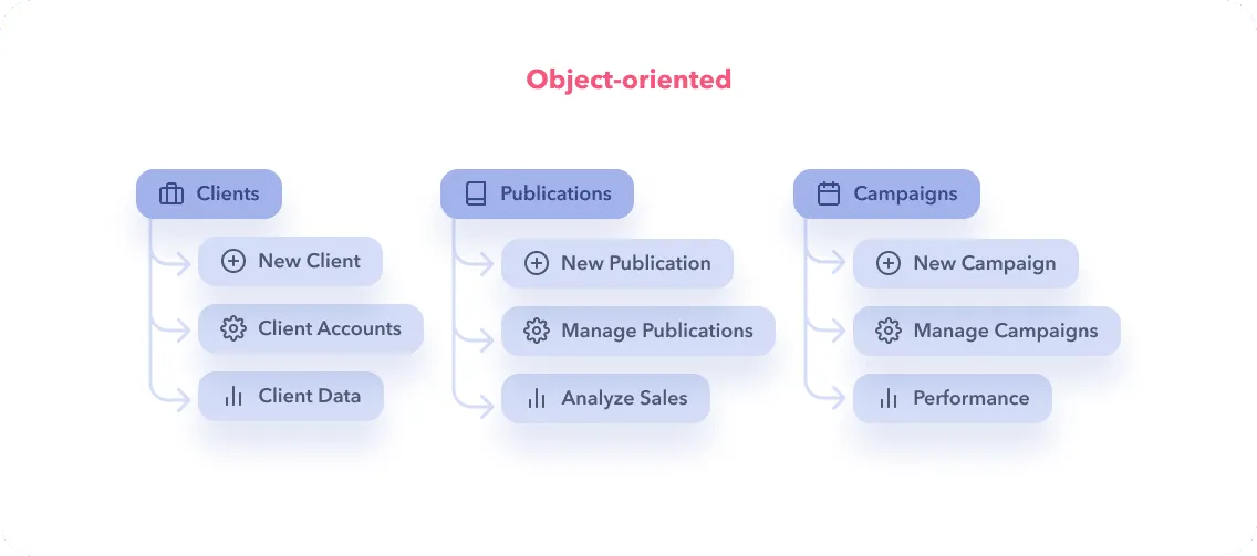
An object-oriented navigation organizes content under typically noun-only categories. This approach exudes more of a “drilling in” dynamic between your users and the content, making it useful when your product handles a complex or diverse set of use cases. For example: Chidi the CFO clicks on Publications to Analyze Sales for their monthly board meeting, whereas a Pip the Account Manager clicks on Clients to access Client Accounts.
Object-oriented navigation can be an elegant choice when user access is already object-based in the software (ex: only Account Managers can see the Clients label) or when your database is composed of objects that can have actions applied to them (ex: distinct Campaigns that can be created, managed and tracked, etc.)
Conversely, an object-oriented approach can be a really convenient trap for cutting corners over time (this is bad!). You might find yourself thinking, “Oh, we’ll just add a whole section about Parking instead of thoughtfully integrating it into the existing navigation,” but then your product will accumulate items over time without giving enough thought to their impact on the IA.
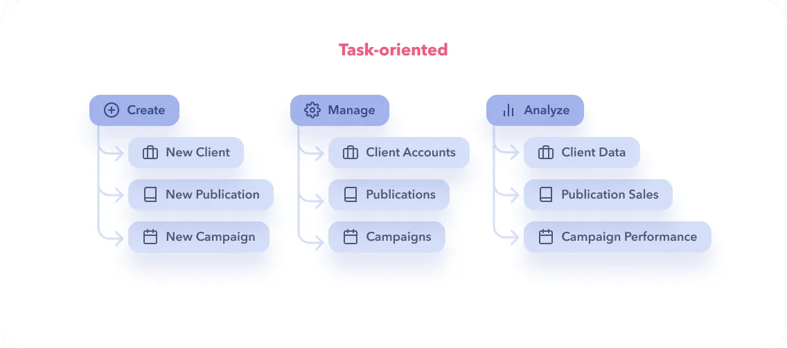
A task-oriented navigation is a better fit for products that have simpler workflows or whose users share the same intent. A common one here is Create, Manage, Analyze as an overarching structure, within which you can continue with task-oriented approach, or switch to object-oriented, as long as it’s clear and consistent.
For example: A Managing Editor at a publishing house uses Create to kick off a New Publication or to add a New Client to the database. They use the Analyze portion of the platform to stay informed of Sales, Social Media Performance, and Audience Data. On the other hand, the marketing people at the same company never use Create; they spend their days on Analyze in order to build the most up-to-date campaigns and strategies.
We love that task-oriented navigation makes it easier for users to understand what they can do on a page and generally inspires a more active relationship between them and the software. This benefit is especially relevant in an enterprise context where products have a sizable learning curve.
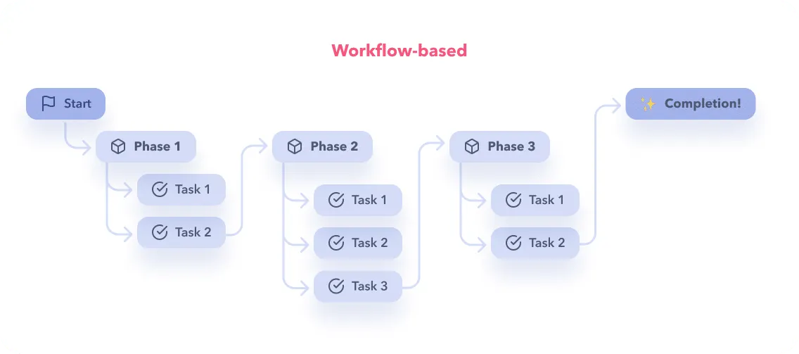
A workflow-based navigation is useful when you’re dealing with a lot of guided steps; not much exploration. This can be the case when your product helps users complete tasks that are both pre-determined and complex.
For example: A homeowner is applying for financial assistance on a government website. They have to Learn About the Program, Upload Documents, Fill Application Form and Review Application before they Submit.
A workflow-based approach is pretty much your only choice when your software or website needs to guide people through a long process; but, if it’s not the perfect fit for your use case, it can make users feel stuck and frustrated, leading them to abandon your product. That’s why it’s important to think through how your workflow approach behaves, maybe mix and match with another approach, all depending on how your clever design brain reads the need.
Like the pin on a map, breadcrumbs are great for helping someone understand where they are and where they’ve been within a workflow or within an information architecture. Beyond that, they can also be a navigation tool if you allow users to click on previous steps in the breadcrumb.


.png)
Giving users the power to customize their navigation can really elevate their productivity when your enterprise product serves many types of users with diverse roles and functions. For example:


Progressive disclosure can help you keep things light in situations where there are a lot of possible paths. This pattern is only successful if you have good labelling and IA, so be thoughtful about it! For example: A multi-level menu (with solid hover and click states) could help you see what pages or functions are possible within Campaigns before you dive into one.
When your navigation does not go as deep as your IA, it’s helpful to also offer a landing page or index page that displays more levels of information. This way, instead of going many levels deep in your actual menu, you just guide people to the ballpark they need and take it from there. In the case that you use this strategy, you often have more real estate. This extra room on a landing page can be an opportunity to point people to other places in your product or add other information, like descriptions. This is a good approach when a product is too complex for most users to navigate easily, or there’s just way too much to do in a secondary menu.
Beyond menus, there’s a strong use case for a more ‘organic’ navigation. For example:
We’ve created an in-depth search UX article you might like, if you’re intrigued about these type search experiences.
A successful navigation is not necessarily simple, but it is predictable. At any moment, ask yourself: Will people know where they are, what they can do here, how to get to where they want to be, where they have been and what’s next?
Your feelings are correct: navigation is a doozy if you want to get it right. Your users’ basic need for security is at stake, and that can feel like a lot to bear, but it’s totally doable if you take the time to properly analyse your project.
Learn to listen to how your users describe the places they go in your product, the words they use are key to helping you be an effective cartographer and guide. Avoid simplifying language and labels in the name of elegance or wittiness; when it comes to enterprise software, clarity is key.
Focus on picking the most useful approach for the job. For example, when dealing with a hypercomplex system, you shouldn’t just offer a map for reference, but also tools to get to popular places easily.
The only way to get all this right is by having a solid understanding of how your users think. There’s no way around it, but getting to know your users the best part of design anyway, so you should be alright!
We talked in depth about nav here:
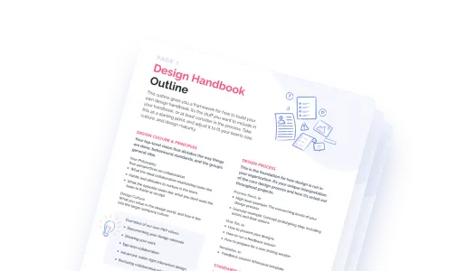
Do a mini UX audit on your table views & find your trouble spots with this free guide.

Be the first to know about our upcoming release!


.webp)


.webp)

