Dashboard Design UX Patterns
January 2, 2026

Fanny Vassilatos

Ceara Crawshaw


Whether it’s for analytical, operational or strategic purposes, being able to interpret the right information at a glance is pivotal for teams and departments of all sizes. When designing a data dashboard for your own enterprise product, your team needs to be very intentional about what data points get showcased. Make no mistake, data dashboard UX is tricky, but hopefully we can help. In this article we’ll share the dashboard design UX best practices we’ve learned over the years.
A product’s dashboards* serve a critical purpose in exposing key data and actionable insights – effectively exposing what’s under the hood in a way that’s useful. With data and by extension AI, being more and more relevant in our modern world, dashboards serve to extend the possibilities of what can be achieved through our use of software.
*dashboards – the term dashboards is often synonymous with the concept of a homepage in an application or even any experience where there is a sprinkle of data vis (to an entire user experience centred around data and information).
In this article we attempt to lay out the types of dashboards and identify them as different types of experiences, at any rate, make sure you clarify with the team you're working with what "the dashboard" actually is that everyone is talking about.
In data-heavy platforms, a common pain point is navigating multiple data sources and disjointed systems. Dashboards can unite those systems together and provide a global overview. Dashboards offer an at-a-glance snapshot and prevent users from having to check 10,000 screens just to “know what’s up”. In summary:
To be crystal clear, designing excellent dashboards is a very complex process which is super difficult to get right, even when you’re using all the best UX practices. There are a lot of barriers and parts that make it difficult. To name a few:
Follow these prompts along with your team as you embark on tackling your dashboard UX design. These prompts should help you think about how you want to apply dashboard best practices to your specific scenario.
Is the data clean enough?
The very first thing you get to do is a data architecture analysis. Sounds fancy? But really, just sit down with your brainiest peeps, look at your data structure, have a chat with your DBA. What data do you even have? Is the data maintainable? Is the metadata consistent and scalable? Start with prompts like these:
Map out user context
As much as it would be nice to design a dashboard for each persona, that wouldn’t be very efficient. Find the overlaps and divergences.
If the divergences are small enough, creating multiple unique versions might not be necessary. But if they are large, you should consider catering to separate personas.
Aim to keep it global at first (default state) + allow for granularity with interactions (see below).
Uncover the data structure and details
Work with a data expert to answer the right questions early in the process. Interestingly, the details here matter and there's a set system you can follow to uncover those vital details - saving time and surprises down the road. Our Data Mapping Workshop outlines a foolproof and efficient process for doing just this!
Determine dashboard design goals
What are users expecting to do with that screen? What questions do they need the dashboard to answer?
Figure out what key actions will be executed there —prioritize warnings and actionable items
In order to offer an experience that is informative at the overview level, you need to be very aware of what users are looking for. You can always allow them to drill down but be sure you surface the key stuff they can take action on, and any warnings they should quickly be made aware of.
Find out what is taking the most time for users to compile
Try to prioritize which charts will actually make it to the dashboard. For this, you need a good understanding of your typical user personas, what are they currently doing to obtain this information? Of these things, which ones do they do every day? Versus once a month or once a quarter?
To do this, try a workflow mapping exercise with your users, or you can learn a lot by reviewing their internal spreadsheets or reports.
This can help guide the selection process of what to actually show on the dashboard. When personas are very differentiated, this can warrant creating multiple versions of the dashboard.
👀 Have a look at our Data Mapping Workshop to find out more.
Dashboards can be very ‘view only’ or they can be deeply interactive and integrated into how users achieve their goals. At an abstraction level, you can think of a dashboard as a page with some data visualization in there, because they are wildly diverse.
Reporting
This is a comprehensive or overview content, often serves to amalgamate data all together. Often you see an export function and/or share functionality. The point of it is to tell a story with data.
Ex. quarterly earnings data
Monitoring
This functions to alert and warn users. This is a more living, breathing type of dashboard, where data may be live and ticking away in realtime. The point of this dashboard is to alert people to problems and anomalies.
Ex. monitoring a fleet of smart devices or web uptime/downtime
Exploring and discovery
This functions to give users a means to discover data and infer insights. Here, playing with the data, drilling into it, exploring around is the focus. The point of this type of dashboard is to give users flexible means to find out new things.
Ex. Open data experiences like Our World in Data, example Mental Health
Functional and integrated
This functions to guide users towards where they need to focus. It’s a less urgent version of a monitoring dashboard and might show much less information. The point of this type of dashboard is to show users where they might need to focus.
Ex. a project management tool showing “at risk” tasks in a queue
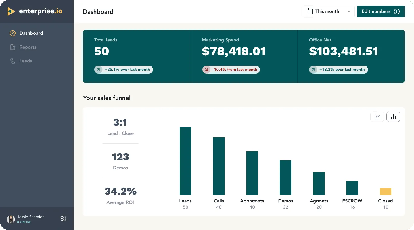
Product home page
This functions as a contextual index of sorts. It’s more about giving an overview as well as serving as a navigation, this is super common in enterprise software. The point of this type of dashboard is to give users context before they navigate somewhere.
Ex. a SaaS application for marketing which shows you main sections like leads and sales with totals and deltas


Ok friends, here’s where we start to both zoom in AND zoom out on the whole experience of a dashboard. The experience of using a dashboard isn’t just looking at some charts, it involves interactions and key moments during your experience that you need to factor into your dashboard design. We’re applying a lens of the moment-to-moment experience within a dashboard experience, so we can appreciate not JUST the graphs and charts, but everything surrounding them.
AKA Getting there. Without getting into the ins and outs of navigation (we’ve written an in-depth article on this topic already for you to peruse). It’s important to appreciate the state of mind and expectations set, prior to the person engaging with your dashboard at all. Don’t forget this part of the journey.
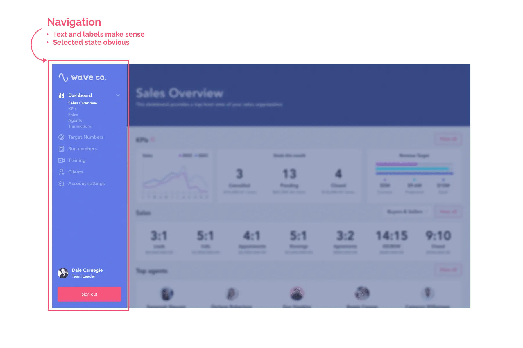
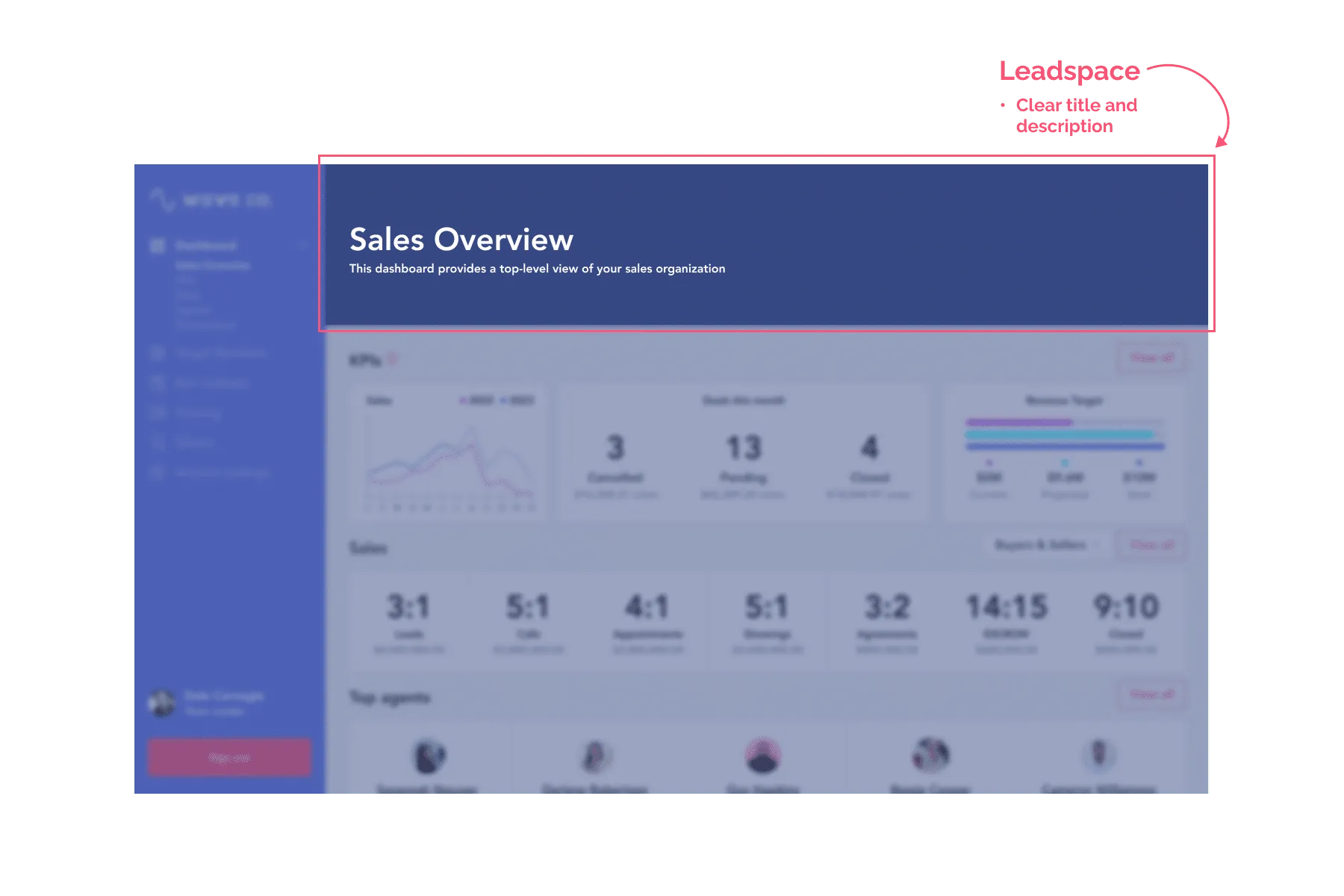
AKA figuring out what you’re looking at. Upon navigating to the page itself. This is the moment where the user viewing this page does the mental lift of figuring out: what the page is for, what it’s showing me, what it’s meant to do, if they can achieve their task or their goal here or not.
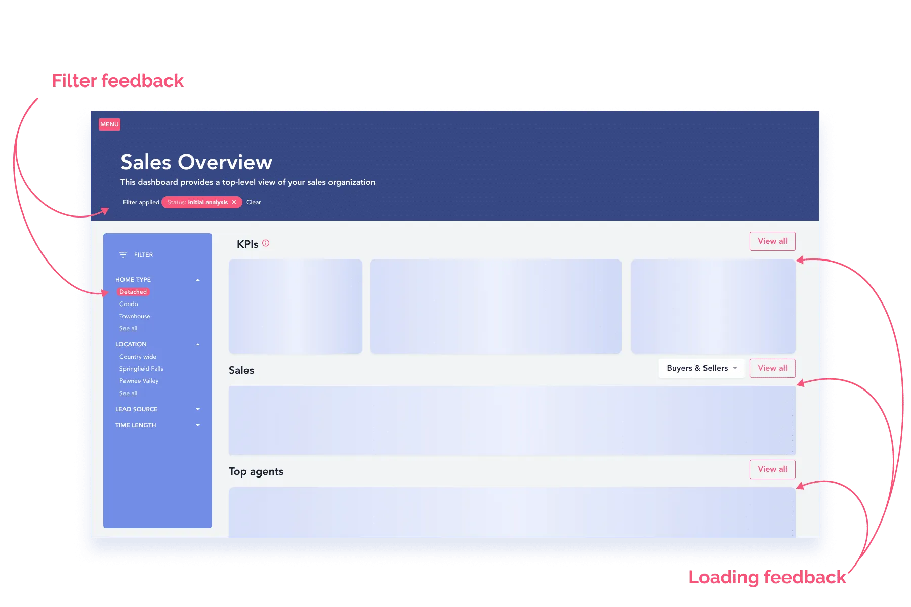
Don’t forget to include any loading feedback and empty states that might apply to the page – this can easily be omitted or forgotten, but missing out on this gives your experience the vibe of a rackety chair as opposed to an ergonomic delight with lumbar support, if you catch our drift.
p.s. Are you seeing just how many considerations you need to consider when making a high-quality interactive experience? Yowza. No wonder you’re tired.🍪🛏️
AKA finding and discovering information. There’s a lot to the filtering of the data itself, which you’ll need to dig into the UX best practices for and really give it some attention.

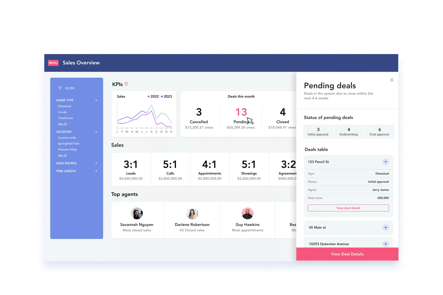
AKA Digging deeper. Drilling further into the information to reveal more detail, reference something or double-check information is an important part of the experience in a dashboard. This is the part where users are free to explore more and discover and really “use” the data. If people want more, that’s usually a good sign.
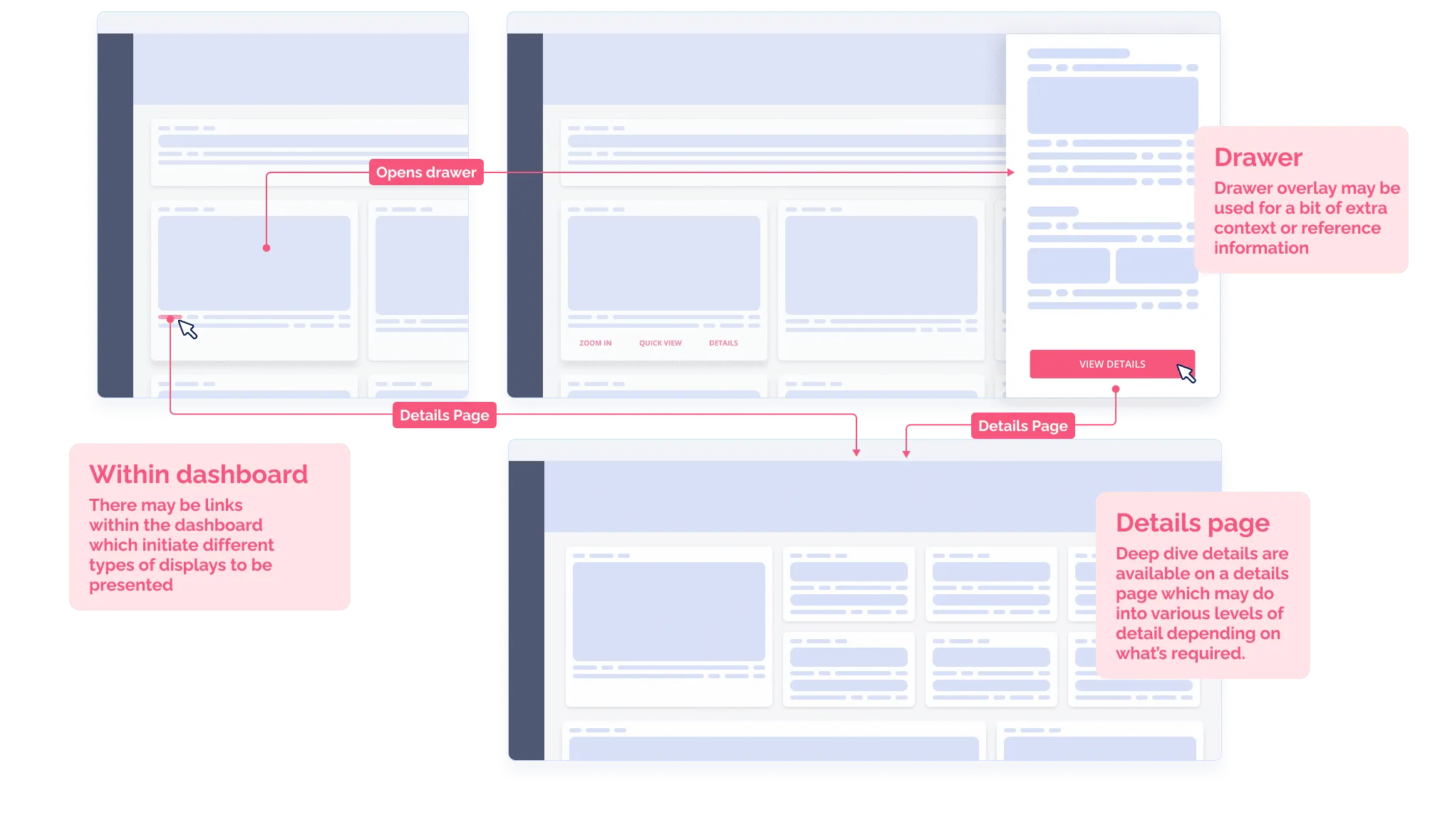
This pattern allows a lot of flexible space to present information without having to exit the context you’re currently in.
This pattern allows you to house a whole bunch of details in an entire view, which in and of itself could have dashboard-like qualities! But let’s not get crazy.

AKA getting tasks done. Dashboards, like the rest of your software, need to get stuff done. As such, you need to account for this in your dashboard experience. For dashboards, they might have simple interactions, like say an “export” button, for others you might be executing something more complex, say like pushing a software update to specific instances or something like that.

Now that we’ve reviewed dashboard experiences in a holistic way, now it’s time to dig in more into the data visualization, layouts, cards and the like. Let’s go!
Now, if you're a small team and data is central to your experience, it may be obvious at a certain point that incorporating data science, user complexity, interaction design, visual design and user testing all by yourself isn't working, or isn't working fast enough. In a word, you're under-resourced, but the stakes are high and getting your dashboard right is of great consequence to your business.
Even some of the best designers and best data scientists in the world have an enormous challenge of making data make sense. On top of that, user expectations for great data experiences are only increasing. Perhaps it's time to consider shying away from the DIY approach to designing dashboards and call in the rare experts that can get it done. Explore our data dashboards UX service and see how we can whip your experience into shape in no time.
Dashboard UX design and UI are very closely related. On such a critical page, you need to optimize content placement for the way your users will scan the page. This key page acts as a homebase with strategic entry points into more granular flows. Users should be able to click a module or chart and enter a dedicated page for that data type.
To optimize that behaviour, consider the typical eye-scanning patterns that are true for web pages. For left-to-right (LTR) language speakers, those would be the F and Z patterns.
The F shape suggests that the eye will naturally get drawn to the top-left corner at first and then scan horizontally, before zig-zagging (that’s the Z) down the page, again starting from left to right for the following sections or rows.

Eye-tracking research shows that users tend to scan webpages in “F” and “Z” shapes
Since the top left area gets more attention, that’s where you want to showcase the most global numbers, or the most relevant data.
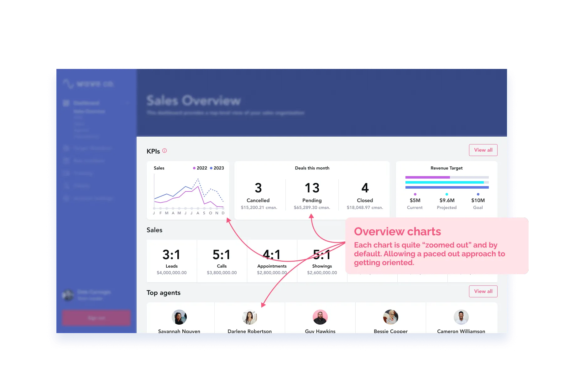
You’ll want to structure your charts and graphs into related sections going top-down. Starting of course with the most important at the top, following with a global overview in the middle, and wrapping up with a more detailed breakdown at the bottom.
Research around the F pattern proves that the further down users get on a page, the less they scan the full width of the row. So again, make sure to stick the important stuff on the left side.
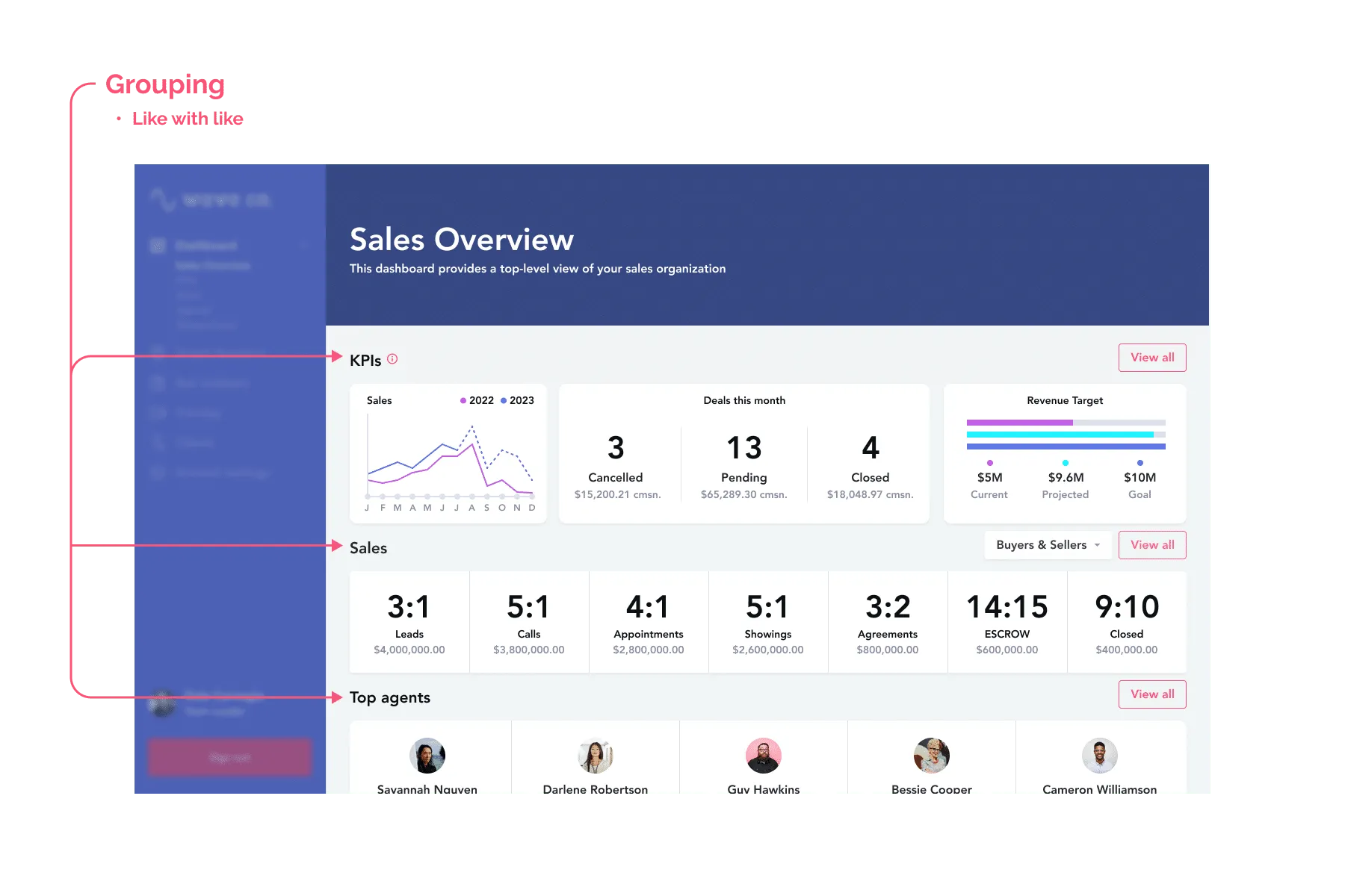
Card layouts are very common for data dashboards and come in many shapes and sizes. A card layout doesn’t mean all your charts are visually enclosed in a distinct “div”. It just means that your charts and graphs are treated the same way, consistently placed along their title, labels, legend and other accessories.

You’ll want to study the best way to layout your graphs inside their cards. Make sure you decide on a solution that can allow for different types of graphs, and that leaves room for recurring elements like key values, date pickers and legends.
Here, consistency is key. You’ll help your users a lot if they can quickly find the title on the top left of each module, or the legend always at the bottom center. That’ll help reduce visual noise when they scan the page.

Now that you’ve nailed down the page structure that works best for your users and your data, let’s zoom in a little and explore ways to elevate the charts and graphs you present in your dashboard.
Think of it this way: how much extra love do your out-of-the-box graphs deserve? Of course a lot of the patterns mentioned below come for free with your typical chart library but do the work of determining which small tweaks need to be brought to elevate your data and better meet the user needs.
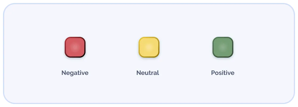
Smart use of colour is a very elegant way to provide additional meaning to the data. How might we go beyond the basic language of red-yellow-green for bad-neutral-good?
Some of your charts might benefit from a secondary palette like different shades of, say, your brand colour to express levels of intensity. Higher values could indicate larger quantities or densities, and lower values smaller ones.

Using variations of the same colour to represent levels of intensity
Other classics if your page is already filled with stoplights are blues to indicate positive values, and oranges for negative trends.
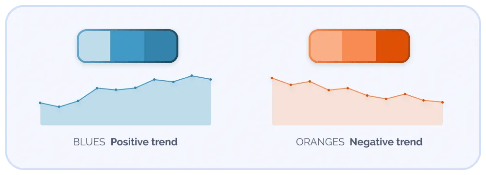
Blues and oranges provide the same levels of vibrancy and contrast as greens and reds, without your UI feeling like a trading terminal
When exploring colours, it’s important to keep accessibility in mind. To ensure good visibility, make sure the colours you choose have high enough contrast against your background colour.
Again with accessibility in mind, it’s considered best practice not to rely on colour alone. Look for ways to add some hashes or texture in your fills and your legends.
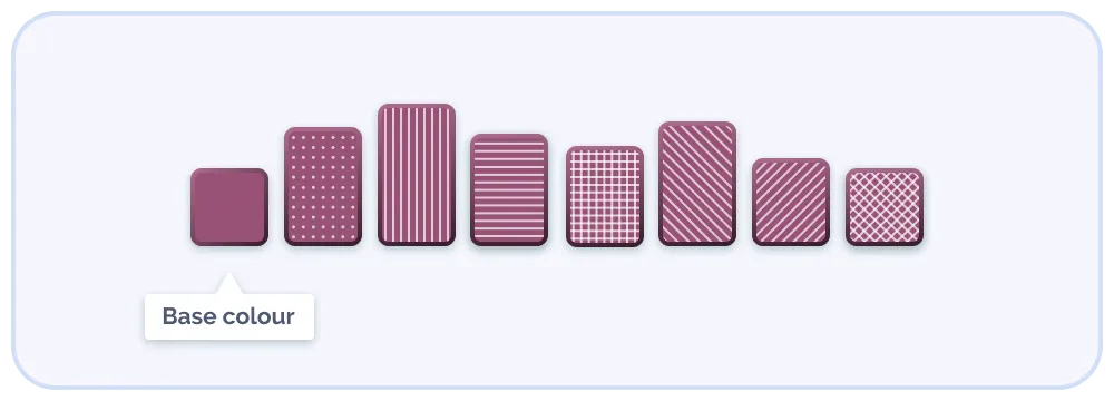
We can build a lot of variety from a single base colour
The same holds true for lines. A line chart with a bunch of solid lines in different colours can quickly become hard to interpret. You can add in a variety of styles of dotted lines.

Increase accessibility with dotted and dashed lines
👋 If this is all A LOT and you've been trying to "just figure it out" with a tiny team, we can help you get a great new version out the door in no time, check out our UX services and dashboard design services for more info.
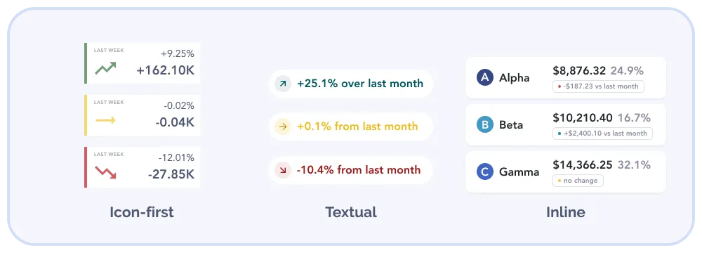
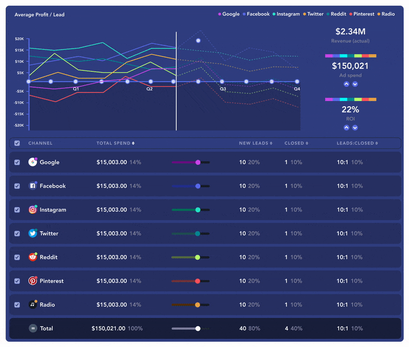
Deltas are used to showcase differences (aka: diffs). When relevant, make sure your charts bring forward consistent deltas to your users. They can be relative (% change since same day last month) or absolute (absolute difference compared to global average). Deltas should catch the eye and be quick and easy to make sense of.
Deltas are either positive, neutral (little to no change), or negative
A typical way to present deltas in the context of graphs is to allow users to select from a few options.

When adapting your dashboard UX design for mobile, the first question to ask is whether all the information is relevant for your users’ “on-the-go” scenarios. Try to understand what they need to see when they’re not sitting at their desk. Chances are they don’t need it all and you’ll save yourself a whole lot of work.
Maybe only display that top section, the most important or global data, and fit it in a vertical layout instead?


There’s also no harm in indicating that this page or a particular chart is better experienced on a larger screen, or to encourage them to flip their mobile in landscape mode.
In general, labels are central to excellent UX design, dashboard design is no exception. When dealing with large timescales or datasets, negotiating space might become a bit tricky. Angled labels typically work well, but there’s always a limit. You should account for those edge cases early and pre-determine the logic to use once the threshold gets surpassed.
There are different ways to navigate label length. Determine in advance how you want long labels to behave. How many characters can you display without it feeling too bloated? How do you want to manage ellipses to best serve your users? For example, deciding to crop the ending versus the middle of a label? “September 19” truncated to 6 characters can become: “Septem…” or “Sept… 19”; which one conveys the most information?
If space really becomes an issue, remember: not everything has to be visible at all times. The visual of the chart itself should communicate the majority of the insight. So don’t hesitate to hide some labels altogether and leverage tooltips in these denser views where more specific labels could appear only on hover.
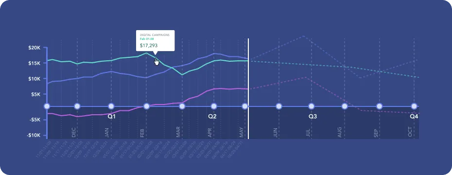
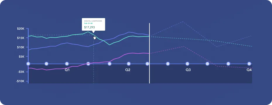
Here we’ve got one endpoint per week, but only display labels for Quarters to provide the high-level trends & projections
You can prevent some of these issues by limiting the length of the selectable filters or date range to ensure users can only select as much as the viewport can offer.
Finally, there’s always the option of coding a horizontal scroll. But for this, watch out for where the scrollbar will appear and account for the room it’ll take up!
When looking at trendy dribbbl-y dashboards, we often see big bold numbers in a stylish display font. When done well, these typographic accents can really help the functionality of your dashboard. They do a great job at catching the eye. If you’ve done your research and identified the right numbers to accentuate this way, it demonstrates confidence and decisiveness.
From the user’s perspective, it means you’ve done your job, you know what your users are looking for and you’ve made sure the system is effectively keeping track of these data points. All-around trust-builder. And karma points.
Okay, now that our charts and graphs are neat and consistent inside their page structure, let’s look at interactions we can offer our users.
To avoid barraging the user with data, you can borrow some of the concepts of progressive disclosure. Offering gentle reveals and visual emphasis upon the user’s request really helps mitigate overwhelm and confusion. Here are a few interactive UX patterns that embrace those principles.
Hover states are the perfect way to hide that secondary layer of detail while avoiding visual noise. Since the goal of the dashboard is to provide an at-a-glance snapshot, the visual of bars or lines should be enough for users to sense the trends. But revealing additional detail upon hover is a great use of progressive disclosure. That way your users can leverage it when needed, and it doesn’t clutter the page by default.

Another interaction that could be relevant for some of your charts is the turning on and off of certain variables. Let’s say the default view of a line chart presents 7 different lines. It might be useful for the user to hide some of those endpoints so they can focus on comparing a smaller selection.
This can be implemented by making your legend items into a checkbox list.
In short, you can offer your users a full-page filter sidebar (or horizontal bar for that matter) but this means the filter selection affects the whole page —i.e. every single chart at once. It’s always useful to have filters always accessible; consider a fixed header for users to easily initiate them as they navigate the page.
Another option is to have smaller filter options inside each module or section. That way, users can be specific in what they want to see. They could filter the top section by location, and then select a specific date range for the middle section.
Now, if you really want to go all out and you know from your users that the dashboard is where they spend most of their time, you might want to build some customization options.
This can take many shapes. You could allow them to move modules around, and reorganize the order of the sections by drag-and-dropping. (Fancy!) You can also let them hide and show some sections.
You might even want to consider integrating a custom “build your own dashboard” flow in the onboarding UX. That way, they get to explicitly pick the endpoints they want to see and they get to make it as minimal or as complex as they wish.

The data eyeball attack🫣 – It’s like a wall of text, but make it data. This is where density of the data makes users run for the hills – there’s a lot, and technically it’s impressive, but the density isn’t appropriate for those outside of the role of “data scientist” or “data analyst”. If there’s some room to integrate a visual break, an extra serving of whitespace or just a little bit less shown by default, why not try it out and see what your crew thinks.📏
🖇️ More on solutions to this in Typography & hierarchy
This happens when the general attitude on the team is this: We have it, so why not show it? This sounds great in theory, but in practice, this shows serious diminishing returns, as more and more charts serve to destabilize users, as they assume if it’s present, then it must be important. The hard work of information architecture is what actually makes a data dashboard experience great, not the fact that there’s a BUNCH of charts. Next time you CAN put another chart in, ask yourself, is this going to be really useful? 🧐..AKA ask yourself, does this spark joy?” 😉
🖇️ More on solutions to this in Toggling variables
Even with well-designed and used dashboards, you can still get the feedback that “this is just a bunch of data”, which is fair enough. Have you ever tried to estimate story points (in an agile team) without a frame reference around your estimate (1,3,5,8 etc). What about when you compare it to a previous story, it becomes much easier. In the data world, our cognitive landmarks (like average or target numbers) can really help us to gauge where we are and what we’re looking at. If you get the feedback “this is a lot of numbers”, apply the lens of comparison and see if that helps.🍏🍊
🖇️ More on approaching solutions to this in Deltas.
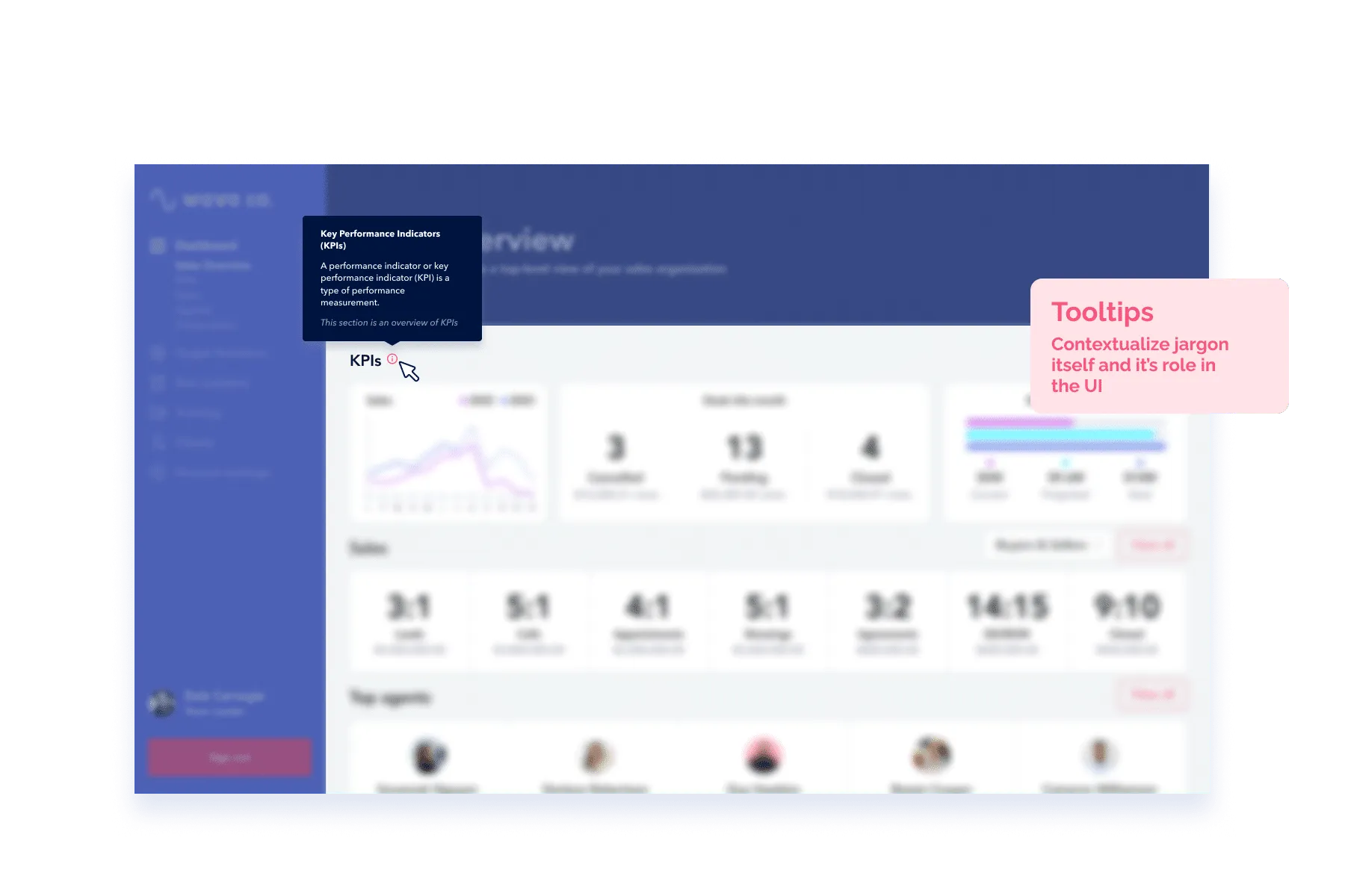
In a feat of irony, one of the most common UX issues is that data is simply shown but not explained in the least. It can be a stretch to even get a title on the page or a graph, let alone a description! On top of that, acronyms are used to shorten things, but explanations in the form of tooltips, legends or other mechanisms are missed. So the user simply sits there, blinking into the abyss. Next time you create a dashboard, apply the lens of someone with zero context, see if you can turn that vacant stare into a nerdy smile.🥴→ 🤓
🖇️ More on approaching solutions to this in Tooltips & hover states
It’s common knowledge that only using colour to indicate the status of something can leave our colour-blind friends in the dark, it’s not considered accessible (especially as the main two colours for good vs bad is red and green *face palm*). Issues around colour coding extend not just around this particular issue, but colour can be overused in data dashboards quite easily without mapping to a particular meaning. When you have various colours within charts themselves, plus status indication, queues for interaction you can get into a situation where you’re suddenly looking at a rainbow salad with nothing sticking out as important. Next time someone says: yeah let’s just make that box purple, implore your team to see reason and try to describe the convention in words first, then see if it still warrants a colour to be involved. 💜
🖇️ More on approaching solutions to this in use of colour.
Whether or not you venture into these more advanced interactions, you always want to give your users some options. If ever the way you designed the dashboard doesn’t meet their needs, you should always allow the data to be exported as raw CSV’s so they can pull it out and manipulate it elsewhere. That’s just some basic data etiquette. Data needs to be free! If you love the data, let it go. 🕊
This article has touched on a lot of dashboard considerations and design moves you can make, but we're only really scratching the surface of the real complexity in designing experiences like this. Data exploration and understanding is an organic and iterative process for a user. Out there, we're catering to data noobs all the day to data scientists and uber data geeks. This is a wide spectrum of understanding and many of our precious users have a really tough time articulating what's going on in their minds when data is right in front of them.
On top of that, most designers aren't comfortable with data and most data people aren't comfortable with design. So the only way to make a super great experience is to collaborate at an elite level.
Another factor that comes into play is AI and how that integrates into all levels of data exploration. We have use cases for people to get a "specific answer" as well as view and understand trends and anomalies, issues and quirks with the data. If you're in the worlds of data in science or engineering, the data viewing experience itself is something to really dive deep on. We only touched on it in this article, but if you want to get inspired, pop over A Compendium of Canonical Charts.
So, you've got a meaty task in front of you, but here's some motivation. The more people understand data, hte more logical and informed their decisions and perspective can be right? Keep going!
Do a mini UX audit on your table views & find your trouble spots with this free guide.

Be the first to know about our upcoming release!


.webp)


.webp)

