
This, my friends, is one of THE most involved and spiciest interaction challenges in the mix. What are we dealing with? Basically every consideration in interaction design happens for a drag and drop interaction. Not only do we have to effectively convey the interaction exists in the first place, the object needs to physically move, the live feedback second to second matters, and there are lots of decisions to make throughout to make it ‘feel’ the right way. Indicating state takes on more nuance than we usually deal with.
Things can get weird and go wrong over different devices, and working out the kinks invariably needs some meaningful collaboration between design and devs.
Any way you slice it 🍕, it’s no joke.
When entering into designing a drag and drop interaction, you and your team have a lot of things to consider.
The number of components or UI pieces involved in a drag and drop interaction is quite simple, the complexity comes in dealing with the states, feedback and logic of your interaction.

This is the thing being dragged, this is usually a list item, a card or another object (for simplicity, we’ll just call them the item or list item for the remainder of this article).
The container that houses the items you’re going to drag.
This may be static (there all the time) or it may be a dynamic thing – the purpose of it is to give you real time feedback on the items being dragged – empty state of sorts, and it deserves some time and attention, especially if there is logic that needs to be expressed within the area.
Drag and drop UI/UX is quite a varied out there in the world and it’s used (for better or worse), in a lot of contexts. They all have slightly different interaction needs and requirements — as such they have a variety of drag and drop UX patterns. This is especially in enterprise software context, where the use cases can get quite involved, so the UX patterns can get more and more complex. Generally speaking, use cases in drag and drop are moving items, reordering a list, resizing containers and power user drag and drop interactions.
This use case is the ‘classic’ drag and drop example, where we assume there’s a static and distinct dropzone – much of this article will reference this classic example as it’s the most complex and involved.
Examples of common drag and drop ‘move’ patterns:

This use case is very common across OS’ and platforms – this is the act of reordering items in a list or card format. Here the drag target is dynamic on the screen and will show the precise position the item will end up in once the drag is released.
Examples of common drag and drop to reorder patterns:

Resizing is when users can drag containers within a screen within a range of space available (usually it’s limited in most SaaS products). There are a couple of unique aspects to this interaction.
Example of resize on drag interaction:

This use case is specific to enterprise products which allow for deeply involved drag and drop interactions, where users can manipulate items in the UI in an almost unlimited way. Take for example, drawing a rectangle in a product like Figma (or any in-depth design product). Users, depending on their ‘level’ of selection into the object can resize it while keeping the same ratio (ex. Hold down shift). They can change the height and width, and even drag an anchor point (double click in a few times) to change the object from a rectangle to any other shape.
This level of manipulation is a whole next level of advanced interaction which we’d love to deep dive on, mostly this article doesn’t touch on this complexity level (but we would love to deep dive into this complexity level, so make a request if you’re dying to dive deep).
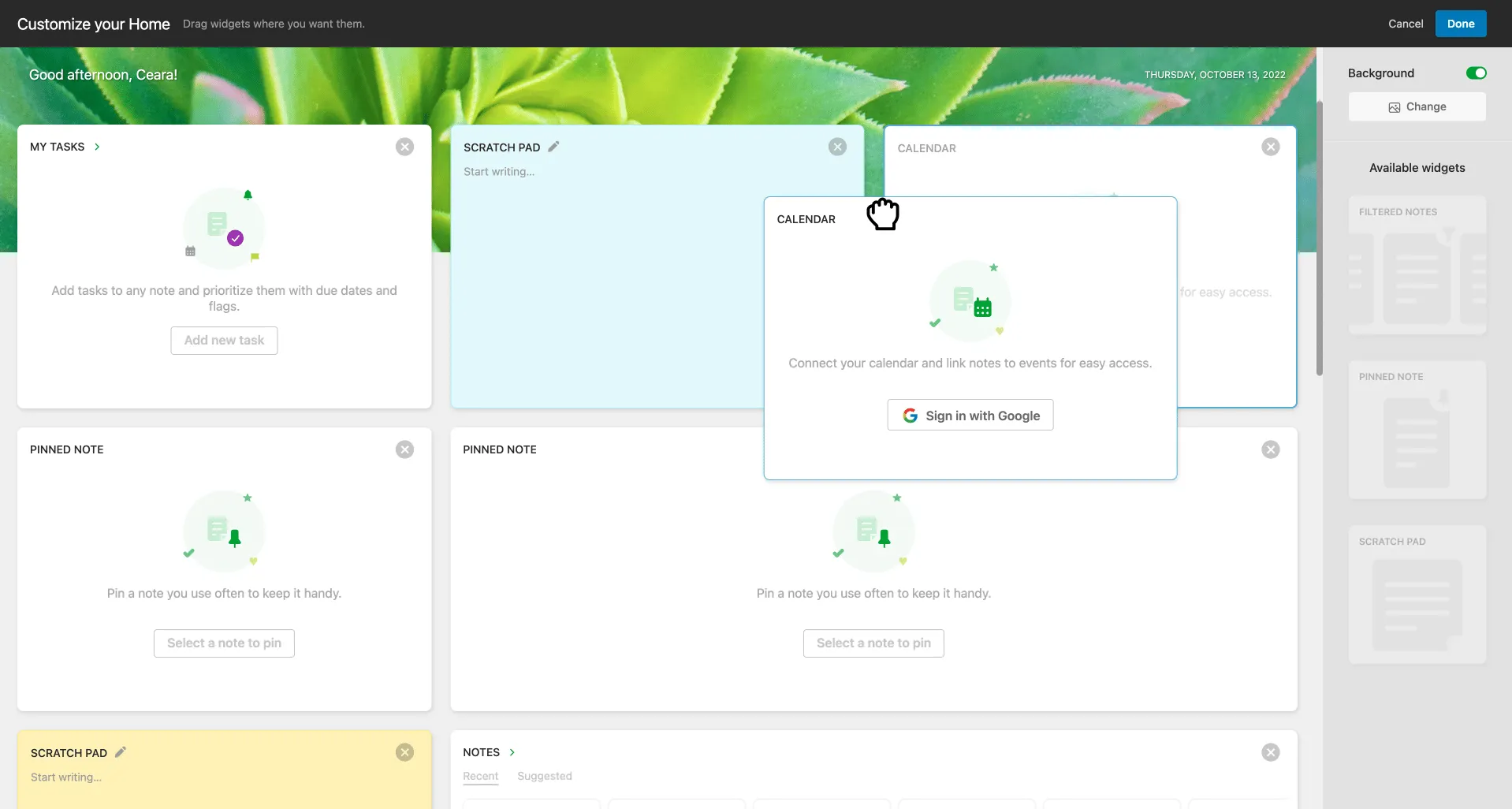
In many a design software, you can create or manipulate an object by dragging. Let's check out these examples of what happens in Figma:


To illustrate each step in the drag and drop interaction, we’re going to use the example of a screen of an app that allows items in a list (either single or multi-select) to be dragged into a specific drop-zone target on the screen itself. This example lets us show each moment in drag and drop as distinct.
In the default state, the list items (and their container) are static and the drop target is visible.

UX microcopy is extremely important for drag targets, so make sure you put in effort here. There are two main opportunities for microcopy, the main text and the supplementary text. The main text tells you the most important information: what to do. In many enterprise or SaaS use cases, there is additional logic that can be explained upfront in the supplementary text.
Whenever possible, we urge people to communicate things upfront rather than throw an error after the fact, this is kind of a big deal heuristic for usability (error prevention and communicating system status are explained in our UX Heuristics article if you’re curious).

The hover state communicates that an element can be interacted with.—The mouse indicator as well as the element design can change.

In this state, the drag area is ‘grabbed’ or gripped. Now it's time to start moving it! Let’s go!🏃🏻♀️
The act of ‘grabbing’ is successful, now the item(s) are moving in space alongside the cursor – this is the step before the drag target starts to activate.

If multiple items are selected: there is another transition possible which confirms to users that the initiation of the drag was successful WITH the amount of desired items (totals) shown.
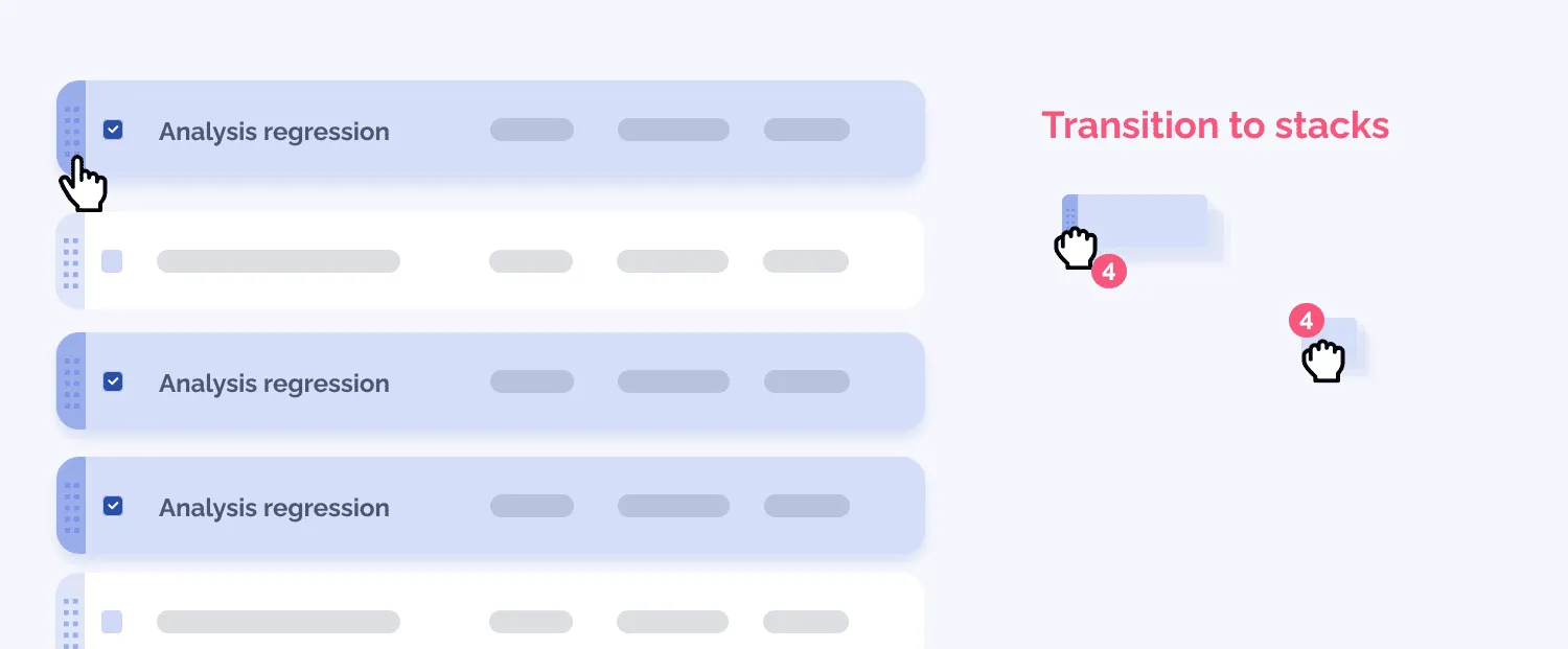
The drop-zone indicates that the items are within range – the visual feedback might intensify as the items get closer and closer to the core of the drop-zone.

This is a good opportunity to give both visual feedback AND use UX microcopy to ensure that the details of the operation to be completed is ‘foreshadowed’.

More nuanced visual feedback may be necessary when say, there are multiple drop zones so people are differentiating between them, so movement will be more precise. There may be staged feedback within the outer edges of the dropzone – initial feedback to assure users that they are on the right track.
Drop zones might be dynamic and based on their x and y coordinates: take this example of a table hierarchy UI where you’re building parent-child relationships.
Warnings may also be triggered as the object enters the range of the drop-zone. We always suggest that you warn people rather than throw errors after the fact whenever possible (see our errors article for more info here!)

🎤 Great success! Or, maybe not. The ‘dropped’ state isn’t necessarily as simple as you might think. In fact, there can be a variety of results, ex: loading states, requiring the user to make another decision, success, or even failure.
Let’s build up our understanding with these other states and top it off with success.
For use cases where files are uploaded for example, you may opt for a very literal UI response, where files are shown going ‘into’ the target. In cases where this drop event has more to it, make sure each item is described properly.

There are lots of cases in enterprise where dragging and dropping actually requires another decision to be made in order to complete the operation. Using the drop target can be a nice place to locate a simple dialog because you know the user is looking there in that precise moment 👀.

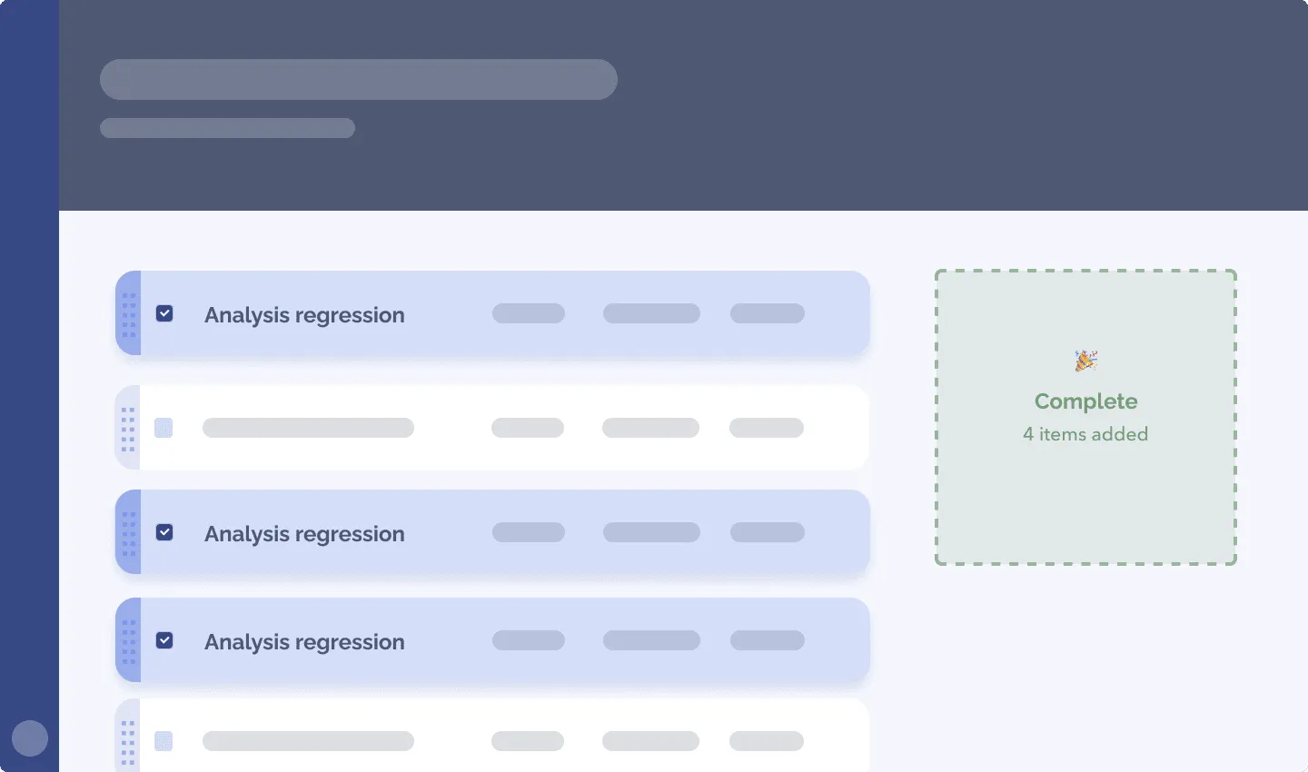
This is an opportunity to show people the operation worked and confirm exactly *what* happened. In this example, success feedback is supported with the statement that 4 items were added. Then users know that everything they just tried to do worked for sure. (Success feedback is often forgotten and deserves its moment, we did a pattern article on success feedback to help).

And finally, the error state – this may happen for many reasons, such as:

Drag and drop is definitely a culprit for ‘passive aggressive’ errors, that is: subtle/non-existent) or even misleading behaviour in the UI when an error happens. Check out our error pattern article if you want to explore more.
This wraps up the phases of your drag and drop operation. Now let’s explore more nuances of drag and drop to become total professionals on the topic.🤜💥🤛
Reordering is special and the perfect place to address a couple of the UX patterns and logic you might want to apply to your drag and drop situation. Let’s take a moment to zoom in on it, so that we can discuss both the drop indicator and the behaviour of the container of the list items.
You know what’s hard? Showing on a flat screen that you can ‘physically’ pick something up (you can’t actually because it’s 0’s and 1’s) and ‘move’ it (you’re actually changing values of 0’s and 1’s in the database that surrounds the product). Showing that drag and drop is available is a difficult challenge for designers. We’ve got issues people.
If the interaction was physical, you could easily create a handle which is obviously designed for a hand to fit around it. That handle would be there, out in the open. Our challenge with drag and drop is that the ‘hand’ is either our pointer/cursor on desktop and a finger on mobile (where you can’t detect if it’s close by to the item at all because people don’t ‘look’ around on their mobile screen using their finger). On top of that, drag and drop may be a very occasional action people do, screen real estate and attention is limited, and screens get cluttered very quickly. Always showing the ability to drag and drop makes it more discoverable, but does it pull focus and make other things less discoverable? It’s a balance we’re always trying to come to when we create UIs.
So how do we make things look like you can pick them up and drag? One technique (the most common one) is the use of icons. Iconography, as we know from many other moments (like in navigation, or buttons for example), can be very tricky to get right.
Once upon a time we tested some drag and drop affordances, and let’s just say, it was confusing 🫠 (this was quite a few years ago), but we wanted to provide a specific affordance that told users precisely what they could do. This is a summary of how it went:

Another visual indicator that a drag is possible happens with the cursor on desktop, specifically upon hovering over a draggable item. We typically see a pointer appear initially, then a grabbing hand once the mouse is being pressed. For move and the re-size cursors, they typically stay the same on hover and while they are active.

Affordances of drag and drop aren’t only localized to the list item itself. The drop target (AKA drop-zone) is also used to communicate the possibilities – that plus the fact that the technique is used across so many platforms can help people put the pieces together. 🤞
Discoverability will be likely to continue to be a challenge in the UX design world for a while. With enterprise products, we have the context of users being trained and perhaps more motivated to discover things that might make their workflow easier than consumer products. But, as we always say, test early and test often. Also utilize your usage analytics when you can to understand more about user behaviour in reality.
Dark mode to UI is what drag and drop is to interaction. It really does illicit strong reactions, either FOR and AGAINST it. For us, we feel that your design rationale and logic is key to justifying your efforts in creating new interactions and functionality overall. There are lots of good reasons and rationale to create a drag and drop interaction.
In cases where the specific view is highly visual, allowing users to directly manipulate the object they are working with is a strong approach to building interactions that are intuitive. Some enterprise examples include a data model visualization, a drawing application, or an org chart visualization tool
Reordering lists using the non drag and drop patterns out there, can be quite onerous and difficult to QA (ex. Adding numeric fields to order them or using a container system with an ‘input’ on the left and ‘output’ on the right) – our crew isn’t convinced these approaches are easier to develop nor are they less confusing than drag and drop.
Enterprise software shoutout here. We actually do a good chunk of UIs which display complex logic in a visual way. There are a ton of use cases around boolean logic (and other logic) out there. To understand them, visualizations are the most efficient way to understand at a glance, the way these systems work. By extension, direct manipulation of the object through drag and drop can be the most intuitive.
Drag and drop is a very ‘demo-able’ feature, it certainly brings the razzle dazzle and presents as very easy in that kind of context. When thinking about solving a problem with drag and drop, consider some of the possible disadvantages of using this interaction mechanism.
If there is priority for these interactions to be created/improved, the non-drag and drop version is key to have as well. Accessibility is a big murky question here that could be an issue throughout discovery all the way to execution. When we’re working on enterprise products, we typically start by building the alternative, then build drag and drop as a supporting interaction or ‘power user’ version of the feature.
As mentioned when we started this article, drag and drop can be pretty complicated in terms of the interaction design, there are lots of cases and considerations to make. If implementing drag and drop as a solution, it needs to be tested across platforms and devices rigorously. If you don’t have the bandwidth to do this, you risk blockers in your software. Drag and drop really needs to be implemented well to work well.
If you are required to scroll and drag at the same time, this may be way too onerous and frustrating for your users. This long distance scrolling might pop up when you have screens which may be very long (and this isn’t predictable because it’s user generated data) like screens with infinite scroll.
Drag and drop is slick and cool, but sometimes there isn’t a good enough justification to build with drag and drop, or perhaps the action is quite high stakes, so lowering the barrier of entry and making it super efficient isn’t ideal.
In enterprise, we typically always design alternatives to drag and drop, even when the drag and drop interaction is definitely making it to production. Having only drag and drop in place to achieve a goal is fragile, because if it isn’t usable by someone, that’s a blocker. (Other than accessibility, there are other ways drag and drop can fail, including latency of the system (ex. secure systems you have to use a virtual machine or VPN to access, browser updates causing bugs, outdated front end frameworks, even just someone having a wonky mouse — you need contingency.)
For moving things, it’s possible that some of the most basic UI mechanisms can do the job for you, perhaps in a more expedient way.

The example above shows two methods, the action bar (this can be contextual or persistent), it offers a way to apply not JUST a move action, but could house a myriad of batch actions at the same time. The menu dropdown is another method you can use, where you can manipulate the item directly, without moving things visually.

Steps of this mobile drag and drop alternative flow are quite simple. This is something worth considering for reordering on mobile.
Steps of this interaction:
Want more alternatives to drag and drop? Shoot us a request on Twitter, we’re full of ideas!
There’s probably a few articles to write on this topic, as a thorough usability test of drag and drop should ideally involve a mix of user profiles, system states and devices/hardware.
On the practical front, user testing drag and drop is quite difficult on a high fidelity design software, especially if you’ve got some complexity in your drag targets or there are multiple states and scenarios you’d like to test.
Here’s where the design and dev crew can shine together as a team. Since so many frameworks are typically used with drag and drop, we suggest that you create a live code prototype that’s realistic enough to give you some nice usability insights. If you’re able to use something that’s relatively fast to build, you’ll be able to nuance and iterate on the behaviour together in a super productive way.
If you want to dig into more topics on collaboration, check out some of our stuff on team collaboration.
Well, we hope your 🧠 is activated by all these drag and drop best practices and UX patterns…and downright nerdy energy we’re servin’ up. Drag and drop is a very rich and interesting interaction pattern that can extend your functionality and give amazing power to your SaaS or enterprise software application. When this functionality is combined with complex operations, workflows and use cases, this can be an excellent tool to give to your power users. Proceed with intention, user data and creativity! 🪐
Do a mini UX audit on your table views & find your trouble spots with this free guide.

Be the first to know about our upcoming release!


