Success Message UX Examples & Best Practices
June 12, 2024

Fanny Vassilatos

Ceara Crawshaw


In the absence of positive success feedback people are at risk to assume the worst (a classic human move). Success, high fives, and affirmations are the reassuring part of life that are not to be forgotten and disregarded.
Often error states are treated as more important than success states, however, all of these patterns need to work together to communicate properly with users. Success message patterns are the other, more positive side of the ‘error’ coin and help you form a solid foundation of any SAAS product’s UX. Success UX feedback patterns happen over all sorts of components (inc. fields, toasts, banners, notifications) and roll up into an overall success message UI pattern of letting people know what they did worked.
☝️👵🏻 These powerful patterns aren’t simply nice to have embellishments employed for ‘touchy feely’ purposes, they serve to reassure your users, build trust with them and set the tone for your product’s experience.
Creating the UX for successful interactions in your system is involved and needs to be carefully considered between design, development and product so make sure your patterns are reusable, consistent and follow your design principles. Start (or continue) the process guided by these prompts to spark your 🧠.
Where are the parts of the experience where success should be indicated?
Check your forms (and form field inputs), lists, workflows (and wizards) to get an idea of where the trouble spots are.
How ‘big of a deal’ is the interaction and how often does it happen?
Gauge the UI ‘response’ in terms of how often it happens, things that are routine and occur over and over shouldn’t get a huge party every time, this can become a hindrance to progress and efficiency.
Are there high stakes interactions where a process or operation completing successfully isn’t acknowledged?
Prioritize these places first, as their absence has a higher impact. High stakes refers to the relative importance of the action, whether it has a large impact on the person’s workflow, costs time, or requires a lot of upfront work to initiate. For example, if someone is about to hit ‘run’ on something they took 2 days to setup, this would be a high stakes interaction.
Here’s our chance to bring wins to the surface. In this section we’ll look at ways to communicate success from examples out there in the world.
A nuance to the ‘success’ experience is to match the scale of the action, to reflect the importance of that action being completed.

You might use a full page confirmation message, maybe with a joyful illustration, if it was a critical action for which such a break in the user flow is appropriate.

For smaller scale task completions, you might prefer opting for a more subtle successUI like a banner or toast.

This Gmail example does double duty, it indicates success and has an ‘undo’ functionality.
The least disruptive way to communicate a successful machine task is with a subtle inline success UI indicator.

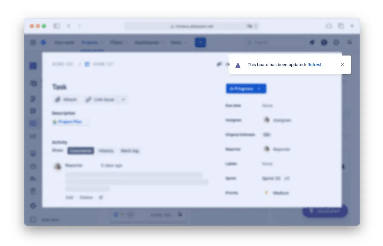
Your confirmation message can even happen inline directly where the user performed the action. This example shows a combination of loading and success UX in a table.
.svg)
.svg)
.png)
A good example of this is the “Saving” and “Saved to Drive” indicator while working on Google Suite documents. It’s great to constantly show the user what’s up without taking too much of their attention. It’s a small reference point users become used to seeing there if they need it.

In both success state cases, you want to guide users towards their next goal so they don’t hang out in front of a big green checkmark forever. What can they do now? Has this unlocked some other action for them? Can you guide them towards another object that needs the same task done to it? Is their next step to communicate this change to another user? Bring these suggestions right there, front and center, in the success state.
Use Case: the computer successfully performed a task – A system-side success state is the same but for a task completed by the machine. These tend to be more “in the background” actions such as exporting a dataset, running a machine learning flow or converting a selection of files.
The concept of success feedback for things that the system has performed ties closely with the UX heuristic of ‘system status’ which specifies the importance of communicating with users where the system is ‘at’ and what it’s doing next.
System success moments may be timed a little differently, especially when say a process was running for a long time and is finally completed. Maybe the interaction you design, if more of an email notification type of flow.
Imagine for a second that a UI is a conversation. If you’re telling a story to someone, they’re looking another direction and not responding to you (even though they LOVE what you just said), that would be quite weird and eerie.
Compare that to a conversation participant who’s nodding their head acknowledging that they are listening and actively responding to what you’re saying. Now that’s a real conversation. UIs and interactions in those UIs is how we develop and nurture the human<>computer relationship here people, let’s make it a nice one.
Do a mini UX audit on your table views & find your trouble spots with this free guide.

Be the first to know about our upcoming release!


.webp)
.webp)


.webp)

