Interaction Patterns UX Design Guide
March 24, 2024

Fanny Vassilatos

Ceara Crawshaw
.webp)

Our job as designers, developers, QAs and product people is to make sure that the experiences we build are communicative with users. We need to build things that make users feel that they are meaningfully interacting with a system, and that they can trust that system to guide them through the complex tasks they are performing.
We often set out to design interactions, taking an idealistic mindset — where we imagine users passing through our interface as we wish they would. We focus on the ‘happy path’ and underplay the likelihood that users will venture out on their own, ignoring the careful flow we’ve mapped for them. They’ll skip our beautiful onboarding wizard, do things in the order they want and discover the interface as they see fit.
The combination of unpredictable user behaviour and the system’s data itself will inevitably create a wide variety of states that need to be represented in your system — whether that’s on an individual component level, a page level or a system level.
When you’re auditing a flow, feature or entire product experience, it’s important to get into the details of the interactions. UX interactions are a big part of how users are treated, taken care of and communicated with in any SAAS product and as such, the details matter.
On top of the importance of looking in depth at interactions, is the surrounding context, which for complex SAAS or web apps is that things often get built very quickly and core measures of ‘interaction quality’ are missed.
Quality in interactions is a nuanced concept, because of the breadth of what we’re talking about. Let’s start with a shared sense of what UI interactions actually are.
Interactions include the visual representations which capture and communicate the situation happening ‘in the computer’ to the user. The designers’ job is exposing the logic of what is happening within the computer and the data while creating opportunities to guide the user forward in their tasks. Interaction at its core, is a conversation between humans and computers.
Interactions in products include several perspectives of ‘zoom’:
Quality in user interactions should be defined per situation, but we can definitively say, that a good interaction means that the situation is explained clearly, the user maintains a sense of control and every action has a ‘reaction’.
Many interfaces out there aren’t actually full of ‘bad’ interactions, rather the interactions aren’t even there.. Missing interactions are much more common than misleading interactions. However, in the case of interaction, if a ‘reaction’ in the UI doesn’t happen, users assume the system is broken, or worse that they are ‘bad’ at using it. It’s the computer equivalent of ghosting 👻. Not cool. Double not cool if the interaction is high stakes or scary for people.
At the core of communicating what’s happening ‘in the computer’ is actually knowing what things typically happen in the computer in the first place. So let’s take a moment to consider CRUD.
Computer science has an acronym for managing data called CRUD — that is; create read, update and delete. Within interfaces (all of which are built from data), users are essentially doing one (or a variant) of the four following actions: creating, reading, updating and deleting.
Examples of each component of CRUD:
Edge case time. Once those basics are covered, this is when edge cases in the data (and interface come in). Sometimes instances of your product have super wildly different data structures and situations, but there are typically some very keen Quality Assurance (QA) people who would love to dive into possible edge cases with you.. Excellent QA people are a secret weapon in assuring interaction quality (not just because they can creatively break ANY live software, but also because you can collaborate with them to draw out key edge case situations to protect against).
Remember that digital products are complicated, and truly taking care of users means that you care enough about the details to consider how users would feel if given an ‘inscrutable error message’ for example. Please resist the urge to ignore or disregard edge cases, just because they aren’t everyday occurrences, that doesn’t mean they can’t instantly wreck your ‘reputation’ with that person.
Microinteractions are the foundational part of your overall interaction design model. These are key for forms and any data input UX interactions you have in your product.
To prime us for thinking about more ‘zoomed out’ interaction patterns where users are editing or creating things in your system, let’s consider the microinteractions that apply to buttons, input fields (text, numeric, multi-line), form fields, cells of a table, card elements, filter dropdowns, etc. all of these things require representing state in various ways. Check out these microinteraction examples:


.png)
We’ve aggregated some key UX interaction patterns that work for many-a-SAAS product. Use these to guide you as you inventory and access the various interactions across your product.
Many interactions patterns can often get forgotten and will adversely impact the overall interaction quality you see across your product. The following are key interactions you need to consider, remember and pay attention to the details.
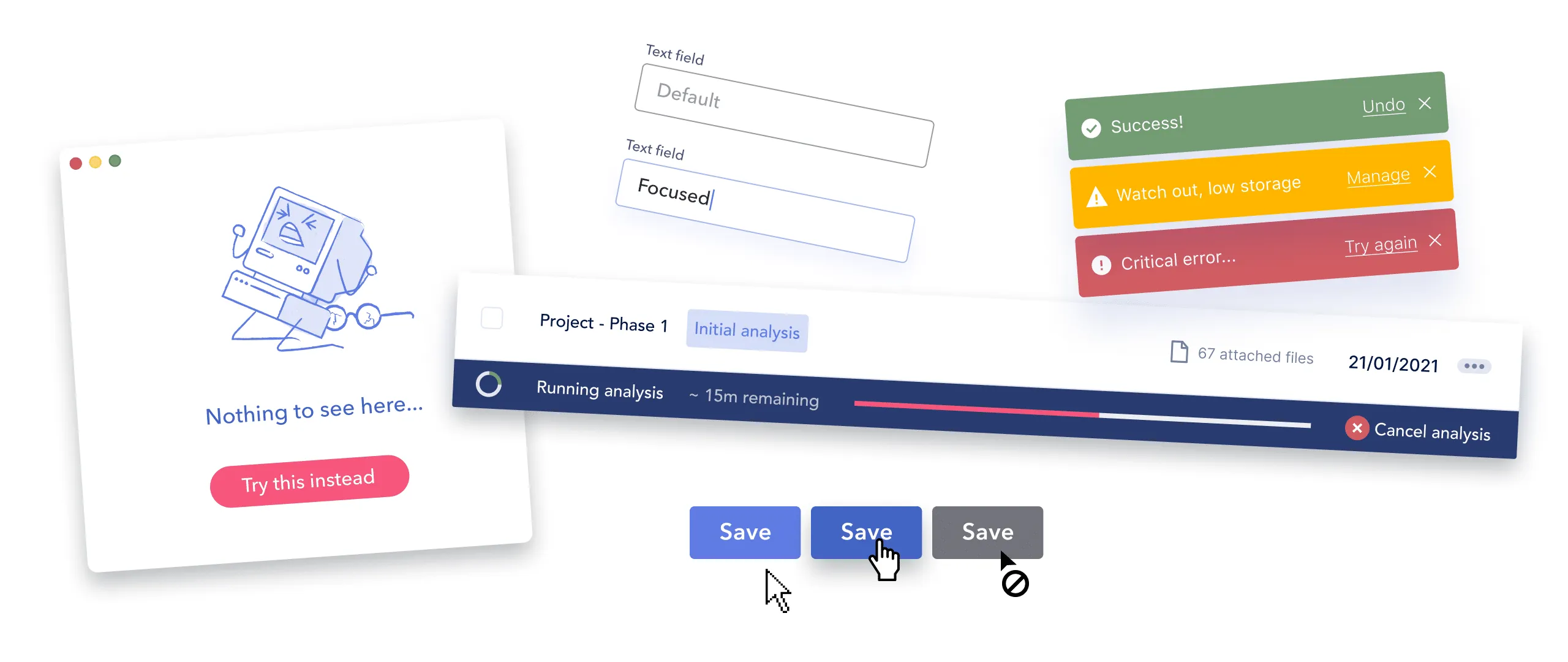
Empty states can apply to entire screens, sections and components and are simply, the situation where there’s no data to fill up that section. They are also called ‘Blank state’, ‘Nothing state’ or ‘Zero State’ UX interactions. We published a deep dive on empty state patterns here.
Example ‘empty state’ scenarios
In the context of web apps, users will either create new stuff in an empty place, fill up existing fields like in a form or table, or bring data over from somewhere else.


High quality empty state UX: An empty state that’s done really well is informative and actionable (or encouraging).
Low quality empty state UX: Is missing or makes the context it’s in more confusing or disorienting.
This is what happens when your software is first loading a page for the user to consult. Depending on the structure of your page, there are many loading UX patterns, spinners and behaviors that you can use. Loading is key to communicating the visibility of system status and an essential UX interaction pattern for any software.
In general the loading pattern and UX interaction you leverage should be built to purpose and consider the time periods that are appropriate for the situation. For example, a spinner isn’t sufficient over a set time.

High quality loading UX
Low quality loading UX
Defaults are a big of an ‘unsung hero’ of user experience, because they can give users a leg up in making all sorts of decisions. If you think about the default state of way, a dashboard screen, the choices made for that screen would save someone from selecting 12 things before seeing anything at all.
When you apply the default concept to components, this helps people to avoid making unnecessary choices which don’t add value.
Places you can add defaults and templates:
Making defaults decisions well takes good knowledge and understanding of your users, make sure to put in careful consideration here, talk to people, see their instance of your SAAS product, do the necessary to make sure you aren’t totally out to lunch. Also, don’t make assumptions or shortcuts that users will find offensive or off putting.
For example, if the onboarding form asks you about trouble with the law 🕵️♀️, don’t assume someone has anything to add under ‘convicted of crime’ and make sure you don’t have a value filled in the field by default. #ithappened
Now for users logging back in to their usual workspace, they expect to be familiar with the setup and be able to get to work quickly. For software where the UI is customizable (think reordering table columns, filtering the data shown on charts, etc), you need to assume the users have taken advantage of those features and might have gone to great lengths to create a screen that works for them.
Here you want to make sure you preserve that state for them across browser sessions to honor the steps they’ve taken to get context.
The same applies for the default columns shown and the sort order of a table. To increase discoverability, make sure the most content is shown, and that it’s displayed in an expected way (Sorting by most recent on top is typical).
This part of the interaction world is huge. Normally we think of errors as either error messages themselves or just the red outline on your text input, but they are so much more. . We’ve got two main types of error messages, ones caused by a system error or user caused error cases. We wrote a full on error prevention and feedback article here.


High quality error messages
For error UX feedback, defining quality on these interactions is an interesting question. In general the anatomy of a good error message follows some rules:
Low quality error messages
Error messages that are done badly, typically follow a pattern, where you’ve got a lot of factors working against users:
Keep in mind with error messages that you have varying degrees of control, but you can control some of the aspects of the UI used and the language used around the error. This is where you can shine, even if there are some tough technical constraints surrounding the experience.
Speaking of communicating things to people so that they actually know the system is still working: enter confirmation patterns. These patterns happen over all sorts of components and roll up into an overall UX feedback pattern of letting people know what they did worked.
Success checkmarks, toasts, banners and all sorts of UI can be leveraged and combined to create solid confirmation feedback UX. (The amount of glee we’ve seen when introducing ‘check marks’ and other confirmation feedback can’t be overstated). We suspect people have such a positive affinity to this part of the UX world, because they rarely receive positivity in a UI, and more often face frustration or a total lack of feedback altogether. Introducing positive indicators of success is often seen as ‘secondary’ to error feedback but it’s not fair!

High quality success indicators:
Low quality success UX indicators

Ok, now you know a chunk more of the interactions you’re going to need to consider for your auditing your UX interactions across your product. Hopefully this gives you a sense of what’s required at the level of in-depth or advanced interaction patterns across your system.
Imagine a world where we talk UX patterns, theory, UX standards and also get to solve in-depth design problems served up fresh every week? Think of the ultimate theoretical and applied combination, where we learn our patterns, then apply them, work out the logic, details within specific constraints, all of this performed from real world anonymized scenarios. Sound like a dream? Yeah it does to our nerdy crew as well.
Do a mini UX audit on your table views & find your trouble spots with this free guide.

Be the first to know about our upcoming release!


.webp)


.webp)

