Data Table Design UX Patterns
February 23, 2026

Fanny Vassilatos

Ceara Crawshaw
.webp)

Tables tend to have a somewhat (undeserved) bad reputation in the world of digital interfaces. They are often perceived as cold and overwhelming. Yet in so many cases they are the most efficient way to organize complex information in a digestible manner (which of course is central to data dashboard experiences as well as they are often paired together). A well-thought-out table interaction experience in enterprise software design can enhance clarity, ease users’ lives and maximize the data’s potential.
Enterprise software companies regularly serve up large quantities of data to their users, making well designed table experiences are a priority.
Before embarking on your data table design, there are a couple key factors to consider. Here are some prompts to get started:
What type of data will be contained in the cells?
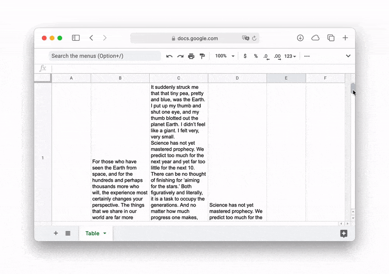
You need to know beforehand if your data is mainly composed of short numerical strings like dates and amounts, or if it might contain more complex data like paragraphs of text, links and files.
What is the user’s intended use for this table?
Table UX can vary greatly depending on if users are expecting to manipulate the data to scan and compare information in order to derive insights or if it’s more action-driven like editing values, updating statuses and assigning people.
Which types of devices will the table be viewed on?
The interaction experience can vary greatly between a mobile device and a large desktop monitor.
Does the table need to be actionable by the user?
The user might need to modify values and delete entries as opposed to simply consulting a read-only table.
Should the table offer customizable viewing options?
This is about how much help you want to provide the users in getting to what they want to see. This can take many shapes; searching, filtering, sorting, adjusting the display density, etc.
Where is the current experience falling short (or shine 🌞)?
If you’re working with an existing table experience and struggling through assessing the UX of the existing thing, we have a UX checklist you can use to put on your reflection glasses, and have a long hard look at your experience 👓. This will give you an idea of where you currently stand.
Now that you have a clearer idea of what the end experience should feel like, we’re ready to jump into some of the best practices to employ for enterprise table UI design. Be prepared, we’re about to get all up in the tiny details that allow this all to come together into a delightful experience.
The mechanics of the table itself are tough to get right, there are a lot of choices you have at your disposal, which this article outlines in detail. However, it’s also quite important to think about the data table you’re solving problems for, in the context of the ‘table view’ it belongs to, this informs at a deep level your design rationale. A table view is just the screen a table is part of. We broke it down, based on our enterprise experience with tables:
If we break it down to its core, a table is essentially made up of three things. Data, columns and rows. The goal is to achieve peak table interaction by juggling all that can be done with those elements and finding the perfect balance for your specific enterprise software needs.
A core part of a table is the data that it is meant to show. Whether that data is textual (strings, links, paragraphs) or numerical (amounts, dates, percentages), it deserves specific considerations to allow for an optimal experience. Here, we’ve wrapped up some of the best practices.
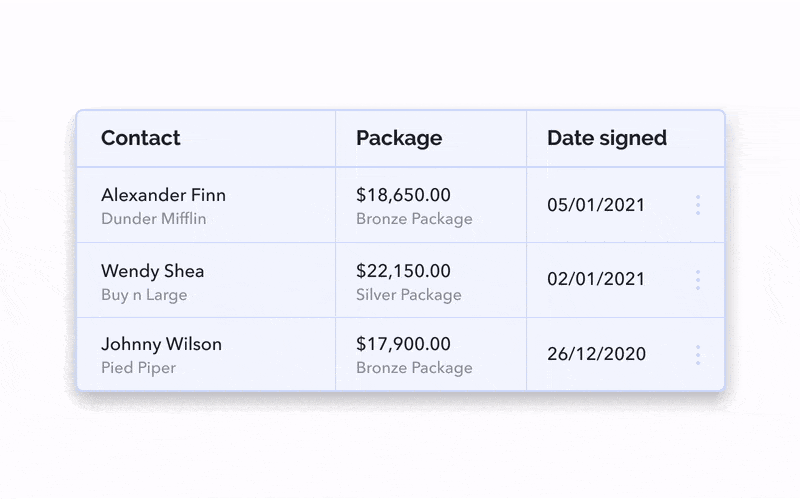
Everything that’s made up of letters should be left-aligned. This is what Western brains are used to. We’ve been reading words from left to right since childhood so, let’s not reinvent the wheel here.


.png)
Column names (a.k.a headers, heads, titles) should always align according to their column content. Not following this rule creates off putting whitespaces and brings in unnecessary visual noise


Using the right alignment for the right type of content is key for enhancing the user’s readability, mental calculations and comparisons between rows. Center alignment prevents quick scanning and noticing irregularities and ultimately makes the eye jump around unnecessarily.
When possible, avoid repeating the title in every cell of a given column. For example, you can omit repeating the word “lead” in every cell like “Qualified Lead” or “Nurturing Lead”. Placing the word “Lead” in the heading and just using qualifiers in the rows will help reduce visual noise.
Especially in the case that you have a fixed header for this table. The user will still be able to quickly refer back to the column head if ever they forgot its context.


Unlike text, numerical values are much easier to compare and contrast when they’re right-aligned. The goal here is to align numbers according to the position of the decimal. If you’ve properly formatted your data so that numbers all show the same amount of decimal digits, aligning them to the right of the cell is the most logical way to display them.
It is highly recommended to use a monospace font for numerical values. This type of typography is much easier to scan and compare because instead of having proportional spacing (where “W” is wider than “I”, or “9” wider than “1”), all characters are the same size. This avoids such problems as $1,111.11 looking visually smaller than $999.99.


If the first column is a date written in numbers, it is recommended to use left-align. Yes, dates are technically numbers, but they’re not exactly a numerical value and it just seems odd that the first column should be right-aligned. In fact, all qualitative numbers can be flexible to accommodate such a situation. Here are some examples:
Otherwise, all numbers should always be right-aligned.
There are a lot of enhancements you can make to how your data in the table is displayed by combining related data, grouping rows by type, adding visual cues including images, icons, colour-coding, progress bars, font weights and sizes and adjusting your units. The UI of table design and the UX of table design work together to enhance viewing your table and applying table actions.
The columns of a table house the distinctive types of information relating to the row/record. Information across columns generally tends to be about the same thing, so vertical separators are optional.
Vertical separators can make the table become visually busy. They are not always necessary. Make sure you stick to a very thin border of 1px max and a light grey colour.


The rows of a table are the distinct records, the core entities of data being displayed. They deserve more visual distinction, so let’s look at some row styles you can choose for your interface.
When rows have a background colour alternating between white and a light grey, that’s called zebra stripes. This used to be a widespread practice but has become more difficult to manage with increasing levels of interactivity.


It can become tricky, when using zebra stripes, to effectively differentiate between disabled, hover, focused and active states. These states are usually distinguishable by the row background color changing to a light grey.
The user ends up having three swatches of grey to visually filter through; the zebra stripes on every other row, the ‘disabled’ overlay, as well as the instances when both of these fall on the same row. (That’s not even counting the basic white of every other row and the assumed overlay colour of a row when selected, which brings us to five semantic levels, causing a break in visual continuity within the table.)

A simple line division can do the trick just fine. Make sure the border colour is light enough as to not become visual noise. It needs to melt into the background.

We’re seeing this type of design more and more. This is a great option to leverage if your app already has a slight background colour.

If your data isn’t that dense or complex, you might be able to afford having a free form table, with no separators at all.

We’ve already touched on the horizontal alignment for text and numbers. But what about how to align the content vertically within and across the cells?
This depends on how much variation exists between your cells’ content, or the row height.
Use vertical center-align for when the row height varies only slightly (up to 3 lines). Centering the text vertically within row height spreads out the white space within the table and thus eases visual scan.


If row height varies more than 3 or 4 lines, using top-alignment makes most sense in terms of legibility and ensuring everything is visible.


Multi-line cells should stick to the top of the cell to ensure everything is visible at first glance. Sticking to the bottom of the cells sometimes causes content to be hidden away (cells risk being clipped by browser viewport edges) and requires scrolling, but then if scrolling jumps to the next row, the experience is very jerky and disorienting and you risk never seeing the full cell content.

Providing customizable viewing options is a great way to improve the data table design of consulting complex tables. Having options like a ‘Columns Showed’ dropdown as well as an allocated spot for a horizontal scrollbar are great starting points.
Those two elements, along with many others, provide good visual cues for the user to feel in control of what they’re looking at. They’re aware they can customize the visible columns, and understand that it would enable the horizontal scroll if needed. It’s putting some power in their hands.
In a horizontal scroll situation, having the leftmost column ‘sticky’ is just as important as the fixed header is for the regular vertical scroll. Sometimes also the rightmost column which typically houses summary content such as totals.
Some of these preferences can be built in the table UI itself, or offered as options for the user to set up for themselves. This can happen by having an options dropdown for each column heading.

Giving your users control over what they see is a sure way to make the interaction more engaging and productive. Forcing users to scroll through dozens of columns of data that’s not relevant to their particular role or goal overloads cognitive load and risks creating frustration.

Giving users the option to resize columns is optional depending on the type of table you’re working with. Actually, the best situation is when resizable columns are not needed because the table has proper spacing by default. But this implies having very clean, regular and predictable data which isn’t always the case, especially if said table supports user-editable content. That being said, having a drag handle show up when hovering over column separators has come to be expected in editable tables.

Giving users the option to add or remove columns is an explicit viewing option which allows users a greater degree of control over their table viewing experience. As users parse information, their use cases can change and context is important. To accommodate this reality, this super flexible feature is helpful. Note: you can make the feature completely flexible (everything can be removed or added, or you can restrict some things being removed), as long as there is a prominent ‘reset’ functionality where users can revert what they did. Take these into account and your data table UX will thrive!

This issue comes up with data table design and there are a few strategies, as outlined above that you can take to solve this problem, to review:
Another key consideration (that takes a bit of a nuanced approach), is to improve the default state of the table – prioritize as a product team which columns are the most important for the user to see upon page load, in the context of that table view itself. We talk about defaults in our improving microinteractions and interaction patterns article – defaults are an under-appreciated part of the table design process (and any design really!).
To ensure you make a good decision for your ‘too many columns’ problem, make sure you get users involved in this process (you might even want to consider involving power users). This issue can be a symptom of jamming #allthethings into a screen, so zooming out a little bit and understanding user needs may be your best approach.
Letting users adjust the density of the table is another powerful way to give them control and make them feel comfortable using the interface. We all have preferred ways of reading and being able to customize your view is just a delight, especially for data-heavy tables that can otherwise feel overwhelming.
It also depends on the screen size; if I’m sitting at my desk and viewing the table on my monitor, I can afford a less dense UI and a more relaxed reading experience. But if I need to quickly compare things on a smaller screen, that’s when I need to maximize the real estate and see more rows at once.
Typically, row density gravitates around these pixel measures:

User controls for row density can simply live in an icon switcher outside the table.

Make sure to allow smooth scrolling on both axes. If scrolling is attached to the visibility of the rows and you have very high rows with multi-line textual cells, the experience will feel jerky. Not to throw any shade, but this is what jerky feels like:
Having a sticky header is a great way to allow the user to keep context and navigate easily across the table. For tables with actions displayed in a control panel row, the control panel should be included in that fixed part.

Or you can have the controls only appear once one row item or more are selected. They can appear as a toolbar fixed to the bottom of the window, allowing the user to keep context and easily know what they’re acting on.

For a deeper dive in the world of pagination, we’ll be writing another piece on just that.
Filtering and searching are pretty complex UX patterns on their own but have a lot of leverage for interaction in a table UI. We’re still putting together separate pieces on filtering and searching so stay tuned if that’s a key part of your project.
You should make sure to provide at least basic options like sorting columns. This is a pretty quick win with high returns and can be as simple as a small chevron next to the column headings. This is another very expected behaviour but here are some things to note:
Make sure your default makes sense for your type of data. In the majority of cases, default sorting shows the most recent entries at the top (most recently created or modified) or entries most needing action (lowest inventory, most urgent priority).
The sort chevron shouldn’t interfere with the alignment of the heading relative to the column’s content.
Typical sorting options are:
Table interfaces are by nature very dense so our goal isn’t to overcharge the UI with buttons everywhere. Instead, we should aim to opportunistically display the right interactions only when and where they are needed. Table action are typically afforded by hover states.
For the user, many different things can be uncovered through hover states; additional row details, bulk actions and inline editing functionality. Discoverability is really key here.
When the whole row is made to seem clickable upon hover, it hints to the idea that more details exist in a secondary view.
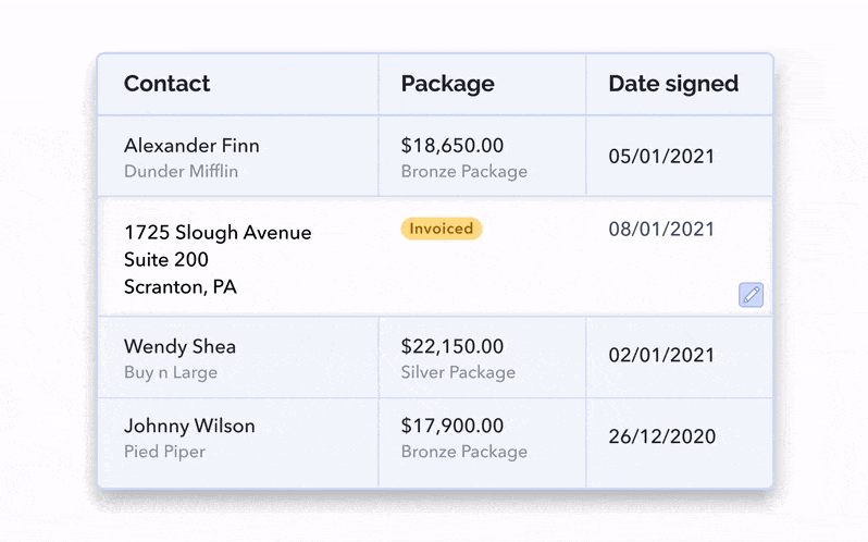
It’s possible that your rows only contain the generic data about the entries but that more qualitative details about them also needs to be displayed. What’s the best way to display additional row information inside a table UI? It depends on your development resources and the amount of information needing to be shown. Let’s look at some possible options:

This is maybe a more technically costly option, but having clickable rows expand inline is an intuitive way to show more details. By doing this, you’re creating blank space for more specific details to live either inside or outside the bounds of the columns.
This can be triggered by clicking the whole row or a chevron icon at the right or left edge of the row.

Sometimes exposing more information in a desktop scenario is most appropriate to maintain full context of the table, but have a ‘sneak peak’ into more content.

Having a modal/overlay show up is a little bit more disruptive, as users are taken away from the context of the table. However, this is an easier option in terms of development.
The modal can be triggered by clicking on the whole row or something smaller like a “View More” link or a 3-dot menu icon.
The most scalable option for this situation is the sidebar. If you need a lot of space and potentially even a scroll or subtabs to account for the additional information, this might be your best bet.
The sidebar can be triggered by clicking the whole row, a “View More” link or a 3-dot menu icon.

Information immersion can be really beneficial in a table viewing situation, especially when viewing a lot of columns and a high density helps people parse through a lot of data. You simply take away ‘the rest of the UI’ for that focused experience.

Tables are all about finding information and are often presented in the context of a search or find functionality. To ease the ‘mental matching’ between search and result, consider highlighting the matches within the rows. This is a key best practice outlined in our search UX article.

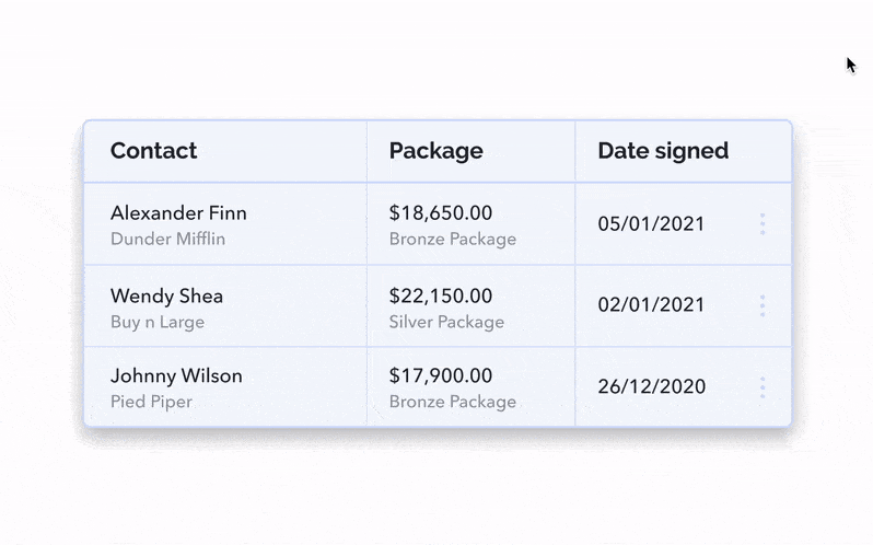
When a checkbox is shown upon hover, it hints to rows being actionable.
Such actions can include ‘Delete’, ‘Export’, ‘Duplicate’ or any functionality you want to provide your users with.
Once one or more rows are selected, only then is it relevant to display said actions. This is a very smart use of space and helps reduce the page clutter. Multi-select is a key poweruser functionality for people to move faster in your application, also keep in mind the other enterprise features to make your product better.

When a cell is made to look clickable with a text cursor on hover, it hints to the content being editable.
Allowing for edits to be made inline, i.e in the original table view, allows for the least friction and maintains the most context; the user will still be viewing neighbouring rows and columns, and only needs a small number of clicks to get going.

However, if context isn’t primordial and friction might be beneficial for the types of edits you know your users will want to do, editing the cells’ content can also be done in the row details secondary view you’ve decided to go with.
You can decide to add friction by making the fields only editable in the inline expandable rows. This leaves less room for error since the user needs to click through to get editing. This is useful for high-stakes data that shouldn’t be played with as much.
You can also leverage a modal and have it be composed of read-only and/or read-and-write input fields. You can always decide which content is editable, while still showing it all in one place.

Or, finally, the quick view sidebar can basically be formatted like a form, showing your data in a way the user is free to modify at will.
Confirming the changes needs to be done when exiting the secondary view or exiting the inline cell. Either by clicking out, hitting ‘Enter’, or having a straightforward checkmark icon or ‘Save’ button. Keep in mind that success UX is super important to any data table experience you’re creating! There are a lot of triggers for UX feedback when you’re creating high-quality microinteractions.


Pencil & Paper is a globally recognized UX studio that sets the standard for enterprise design. They are described by their clients as providing innovative solutions for difficult problems in modern software which provides better user adoption, reduces churn and propels product-lead growth. They routinely innovate on novel experience patterns of generative and AI-driven workflows. They provide fractional design leadership and act as a plug and play design team.
This article was written by Fanny Vassilatos and Ceara Crawshaw and peer reviewed by the greater Pencil & Paper team.
Phew! We’ve gone through a lot. If you’ve made it this far, you are well on your way to implementing the smoothest enterprise table experience you can get. There is a lot to process but make sure you start out by outlining the requirements and the interaction goals of this interface. You’ll reduce the amount of decisions you need to make and also ensure they are all coherent and bring a delightful experience to the user.
Even though you’ve got some best practices, patterns and good ideas, you still might be thinking about where you should prioritize and “where do I start?” vibes. Never fear, just go through our nerdy (but succinct) UX checklist specifically for data tables in complex environments.
Do a mini UX audit on your table views & find your trouble spots with this free guide.

Be the first to know about our upcoming release!


.webp)


.webp)

