Visibility of System Status
October 13, 2024

Meganne Ohata


When you talk to someone in real life, a multitude of cues inform the flow of conversation; you’ve got their body language, tone of voice, eye contact (or lack thereof!) and even the way the other person pauses can tell you something. You can tell when your friend has exciting news to share or when your sibling woke up on the wrong side of the bed, even before a single word is out of their mouth.
All the dimensions of communication are just as important to explore and represent in human-computer interaction, especially when you take into consideration the trust and confidence your platform is likely trying to build.
Visibility of System Status exposes cause-and-effect so that we can understand what the system is doing, and decide how we want to respond. Stripped down to the absolute bare bones, the most basic ones look like a piece of text telling the user what is currently going on, ie: “35 emails selected”. As a designer, you’re probably aware of how much more complex it can get from there —especially in niche enterprise products with system-specific functionalities and considerations. It goes much further than just displaying words on a screen, so let’s dive into it!
Let’s start with talking about what the system should even communicate to the user. What’s relevant? What does the user want to find out? We need to make sure the dialogue (hah!) between human and computer is productive, helpful, and a positive experience overall rather than one that’s full of fluff or confusion. Nobody likes it when they’re rudely interrupted, or told to do something they’re literally just about to do (overzealous error messages, anyone?).
A good rule of thumb is to think of system status as a way to tell the user what the result of their actions will be, and to set expectations for what’s happening in the moment.
🥹 Some examples of beneficial communication:
🥺 Some examples of aggressive or failed communication:
Now that we have a sense of what should be communicated from the system, let’s talk about what "visibility" even means. How distinct and eye-catching should a system status be? We aren’t just talking about making everything the colour of jalapeño peppers 🌶 —this goes beyond aesthetic choices. Consider what metric “visibility” might be measured by in the actual use case you’re designing for. Is this more of an understated “nice to know” reference point for the user? Or is it worthy of a dramatically emphatic “You shall not pass!” in the UI that the user shouldn’t be able to get around without acknowledging? While the heuristic is called “Visibility of System Status”, visibility actually encompasses multiple dimensions such as timing, detail, level of obtrusiveness and more.
In some cases, a short message appearing on-screen briefly is suitable. At other times, actions trigger more than just the immediate reaction. Aside from what happens instantaneously, there could be a state of processing, as well as the final result (failure or success). This series of system statuses might need to be communicated each step of the way based on the risk level. Not only that, but the processing time could differ wildly; a loading state could help when there’s a few seconds' gap, but what about if a process is expected to take 24 hours? This should also be taken into consideration when evaluating the level of obtrusiveness that you want to saddle the user with (more on that later)!
Before choosing a roster of cute icons to sprinkle through your design, consider the weight of the message you’re trying to convey. It’s often safer to go beyond iconography and include concise text to clarify the status —nobody knows what that adorable line-art means when it comes to their medical platform, and there’s no room for guessing! In fact, where absolute certainty is beneficial and redundancy is even welcomed, choosing to forgo a strictly minimal design in favour of repeating key pieces of identifying information would be the way to go. Note that while this is a generic example, clarity also goes hand-in-hand with the microcopy you choose to display. Well written copy that is helpful, to the point, and tested with the target audience is the way to go.
.png)
.png)
.png)
Well-crafted microcopy adds clarity by including identifying pieces of information, which supports and boosts confidence in user actions.
Sometimes the knee-jerk reaction in design is to avoid “bothering” the user and creating an unpleasant stopping point. However, sometimes that’s precisely what the doctor ordered! Based on the situation you’re dealing with, you’ll want to consider if system status will be communicated in a mild, non-obtrusive way, or if the entire workflow and screen should be locked up until the user intentionally clicks on a certain button. As mentioned earlier, timing should be taken into account at the same time. If something is expected to take 24 hours, it probably wouldn’t make sense to block the user from continuing their workflow until then, and maybe an email update or timely notification once the 24 hours is completed is more appropriate.
.png)
.png)
This refers to whether the status update takes place close to or at the location where the trigger was executed, or if it’s elsewhere. If it’s elsewhere, it could be located at the target of the action (ex.: refreshing a data table), or in a stationary location that other status updates of a similar nature on the platform are found (ex.: bottom left corner). The latter is actually a common pitfall especially around short-term notifications because if the stationary location is too far from the trigger area, it could be accidentally missed. It’s especially tricky if the user has a large screen monitor or multiple monitors with which to use the platform they conduct their day-to-day work on.

Some system status updates are best paired with an action. When a destructive or transformative change has been triggered, the action could be “Undo”, which incidentally also serves another heuristic principle: Error Recovery. Other actions could be next steps that help the user along their workflow, which are opportunities for guidance or onboarding.

Is the status update merely visual, or is it on a device or platform where haptic or audio feedback is useful or expected as well? Consider how users may experience the different types of feedback and combine a variety of strategies to keep functionality as accessible as possible —just as you shouldn’t rely only on colour to indicate a status, you wouldn’t want to rely solely on auditory feedback either. This is especially true on mobile devices, where overriding functionality such as Colour Adjustments and Do Not Disturb might be found.
Is it just me, or is everyone talking about microcopy these days? Well, it’s for good reason! While the UX behind microcopy might seem super basic at first glance, I’m sure we can all think of a user test that went surprisingly off-course over a single misplaced word or inconsistent use of tense. Microcopy is something that could be a sticking point due to accessibility, native language, age, experience, and more. Given these aspects, considering how to convey information clearly and succinctly becomes a science of its own. Additional context, tooltips and descriptors can help with parsing out information in digestible bundles.
Now that we’ve looked at several elements that come into play in the anatomy of system status, let’s look at different UX patterns and expressions of this heuristic. As you’ll see in the examples below, it’s a ubiquitous staple of design that employs the entire UI design toolbox.
The purpose of the indicator is to reassure the user that they’re moving forward and to set expectations about when completion will occur. This indicator should match the complexity of the situation. In the case of an onboarding flow where the user simply has to swipe through 3 static screens to get to the app, perhaps a small visual or 2-tone progress bar is enough. For the case of a workflow sequence with dozens of requirements over multiple steps however, details like the number of sections, what each section is about, and expected time left could be really helpful. Using a stepper and friendly microcopy would be more appropriate in that case.

People are often either in the "vehemently opposed to the idea of more emails" side, or the "emails can be the catch-all of everything" side. Sure, maybe email might have a bad rep of over-enthusiasm to overcome, but think of all the emails you depend on. When you book a flight, you expect a confirmation email and would probably freak out if it didn’t hit your inbox. If you’re doing taxes, registering for adoption, or waiting for some kind of evaluation result, an email to let you know what’s going on and what to expect is something you want to see. Like it or not, emails have their place in communicating system status.
Some clues as to when an email might be appropriate:

Loading indicators differ from progress indicators in that these are scenarios in which the system is “thinking”. Communicating the time left is purely based on how long the system needs to “finish thinking” rather than on any action the user is proactively engaged in.
Anyone who’s used the Internet for more than a day is probably intimately familiar with a variety of loading strategies for page load. A spinner is a global favourite for people who want to use a library to “plug and play”. Others use page loading as a branding opportunity, and cute animations can add a bit of playful delight to the moment. For data-rich platforms, showing a skeleton of the content that’s about to be loaded can boost confidence in users, and make them feel like the wait is shorter than it is.
These are UI elements that can serve a variety of needs while maintaining a consistent overall structure to deliver value. The iPhone’s Dynamic Island is a prime example of a visual element that can morph to give users timely, relevant information. This sort of flexibility adapts to the needs of the moment.
This concept can be adapted into more complex systems as well. One example is an action bar that shows possible actions that are updated based on the selection of the user. This is a way for the system to let the user know what is permissible or not, and prevents accidental errors from occurring.
(If you haven’t already, make sure to check out our primer on the 10 heuristic principles from an enterprise angle)

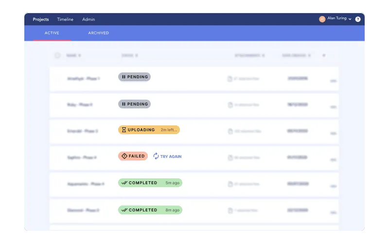
Enterprise platforms often handle the execution of multiple processes through a queue. The computer will be thinking and working on things, but since it can’t talk or show facial expressions, it’s important to show how things are working and moving along for the user to be aware of and understand what’s happening. For example, through the course of their workflow, a user might trigger the export of 25 different PDFs of data —each one might then be prepped by the system in the order the request was received. The system needs to communicate which one is processing, how much time is remaining, if it failed or succeeded, and which ones are next.
Queues can work in many different ways, so setting the right expectations for the user is something the system needs to communicate clearly. A queue could work in sequence, one at a time, or could allow several to run concurrently. The processes could also be dependent or independent of each other, and how a failure in the middle of a queue is handled needs to tell the user whether the entire series has come to a screeching halt, or if only a few need to be re-addressed. Timing could also vary, and the way the system communicates that a queue is expected to take several minutes should be significantly different from a queue that is expected to work for days at a time.
In some cases, users will need to make a selection with an upper limit; perhaps they can list dozens of career skills on a job application platform, but can only choose up to 5 of them to highlight. In this type of scenario, the upper limit needs to be communicated with clear microcopy, and the selection number should update as the user engages with the interface as well. And on top of that, maybe they can re-order their top 5 with drag-and-drop? That comes with hover states and all the other juicy micro-interactions that you’d expect, all of which are communicated as part of system status and the give-and-take of the human and computer interaction.
Phew! We’ve broken down how system status should work, what helps make it visible and the kind of elements that come into play, and finally looked at different outputs and embodiments of this heuristic. This principle is a major umbrella for basically all the communication you’d expect between a human and system, which is probably why it’s the first on Jakob Nielsen’s list of 10 heuristic principles.
Do a mini UX audit on your table views & find your trouble spots with this free guide.

Be the first to know about our upcoming release!


.webp)


.webp)

