Introduction to 10 UX Heuristics
September 26, 2022

Meganne Ohata


These 10 usability heuristics are well-established in the design industry and form the basis of our heuristic evaluations. They act as both guidelines and ways of measuring usability in different situations. Rather than exploring them with a bird's-eye view for wider applications, let’s explore some examples of how these heuristics can apply to enterprise and SaaS products in real, concrete ways.
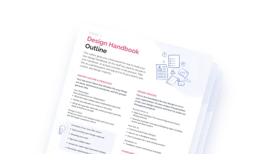
(By the way, we’ve prepped a UX Heuristic Evaluation Template, if you’re doing a heuristic evaluation and want to make your insights shine!✨)
Users should be able to easily see and understand what is happening with the system they are interacting with.
One of the most frustrating things when using a product —particularly an enterprise product that you depend on to get your job done— is to do something and then be stuck wondering if the system froze, is thinking, or encountered an error. These system statuses need to be clearly and effectively communicated to users so they can figure out what they can do next and move on to their next task. Ambiguity could result in lost time and efforts, which damages trust in the product.
Enterprise heuristic example:
After engaging in the bulk upload of several large files, a platform used in the parsing of medical studies has multiple steps that are then executed in sequence by the system. It may take an unspecified amount of time, which can cause uncertainty, especially with sensitive data being processed. Having visibility into the status and progress of each step gives users a sense of control and transparency.

The system should reflect phrasing, iconography, convention and behaviour that is familiar to the user to reduce their cognitive load.
This usability heuristic applies on a crucial level when talking about niche industry products, where users tend to be well-versed and deeply immersed in a specific knowledge area and the established conventions within it, in comparison to consumer-facing technology.
Enterprise heuristic example:
An accounting platform positions itself as a friendly, modern solution for small businesses, and their designer proposes a wide variety of bright colours for their branding. The business cards, stationary and logo looked fantastic and fresh, with a pop of vibrant pink and a fresh teal colour to offset the traditionally serious industry. However, in-app, the colours needed much more serious consideration. Accountants were thrown off when looking at anything that remotely resembled red or green, as this was instinctively associated with costs or savings in their minds. A subset of colours needed to be defined for clear data visualization.
.png)
.png)
.png)
Innocuous in other contexts, the use of fuschia and teal here can send mixed signals. Red and green signify very specific and distinct things in finance, and any visual touches that can be mistaken for these signifiers can add confusion and ambiguity due to this deeply-entrenched convention.
This is where testing and user research is paramount, because any decisions that go against ingrained norms for these users would at best cause slight confusion, or at worst, suggest that the product team fundamentally misunderstands the world that the users live and breathe. Nielsen Norman Group references Natural Mapping, which further explores how stimulus-response incompatibility affects the user experience.
The user should have the ability to always undo actions, change their mind about decisions, and fix any errors.
On a platform with complex functionality and workflows, there are many reasons a user might want to undo an action —they might be getting to know the product, learning by trying, testing out a hypothesis, or trying to remember something else. Always have a way for them to recover from their actions so that they are enabled to continue working, exploring and experimenting without fear.
Enterprise heuristic example:
A new employee who’s just been onboarded is trying to get a handle on the file management and versioning system the team uses, and experiments by creating a new branch off of the master file. They make some changes and try updating their branch, but because they aren’t familiar with the concept or confirmation syntax, unintentionally merge to master. They notice their mistake at once and confer with a colleague, and after some discussion they learn how to reference the action history and roll back the version to the appropriate point in time.

Allowing users to see their activity and change their mind about any actions or decisions puts control and freedom in their hands. Here, the user sees a log of master activity and can revert back to a particular commit at any point.
Various elements such as wording, iconography, and functionality should remain consistent across the platform to establish trust and eliminate confusion.
Consistency is one of the basic foundations of good design, and continues to apply in enterprise situations where a wide variety of users will be interacting with the product in complex ways. Consistency provides a level of comfort and confidence so that users can learn the mental model of the platform functionality and execute their tasks with efficiency and accuracy.
Enterprise heuristic example:
If you have a feature labeled “Recover recently removed files” but users can encounter both “Delete”, “Remove”, “Archive” and “Trash” in various places on your platform, there can be some hesitation around the logic and reliability of this feature. Questions around the different words, as well as colours or iconography, could lead them to hesitate and act conservatively to avoid risking their work, even if a function already exists to help them recover from it. In this way, consistent wording both reinforces the function and empowers users.

This quote from Anton Axelsson’s 2012 thesis, “Consistency in Web Design from a User Perspective” further illustrates the concept: "We recognise familiar patterns, or acknowledge disruption of patterns, and upon this we base our decisions. Our innate ability to recognise inconsistency alerts us also when interacting with computers, and the conventional view is that it impedes usability."
Optimize the design to help users avoid making mistakes, such as hiding destructive actions within a drop down.
This is one of the easiest heuristics to overlook in enterprise settings. Common themes such as “fewer clicks are better” and “don’t make me think” can be misconstrued as an ultra-simplified doctrine that can end up sacrificing error prevention strategies. In actuality, sometimes we do want to create friction, and make the users pause and think things through.
Enterprise heuristic example:
SaaS and enterprise platforms will usually have user management functionality, likely for billing or permission purposes. Whereas exposing actions would be valuable in other contexts, having something like a “revoke user” button directly available in this scenario could open the user up to high risk, detrimental effects —especially if there are also no confirmation or undo features available. It would be much more secure to incorporate some friction, such as hiding the functionality in a drop down or displaying an action bar that appears upon selection. In this case, we also explain the effect of this action to help prevent misunderstandings regarding the impact of the action.
.png)
.png)
Assume the user will have higher success rates when they are presented with familiar options rather than expected to conjure information up from their memory.
Cognitive load is much greater when we expect users to put in the effort of remembering a specialized set of information rather than just presenting them with enough to spark their memory. This is markedly useful and often combines with other heuristics (such as Error Prevention and Consistency) in workflows that may need to rely on standardized inputs. Determining the level of cognitive load involved is key to the analysis around this usability heuristic.
Enterprise heuristic example:
An HR system contains information for the 700 employees of a business. When an administrator is adding a new employee or changing an existing employee’s title, it’s convenient for them to be able to reference and select from a pre-set list rather than to input a title by memory. This helps prevent redundancy, keeps the data clean, and reduces ambiguity compared to free text input, which by human error could easily allow Senior BE Developer, Sr Backend Dev, Senior Developer, and others to proliferate.
.png)
.png)
Allow users to tailor the experience to suit their needs, and include strategies to allow pro-users to complete tasks in an accelerated manner.
If you’re designing for SaaS or enterprise platforms, it can be assumed that there will always be a wide variety of user behaviours and backgrounds to account for. There will be users who are onboarding for the first time, and users who could have been using your product for 30+ hours / week over several years. Some users will insist on bookmarking things you never expected, and others will always try to open things in a new tab. Rather than assume your solution is the best solution and that users should ‘get with the program’, look for ways to accommodate their personal work habits to empower them to work even better within their preferred mental models.
Enterprise heuristic example:
It’s common for project management platforms to allow users to view tasks as a list or a board, to favourite particular projects, or create default views with custom filter settings. The platform doesn’t presume to influence the way the user works, but creates opportunities that accept a variety of use cases and preferences so that people have the flexibility to work the way they want to.

Being flexible and providing options for the user to use tools in the method that works best for them also supports accessibility and neurodiversity. For any tool that hopes to target a significant audience, these factors will make a difference in how much impact, value, and delight a platform can deliver.
Visuals should enrich the user experience. Remove information that is irrelevant and display only what is most important and valuable for the user to complete their goals at each point in time.
When it comes to this heuristic, it’s not merely about choosing something pleasing to look at. This is a foundational heuristic that helps draw the eye toward the right information at the right time for users who need to digest a page full of dense yet varied sets of information and functionality.
Enterprise heuristic example:
Data tables are probably not the first thing to pop into your mind when aesthetics are discussed, but they’re always a relevant consideration in enterprise situations. Here, illustrations and flashy visuals won’t be taking centre stage, however, aesthetics are nonetheless fundamental in choosing where padding is added, how much contrast to include between rows and columns, what the treatment of a header should be.
It can be easy to fall back on “library defaults” in terms of enterprise design, but what comes out of the box may not have usability as a primary focus in comparison to functionality. It’s always worth the time invested to test and ensure that the information being communicated actually serves the needs and goals of the user.
Errors and any event that blocks the user from achieving their goals should be explained in a way to help prevent recurrence. Methods to allow the user to try again or to find alternative solutions should be included.
We’ve all run into the frustrating situation where a platform doesn’t perform the way we expected, yet there’s no clue as to the reason why, so we try again. And again. And maybe even one more time!
If repeating an action is the only method available to decipher an unexpected failure, then this heuristic hasn’t been addressed. Users should not only be notified of what happened, but should be given the tools that will set them up for success and back onto the path of their task —this is a key principle to any software product. In an enterprise setting, the way an error is handled can be judged much more harshly than the actual error itself, as users might forgive a one-time glitch but not a complete disregard for their time and efforts.
Enterprise heuristic example:
A user is uploading a spreadsheet in order to populate the data table on their analytics platform. The upload seemed to fail, and the user tries again to make sure it wasn’t a one-time failure. When it fails a second time, they remove the spaces in the file name in a wild guess at what went wrong. When it fails a third time, they check the file size and cross reference to make sure it’s within the acceptable limit. It still fails. Finally, after searching for help documentation online, they realize that one of the columns within the spreadsheet contains a typo, and the platform can only accept exact matches to their requirements for a successful upload.
.png)
.png)
Having the information and tools available to quickly understand and recover from errors completely changes the experience of running into an unexpected hitch. Rather than feeling frustrated about the lack of transparency in the above example, a thoughtfully prepared experience could instead make users feel supported.
The user should ideally be able to navigate without documentation, but resources should be easily available if they want additional help.
Examples of help documentation include having an FAQ, providing community resources, a chatbot or video tutorials. At the same time, it could be assumed that many users of enterprise and SaaS software don’t want to dig through help documentation to be able to make sense of the complex workflows they need to work with. In the heaviest and most complex systems, it’s therefore fundamental to have omnipresent sources of information spread pervasively across the platform to support cognitive load as well as the onboarding experience. This may take the form of tooltips on hover, well-written and intentional copy, pre-populated placeholder content to exemplify functionality, or contextual quick help widgets.
The method used for this heuristic should match the urgency and complexity of the use case. In terms of abbreviations or action buttons, a tooltip on hover can support the user’s experience without interrupting their flow. In terms of handling a complex workflow, example content with embedded or floating help content could be more appropriate.
Enterprise heuristic example:
A platform that houses legal documentation, proceedings and statuses has many different features and functions that new users need to become familiar with quickly. To support the learning curve and reduce cognitive load, example content is populated from the onboarding experience so that users can understand and play with the system using dummy data. As they begin to learn how to use the tools available to them, dummy data is eventually removed and the tooltips, help screens and accessible widgets sprinkled throughout specific points of the workflow become the main source of support. Eventually, the widgets are also removed from their flow and users work independently with quick access to additional help or documentation when needed.

You can find additional examples of how other platforms include moments of support for users in terms of empty states in our article here.
UX heuristics have been around for decades and as UX designers, they are some of the most useful usability scaffolding to rely on. These enterprise UX examples look at our classic tenets with specialized eyes, and are fantastic to refer to when shaping a new product or feature. In the future, we’ll explore each heuristic with a deep dive and more detailed examples to share some of the things we’ve encountered in the past (tweet us if you have an example you’d like to throw in the ring too!).
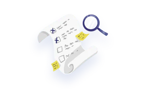
When looking at existing solutions retrospectively, UX heuristics come into play with a thorough heuristic evaluation process that analyzes the level to which a usability heuristic is impacted for a certain feature or page, what solutions can be explored, and how to prioritize it. If you’re interested in being notified when more articles about diagnosing UX problems are released fresh off the presses, or if a deep dive into each heuristic with more detailed examples is content you’d want to see, sign up to our mailing list below!
Do a mini UX audit on your table views & find your trouble spots with this free guide.

Be the first to know about our upcoming release!


.webp)


.webp)

