Match Between System and Real World
August 17, 2024

Meganne Ohata


The design should speak the users’ language. Use words, phrases, and concepts familiar to the user, rather than internal jargon. Follow real-world conventions, making information appear in a natural and logical order.
—Nielsen Norman Group
Let’s grab a hot beverage, cozy sweater, and just walk down the blustery winds of Memory Lane for a second, shall we? Picture this: it’s 1995, and you’ve just downloaded a new skin for your Winamp program. It’s absolutely poppin’ 😎! Now let’s jump to 2005: the shiny gradients of skeuomorphic design are all the rage, and even the shadows have shadows. Things are looking real slick (though flat design soon starts taking centre stage). All the while, regardless of the final visual expression, we’ve got the constant presence of the Save button, Trash can, Folders and Bookmarks. You can picture any of these in a number of styles, skeuomorphic or not. Still, the incredible thing is that you’d recognize the symbolism anywhere, even if you’ve never actually used a floppy disk or file folder yourself in real life.
All this to say, matching what you see on the system —whatever device or platform you’re on— with the real world is something that’s been a part of the Internet and technology since the beginning. It should be emphasized that this match isn’t just a cute visual choice, but integral to the adoption and use of a system.
So what are the things you should set about matching? We put together the main categories you should look out for, and of course, sprinkled some delicious enterprise UX examples in as well.
UX microcopy is a whole world worth diving into, but to keep it to the point, the wording should match what the user expects and is accustomed to. This includes the names of functions, actions, navigation labels and processes. Special considerations for enterprise UX include finding out what kind of niche vocabulary is used for a particular industry and making sure it’s appropriately reflected in the platform to avoid confusion. This might involve working directly with subject matter experts and testing rigorously in real-world conditions to ensure that the language chosen stands the test of time.
.png)
.png)
.png)
Based on real-world enterprise experiences, the original choice of microcopy presented a baffling hurdle to many employees who simply wanted to request a day off.
Iconography and visuals are where a lot of focus tends to get spent regarding this particular usability heuristic. Admittedly, it’s a juicy one —people are visual creatures, and there’s often a sense of sentimentality involved. All the more reason to proceed with caution. Choosing a new icon to stand in for something that’s been long established should be avoided where possible unless it’s evident that the friction of learning something new is overwhelmingly rewarded by some unique value it provides. When looking at enterprise products, value is often heavily weighted toward accuracy, efficiency, and ease of use, so choices should strive to strengthen those aspects and not come at their expense.
.png)
.png)
Use recognizable iconography wherever possible. Labels should not be the sole method of deriving value from visuals.
Whereas consumer products may spend entire design explorations nailing down just the right "friendly, modern, high trust" shade of blue, colour is a peculiar aspect of enterprise UX that some may feel doesn’t quite matter …until it matters. When it does, it matters to the utmost degree. The most critical colour choices relate to the system status —communicating that something is destructive or that an error has been encountered. The typical red, orange and green is sought after in these cases, mimicking the traffic light system that’s universally recognized around the world. You may also run into colour issues based on the industry you’re designing for, particularly with dashboards containing complex data visualizations and finances.
.png)
.png)
In an accounting software, anything that remotely resembled red or green carried additional meaning for the users. It was immediately associated with costs or savings due to industry standards. A subset of colours were defined for clear data visualization.
We’re at a point where the real world is encompassing all the technology we use. We expect things to work similarly across platforms. Imagine if the keyboard shortcut to Save or Undo were different based on what program you’re using. It would be a disaster! So with interactivity, look to match user expectations across their universal experiences regarding:
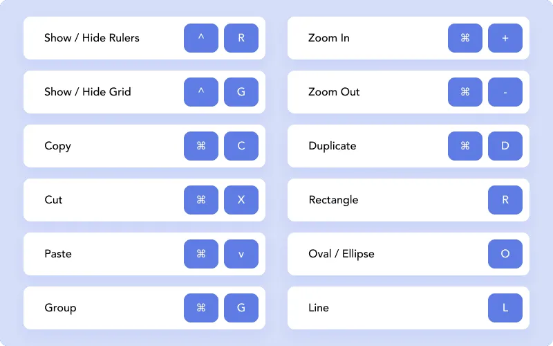
With technology encompassing our real world, we expect platforms to behave in a way that matches our previous experiences predictably. These above shortcuts are some of the common ones that overlap between the design platforms Sketch and Figma, catering to specific expectations that their niche industry users have come to expect.
A "mental model" is a framework through which people have a standard set of expectations and reactions based on previous experiences. All these considerations for system and real world matching basically revolve around identifying and taking into consideration any mental models that a user is already familiar with. By the time we’re old enough to start working with or creating enterprise software (or reading this article!), we’ve already absorbed a number of these mental models. For example, in the real world, we book appointments with doctors or check our items out at the grocery store. We put books on hold at the library, and glance at our speedometers. These mental models are pervasive, and matching these real-world concepts helps with the adoption of complex functionality.
If the system’s language, colour, iconography and everything else revolves around matching to existing real-world mental models, what happens if you’re working on a platform design that has no existing real-world metaphor? Welp, first thing’s first: as you work on enterprise software, this is bound to happen. Technology will continue to make leaps and bounds forward, and software is and will continue to become the real world. You’ll break into new ground and then will be at a cross-roads of deciding whether something is worth challenging and creating anew.
Signs you might need to break and define new ground:
Matching is important because it tangibly affects how users interact with your platform. When things match, users can do things faster and much more easily, and would likely take the efforts behind this heuristic for granted. When a mismatch doesn’t come up, they’ll be able to reap the following rewards:
Cognitive load is alleviated because the user does not need to learn something new —matching is like a mental shortcut. Matching allows them to recognize and map to an existing mental model instead of reworking it, so less active thinking needs to be involved.
Greater efficiency is achieved precisely because of the lower cognitive load. The user can focus on their task rather than on clarifying the functionality of what they’re seeing.
Matching to the real world is an accessibility consideration that spans across language barriers and cognitive variance. This opens up the product to a greater audience. When something has increased accessibility, everyone benefits.
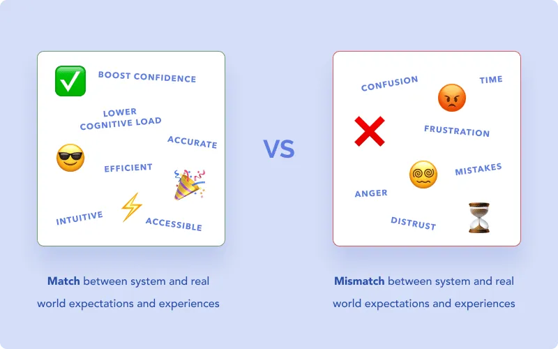
If you’re looking at the flip side of this, what happens when there are rampant mismatches between the system and real world? We looked at a few examples earlier like ubiquitous keyboard shortcuts and standards in iconography. If you imagine having to use something that went against the grain —for example, using ctrl+Y for Undo instead of ctrl+Z— you can probably picture yourself making mistakes, getting angry and having a harder time adopting the platform. Introducing unnecessary friction is a point of frustration that all designers want to avoid.
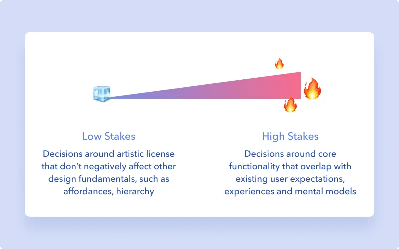
Not all real world concepts and metaphors should be weighed the same when making decisions around your design. A lower risk decision would be choosing to what level of skeuomorphic design versus flat design your brand expression is willing to go. As long as affordances are clear and users aren’t confused about where interactivity lies, there’s an element of artistic license to be had.
Decisions surrounding core values and functions are the highest priorities for matching between the system and the real world. If a stock trading platform uses beautiful gradients to convey information but it goes against the blatantly obvious traffic-light colours, it affects an integral aspect of the tool. Similarly, unique but misleading iconography on a medical system that causes emergency staff precious seconds to decipher could render the platform useless (or even dangerous).
We’ve looked at what constitutes real world matching, how it’s relevant, and several enterprise examples. Notably, we also looked at the kind of risks and stakes that are at play, and how different decisions might be weighed differently. Whereas risks in the consumer world often lie in gaining or losing audience and profit, risks in the enterprise world could have medical, financial or employment implications.
If you haven’t already, make sure to check out our primer on the 10 heuristic principles from an enterprise angle.
Do a mini UX audit on your table views & find your trouble spots with this free guide.

Be the first to know about our upcoming release!


.webp)


.webp)

