Time for a redesign? Use our checklist to assess your software's design needs—quick fixes or a full overhaul. ✉️

5 Enterprise UX Examples That Increase Flexibility

September 20, 2022
No items found.

Call it whatever you want, enterprise software AKA complex software AKA SAAS products, whichever is your fave nickname for these products, they all have two things in common: complexity and scale.

Normally when approaching building these products, we zero in as much as possible on the work roles, use cases, pains of our precious users – who represent diverse personas. On top of that, each company that these personas belong to have unique ways of running their operations. We see this as products grow and users themselves evolve their workflows and ‘game’ your product to suit their specific fingerprint.

This means, as much as we design for precise pain points, we still need features which allow for user creativity and workarounds. We, in enterprise software want to gauge that balance between appropriate guard rails and openness to these digital experiences. We create constraints as well as add flexibility to how people work.

Flexible enterprise patterns allow us to scale our functionality in a sense, by creating features which are ‘undifferentiated’ and either map to familiar patterns (take a note) or allow hyper-specific modifications for a one off system (ex custom fields).

These flexible features can give your users more power over your system, but they need to also be considered carefully. These types of features aren’t replacements for thoroughly considering workflows but they can also shed light on actual behavior users want.

This article is meant to prompt ideas if you want to extend functionality or extensibility in your SAAS product.

Custom views pattern

Sometimes the nuances of the view (aka screen) is a tough cookie to crack. Not only is it hard to nail the perfect view for a persona, but there’s also a timeliness and personal preferences to take into consideration. Beware though, this type of functionality can be ‘as long as a string’ and may take a lot of effort specially as different screen sizes, data models need to be considered and QA’d’.

Example UI Pattern: Clickup (a project management tool), allows for custom views for every new project.

Clickup screenshot showing create view flow where you select a list view

This example comes from Clickup, a project management software which seems to focus on integration and flexibility features throughout the experience. The available views are varied in their format and overall purpose. It’s worth noting that these particular views also allow admins to dictate the formats, but individuals also can control additional views they want to see.

Example use cases & scenarios for custom views

  • Timesheet Reporting in PM software based on a specific project
  • Dashboard for a large company about their turnover data (in a specific country for example)
  • Project Management software that allows you to create tabs per project

✨UX tip: don’t forget to account for the empty state (see our empty state deep dive), because things can be made to break with flexible views like this, so empty state feedback will be key to making sure people don’t end up famboozled.

✨UX tip: don’t forget to account for the empty state (see our empty state deep dive), because things can be made to break with flexible views like this, so empty state feedback will be key to making sure people don’t end up famboozled.
✨UX tip: start, if you can with great default selections. Allowing a totally open world to create can be a pretty intense lift for a lot of non-power users (see our article about power users). Starting people off with a base and having them edit can be easier.
✨UX tip: don’t forget different screen sizes – even if it’s in an enterprise software!

Adding notes pattern

The ability to add a note can be very beneficial for users, this allows users to put some human context onto data objects in their system. This helps people maintain context for their own workflows, but can also is a step towards collaboration functionality. (Collaboration functionality is kind of a big deal, we talk about it in our ‘Future of Enterprise UX‘ article).

We’ve seen notes features across very different software like: CRMs, ordering software, lab software, data analysis software, ERPs, HR software, quality management software.

Example UX pattern: project management software
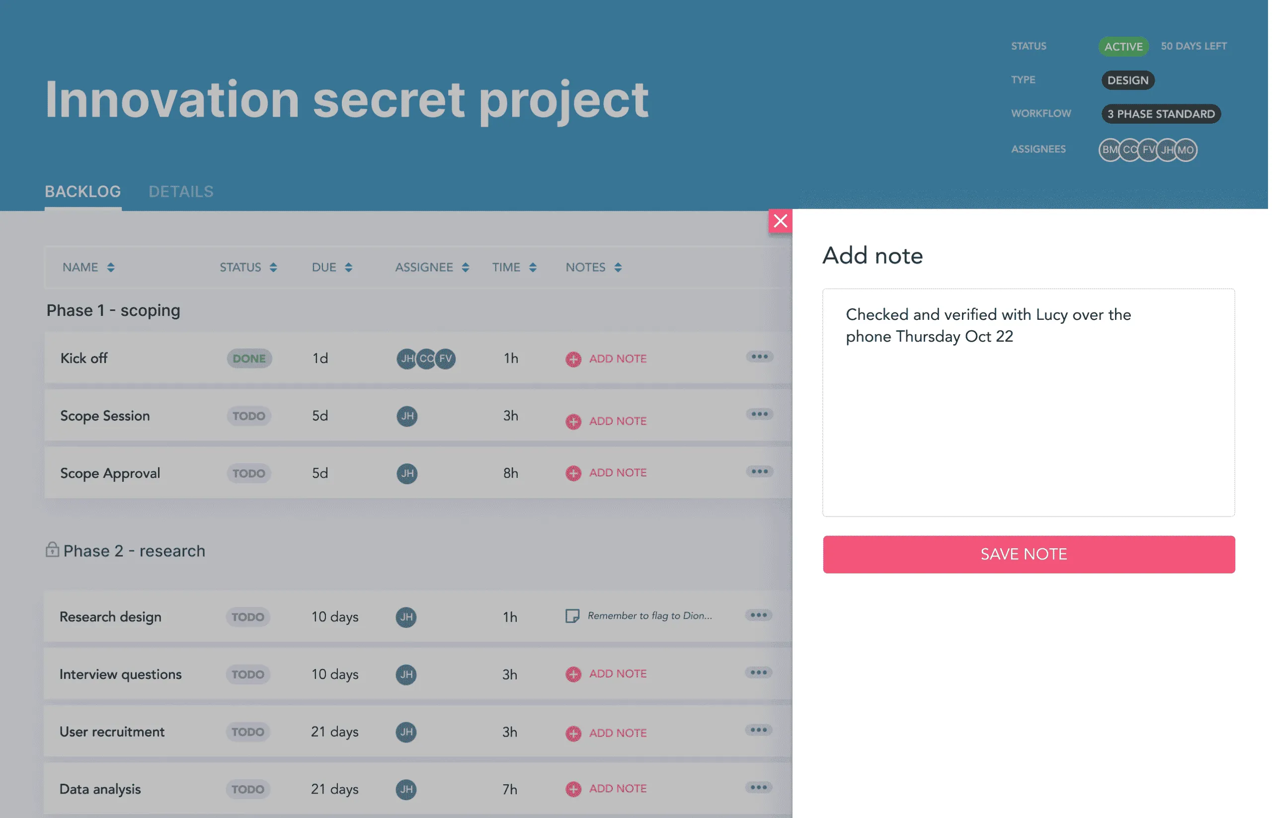
A note being added on a project management software

Example use cases for favoriting:

  • A tool with many data analysts collaborating together, needs a note to explain why a decision was made or notes can be used for compliance
  • A CRM needs a note about the last customer service call between the company and the customer to the next person picking up a call can understand important context about the customer’s last interaction with the company
✨UX tip: Bonus points for these notes being indexable across the product search ability to tag collaborators.

Tagging pattern

Tagging can be a light weight interaction which doesn’t permanently ‘move’ or ‘group’ things in the UI, and allows for multiple tags to be applied at the same time. This can be useful especially for differentiating items in the UI in a given session or as a unique phase in the workflow. This may allow people to recognize specific things that might need attention (or should be ignored for example).

Example UI pattern: data product allowing for colour tagging to ‘mark’ the rows someone is interested in.
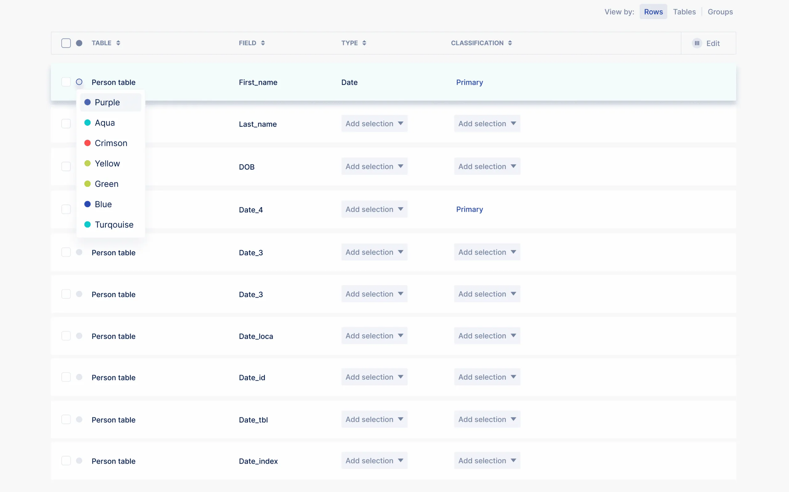
Screenshot from a data product in the middle of adding a colour tag

Example use cases for tagging:

  • Rows in a table which require special consideration or are especially important get a specific colour to show their importance
✨UX tip: beware of using colour as a sole indicator of something (as shown above 😱), not everyone can differentiate colours the same way, ascribing another indicator like a word or icon supports this functionality and makes it more relevant.
✨UX tip: make sure your colours have enough contrast to be perceived by folks with various colour blindness – this seems harder than it is, especially with all the fab tools out there.

Custom Fields Pattern

It’s a lot to ask your product’s data model to accommodate a every single use case enterprise teams need, especially when you consider the complexity of the datasets which all need to integrate together – chances are your product is one of many in a ‘stack’ a company uses.

Custom fields can be a good option to introduce flexibility and extend your product, while not going down the road of implementing custom features for specific verticals.

Example UI pattern: Dovetail App custom fields interaction

Dovetail screenshot showing custom field being added

Example use cases & scenarios for custom fields

  • A project, managed by the accounting team, needs a special ‘project code’ field which is a numbering convention based on the company’s invoicing software
  • An accounting team needs to add a customer ID to their project management software so they can integrate
  • A lab needs to add a field which is unique to a certain type of sample
✨UX tip: this can be complex, so map your logic really well before taking this on.
✨UX tip: whenever possible with configuration features like this, if you can let people preview the result visually, that’s very helpful

Wrapping up

Whether your overall enterprise experience is rigid and strict, or open and loose, flexible patterns can provide scaleable functionality for your product. Any flexible patterns also need robust user testing to ensure they are appropriate for your audience and the way they use technology.

📝 Our article on high quality microinteractions and UX patterns may help you level-set some of your key enterprise experiences – or deep dive into tables or filters.

Great data-rich UX minus the mess

Our secret methodology for features that hinge on data.

Amazing design for data-rich features relies on:
Clarifying the problem space

  • Unveiling the mystery of the data
  • Establishing great collaborations that will lead to better data quality
  • Creating realistic designs that fully consider the data structure, limitations and capacities
  • Solidifying rationale through a process of understanding

Our Data Mapping Workshop is a tried and tested approach to understanding the data deeply, so you can design better (and look like a total pro in the process).

Data Mapping Workshop

$499 USD
Learn More

Download our Table UX Audit Checklist

Do a mini UX audit on your table views & find your trouble spots with this free guide.

Available in a printable version (pdf).

Please fill in the form below and it will be in your inbox shortly after.
Thank you! Your submission has been received!
Oops! Something went wrong while submitting the form.
letters

Want to dig deeper on flow diagrams?

Be the first to know about our upcoming release!

If you found this intro content useful and find yourself needing to express yourself more efficiently on your software team, this training is for you. Our new flowchart training includes real-life enterprise stories and examples for using flowcharts for UX. You’ll get tips on how to make your diagramming efforts successful, how to derive info for the flow charts, and how to get others to use and participate in the diagramming process.
Thank you! Your submission has been received!
Oops! Something went wrong while submitting the form.
Contact Us

Intro to UX for Teams

A fun, high-impact injection that levels up your entire team and gets UX alignment without all the fluff. We cover everything from the basics of UX to real-life, enterprise examples that you might just sound a little familiar.

For up to 20 team members
7 Videos
55 min
$1000 USD

Explore our UX/UI Services

Curious about the possibility of working with the P&P crew on your enterprise software project? Check out our services.

Our services

Join our newsletter

Bringing enterprise-grade UX resources into the world to help you think better and have more interesting conversations with your crew!

Newsletter sign up

Data Tables Checklist

This free checklist lets you double check your data tables for their UX quality and assess various aspects which make or break the data table experience for your users.

PDF
Free

Data Tables Masterclass

We’ve crafted the masterclass to enrich and expand upon your experience reading our article. Peppering in design principles, more examples and workflow nuances that’ll help you deliver high quality UX.

90 MIN
$149
$99 USD

Curious about our Products for Enterprise software?

Check out what other goodies we have for you and your team

Explore products

Data Tables Checklist

This free checklist lets you double check your data tables for their UX quality and assess various aspects which make or break the data table experience for your users.

PDF
Free

Explore our UX/UI Services

Curious about the possibility of working with the P&P crew on your enterprise software project? Check out our services.

Our services

Join our newsletter

Bringing enterprise-grade UX resources into the world to help you think better and have more interesting conversations with your crew!

Newsletter sign up

Interaction Design Masterclass

Ready to level up with a 1 hour masterclass full of real, enterprise-grade examples?

Check out the Masterclass

Need expert ux help?

Explore your needs and possible solutions in a free, 30 minute session with us.

Book Free Session

Get your free Redesign Assessment Checklist!

We've put together a 14 page PDF with situational questions in a variety of focus areas to help you figure out what kind of needs and solutions you can explore for your software.

Get the Redesign Assement Checklist

Get your Heuristic Report Template Kit

Spend your time and life force actually doing your heuristic evaluation, rather than endless visual fiddling. Complete with a easy to customize Figma file and comprehensive how to videos!

Check out the Heuristic Report Template Kit