Bad UX Design Examples in Products
October 26, 2024


There are a bajillion reasons your software product might be struggling with UX issues. Maybe design is only seen as a nice-to-have, and its meaning and value is misunderstood within your organization. Maybe the design team is under-resourced (or non-existent).
For most software companies, bad UX is insidious: it creeps in during every rushed release process. Many teams deploy things as fast as possible (in the name of being agile), rushing to release the minimal viable product (MVP)—and it stays “minimal” for too long. An agile approach, however, requires continuous improvement, collaboration, and a lot of back and forth. So when teams continue making a bunch of new features without updating the previous ones, the UX suffers—as does user adoption.
A lot of bad UX is actually bad or insufficient interaction design: the interface isn’t responding appropriately to the user’s actions. This often happens when the team hasn’t mapped out proper end-to-end flows (more on this later).
Bad UX can reach a tipping point in enterprise software companies when you can’t ignore it anymore. Maybe your design and tech debt have piled up for so long that it feels like a mountain to overcome. Or it’s become so onerous to implement new features that you need to rebuild things from scratch. You might start to lose good people who want to propel their career forward rather than be stuck working on old tech.
If you spot any of these examples of bad UX within your organization, it’s time to make improvements. Start fixing stuff yourself, or hire an expert UX team to get things sorted on the double!
This is a sure sign of design debt if there ever was one: using the same mechanism over and over again, regardless of the stakes or context involved. To create a sophisticated user experience, you need to adapt your components and patterns—whether it’s pages, modals, toast, tabs, or error states—to different situations.
For example, toasts are a gentle pattern to use: they reinforce a message and then go away. But you wouldn’t want to use a toast for unmissable feedback, like when a fatal error has occurred.
Or let’s say you land on a page with a form view: if you haven’t filled anything in yet, the form fields shouldn’t show error messages.
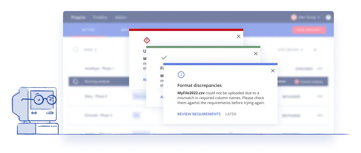
Overusing the same components and patterns is like having a strange conversation with someone, where you say “I had ravioli for lunch,” and they respond “Oh, neat.” And then you say “and I’ve given birth to octuplets,” and they respond “Oh, neat.” It makes for a pretty off putting experience and leaves you wondering, “Are you even listening to me?”
Consistency is important in UX when the trigger is equivalent to the reaction—when you don’t use consistency in the proper context, it shows a junior application of the principle. If you are addicted to modals, toasts or any other UI mechanism, you're now alone, and there are UX professionals available to help any time of the day or night.
No one brags about having the most unpredictable neighbour on the block—that guy who mows the lawn at midnight and hosts llama yoga sessions in the backyard. The same goes for software— reliability beats surprises any day of the week.
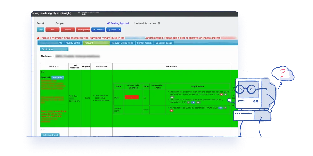
When the system doesn’t appropriately respond to users’ actions, this is a sign of bad interaction design. A lot of people are designing interactions without even realizing it. After all, our job as product people is to make users feel that they are meaningfully interacting with a system. Users will see your product as untrustworthy if that system doesn’t guide them through the complex tasks they are performing—they won’t know whether they did something correctly or incorrectly.
For instance, in one area of your UX, you might have a full flow, great error messages, and reminders to hit save. But then somewhere else, if the system doesn’t say to hit save, users could lose all their hard work in an instant.

Your users might also be doing several workarounds for fragmented flows. For example, they export a spreadsheet from your system and then import it back in.
Or maybe the flow ends abruptly somewhere: you do something but then there’s no next, save, back to home, or anything, and you’re just left sitting there. Then maybe an hour later, you get an email from the software saying your thing is done. This is a sign your flow is missing a sense of completion. At P&P, we call these “terminal flows,” and they’re a major red flag to avoid.
Lack of predictability in software causes people to lose their precious time and effort. Having people guess whether something they did worked is a huge waste of time—it’s not how you want to treat users.
The best way to pinpoint interaction design issues is by doing an audit and mapping out all the triggers and reactions, then comparing them across flows. When auditing your flows, get into the nitty-gritty details of the interactions—these details are a big part of how you treat your users, and you want to get them right.
A confusing navigation is a telltale example of bad UX. You don’t want people to be disoriented when navigating your product—especially if the stakes are high or it took them several steps to get where they are.
Where you are in a software dictates what you can do. And if your user doesn’t even know where they are, you’re in real trouble. Reducing the cognitive load is crucial for a positive user experience, and one of the worst, most frustrating feelings a user can have is disorientation.
For example, too many pages on an application can destabilize users. And if there’s no title or page description to be found, users won’t know where they are. Or if you’ve used breadcrumbs in a weird way, users might click on similar things and get somewhere else, depending on the moment and the object itself. Lacking a consistent forward and back logic also makes it impossible for users to have a consistent experience.
Have you ever landed on a page and you don’t know where to look? It’s like your eyeballs are working independently from each other. 🤪We’re talking endless colours. Font types galore. There’s not a lot of support of visual hierarchy, so you’re left with a sense of vague confusion on what to do next or how to figure that out. We’re speaking a visual language in UI, and the “words” aren’t clear. This can make a person feel out of sorts, even crazy from time to time.
Colour explosions can happen in a lot of data visualization situations. Recently, we saw a dashboard with so much colour coding that it was impossible to deduce any meaning. The totals were represented in green, red, orange, and purple—what does purple even mean?!
On the other side of this coin, don’t let clean visuals fool you. A lot of companies want to downplay the visuals, and when the UI is clean, you can’t tell how bad the UX is as easily. But when you take a step back and look at how the UX behaves—the interaction design—you see just how confusing it really is. 😱
Visual design inevitably gets crazy when no one’s taking care of it, or when constant changes naturally introduce entropy to the system. Fortunately, you can tame (and avoid) the crazy via robust design quality checks. This is something that needs consistent attention and standards to be applied in order to strip out the disorder and ensure cohesion.
How do you make design decisions within your organization? Does the responsibility fall to a product owner who doesn’t have a design background (and never touched a wireframe)?
In organizations without UX designers, it’s typical for someone like a product manager, who’s not trained in UX, to be responsible for UX decisions. The company hasn’t put any resources into design and they expect devs and product people to handle it as a side hustle next to their main responsibilities.
The product manager probably doesn’t want that responsibility and doesn’t feel good about their design decisions, but hey, someone’s gotta do it. So they keep winging it, going by gut feeling, and doing the best they can to reach their goals.
In these scenarios, the team is usually lacking a clear understanding of what UX design is acceptable and what’s unacceptable—standards and rules are nowhere to be found (not even in the depths of a Google Drive folder). To make any changes to your bad UX design, the whole team first needs to be on the same page with what UX actually is.
If you’re making decision decisions on a whim, you’re probably not doing any user testing either. While you can get pretty far with a design system and best practices, speaking to users is the best way to get new ideas and prioritize developments. Especially for more complex software, if you don’t have consistent feedback coming in (besides what the CEO with low blood sugar is feeling), then your UX will become a hodgepodge of mismatched elements. 🍭
Or maybe your team is getting consistent user feedback, but they’re applying it to the product without first thinking it through. Sure, taking feedback into account is essential, but blindly adhering to it might be a red flag.
Don’t accept sub-par UX or mediocre software demos that don't quite hit right. Bad UX has a huge impact on your product team, harming morale, confidence, and growth. You don’t want a UX culture of complacency around user experience to seep into your organization, or for your team’s creative spark to dim to the point of no return.
If any of these red flags resonated with you, take it as a sign to start making improvements to your product’s user experience. Get devs and designers on the same page about what high-quality UX looks like, and encourage open discussions with technical teams. Look for ways to level up the team's ux skills or think about collaborating with a specialized UX agency that has experience providing services to complex industries like yours. The journey to great UX involves collaboration, continuous improvement, and a commitment to understanding and meeting user needs.🤝
Do a mini UX audit on your table views & find your trouble spots with this free guide.

Be the first to know about our upcoming release!


.webp)

.webp)

