
Fostering a positive and supportive company culture is a hot topic lately. Time and time again, we hear about culture being a “make or break” for organizations. Especially in the realm of knowledge work, culture and ways of working aren’t just subtle details but are crucial elements that demand our attention.
User experience design, human-centered design, design thinking: These are words you’ve likely heard to describe some of the most innovative companies around. But these aren’t just industry jargon; a strong design culture is crucial for companies to stay relevant and innovative. Why? because the design process and mentality brings about greater alignment with user's needs and wants than flying blind.
Coming up with new ideas doesn’t just happen by accident or because of a CEO’s eureka moment after going to a conference. They happen by mixing top-level vision with human-centered iteration loops throughout the design process. At least, this is what we’ve consistently seen across companies in complex industries.
We’ve compiled a few concrete things you can integrate to build a better design culture brick by brick 🧱, but first, let's explore design culture abstractly to set the scene.
Design culture is an organizational culture focused on approaches that improve customer experiences through design.[1][2][3] In every firm, the design culture is of significance as it allows the company to understand users and their needs. Integration of design culture in any organization aims at creating experiences that add value to their respective users.
source: Wikipedia
A strong design culture ensures your company keeps that user-focused mentality in everything you do. The culture piece of the puzzle is especially important for people without a background in UX who are just discovering it’s a thing (read our UX Process can help if that's you right now). They need to figure out how design fits into their organizational culture and decide what needs to change to facilitate user-centered work. A design culture can touch all aspects of the business, but is often more concentrated in those who focus on delivering product (on software teams this is product managers, developers, designers, QAs etc).
Leaders in UX often speak about a UX maturity spectrum, a way to measure an organization’s desire and ability to successfully deliver user-centered design. The vast majority of software companies are low on this spectrum, unaware of design maturity as a concept.
Larger companies might especially struggle with adopting a design culture. If they already own a big market share, they might think they’re fine as is. They might focus their growth and profitability on what they already know works well and find changing on a larger scale to be slower and more difficult. In these companies, they often break out a separate R&D group whose job it is to discover and experiment with new business ideas and solve novel problems.
Not every company has the surrounding culture to support a transition into a more design-oriented or human-oriented culture. There's an underlying value that's implied here around caring for humans which doesn't suit every business model and situation.
There are a lot of established SaaS companies who have gotten away with bad design for a while now and never “needed” UX in the past because they were the only competitor early in the market, or their clients were locked into their offering. But even in these niche markets, more nimble competitors are now cropping up, forcing many companies to work harder to maintain relevance in the market. (This is where a lot of companies come to us for UX services).
The big business case for UX is that you’ll be able to maintain relevance in your field and stay competitive (see others in our ROI of UX article).
For most companies, a strong design culture leads to more product relevance, differentiation in the market, innovation, and employee morale and retention.
That all sounds great, but how do you nurture a design culture on your team and grow it from just a seedling of an idea to a collective way of being?
A lot of people have a vague idea that UX is important without totally getting why. Some senior leaders misinterpret UX as visual design, or see it as slick interactions and transitions on cool websites. Some people interpret design as just making things pretty. Others know that you need to think about how something works before making it cute. 🎀
When companies first start on this journey, they know they have a UX problem, but just aren't sure how to address it. Maybe they’re frustrated because they’ve spent way too much money making things that aren’t working. (a UX Audit or considering a redesign might help those in that situation)
Before getting to the complicated operational stuff, make sure everyone in the organization has a common understanding of user experience. This will avoid misunderstandings around the scope of design, what it touches, and how it works. We've come across this use case and situation so much with teams that we created an Introduction to UX for teams just to address this problem.
Clarifying this base-level knowledge about UX can be transformative and lead to a huge mindset shift within the team. It changes the conversation and the nature of arguments that people spend so much time on (one designer in our crew calls them "circular product discussions"😅.
Getting outside input from your users is the single most high-impact practice you can adopt to directly impact the bottom line—even if it’s just avoiding unnecessary costs at first. Why, do you ask? You can immediately stop building things that don’t matter to your users, and adjust your direction on things that matter, but aren’t well thought out.
We recommend starting this process with a few simple techniques in a wide field of user experience research (UXR), that is:
Speaking to users reduces the amount of speculation and arguments within teams, and helps you make evidence-based decisions rather than go with your gut feelings. Although our intuition as product professionals can be great, we need to regularly check our egos and our assumptions—and speaking to users is a mechanism to do just that. It also sets the precedent that users matter and their inputs are required to create value in the market.
If you have a hard time involving users, you can also involve people who aren’t your customers—they can be people who don’t know about your product but fit your ideal customer profile.
Managing the energy and creativity of the team better is central to keeping the creative spirit alive! This is all about removing anything that drains your team’s energy, and better using their brains to boost creativity in the room - leveraging this energy is central to the design mission. Most companies have some draining ways of working, and with such tough problems to solve, we can't afford to waste smart molecules.
As external consultants, we see the work habits of many product teams. There’s a wide range of styles and efficiency levels in how people tackle their tasks. When we consult with more “traditional” companies, we see a lot of meeting burnout. Many teams that have gone remote have resorted to synchronous discussions on video conferencing tools as the primary way of doing all types of work. As a result, people show up to design sessions distracted and out of energy. You can tell this is happening when people multitask, zone out, and need questions to be repeated.
When companies adopt more of a design culture, they recognize this creative waste and sound the alarm. The aim we have as consultants is that smart, capable, creative people have outlets for their individual creativity and opportunities to act as conduits for others’ creativity, building off one another’s ideas to create design work that no one individual could create on their own.
Instead of slapping a meeting onto the calendar, companies can adopt more intentional asynchronous practices. For example, you can communicate ideas to a group of people via video message (using a tool like Loom) so that people can take time within their schedule to reflect and maybe create their own idea based on that original touchpoint.
By the time the team meets to ideate together (using a collaboration product like Whimsical), they’ll know the context, be engaged, and can bring creativity. This type of session is not just a “meeting” but synchronous collaboration that produces a specific result. The more you can introduce the idea of making things and expressing ideas, the more interesting product ideas will emerge.
When your team can efficiently generate and represent ideas, you can quickly test them with users, establishing an efficient feedback cycle that minimizes the risks associated with your project.
A large part of our work in product development involves highly abstract concepts and complex logic. We spend a lot of time verbally discussing this logic in product teams, which is when the phrase “A picture is worth a thousand words” hits home.
Picture this: you’re working on a password reset flow. It could take you 5 to 10 minutes to describe the logic of what happens when a password is entered incorrectly, where the user goes, and what actions they need to take. But everyone could align around a flow diagram in a minute.
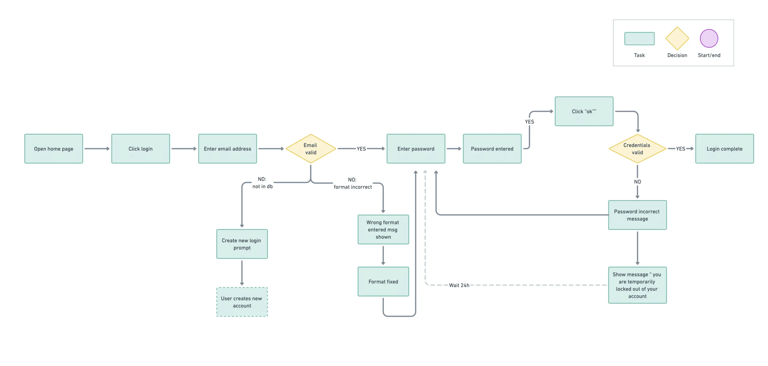
We also often discuss solutions in the abstract, which creates a lot of argumentation and speculation in the process. Even the most visual people struggle to translate abstract ideas into words. This is where teams can externalize ideas into a visual format—whether through whiteboarding, flow diagramming, wireframing, or adopting logic diagrams like Venn diagrams. Having literacy in both verbal and visual communication can not only bring clarity to conversations but also improves the fluidity of ideation.
During work sessions at P&P, we often create and refine flows and wireframes, which serve as focal points for ongoing development. We’ll often spark an idea, say “hold on a sec,” and create a wireframe in about a minute so we continue working around it.
Teams that can take command of visualization techniques to better collaborate and express ideas, including complex logic, are way more effective than teams that need to do this, but don’t.
Many companies don’t realize how many people need to be involved to create well designed, user-centered products. Strong design workflows are interdisciplinary—you have to leverage all the brains in the room to come up with the best possible solution (while not designing by committee). Developers, data analytics, machine learning specialists, and subject matter experts can all contribute to design in different ways. The key is to leverage the right brains in the right ways (hence all this talk about facilitation and working in a smart way together).
We suggest that the whole design cycle that different people are brought in as subject matter experts and can contribute to their area of expertise. On a practical level, as features are being created by the development team, to ensure UX quality, a UX QA process needs to be integrated prior to features being sent to production. This may be performed by a design-minded QA person or more likely a collaboration between the dev, designer and QA person.
Many companies spend surprisingly too much time sitting together and talking through design decisions like “Should we use a radio button or a checkbox here?” 🤔 The solution is to adopt a design system. We've written about the benefits and anatomy of a design system to help give this more context.
Whether you call it component standardization, UX standards, or non-functional requirements, the goal is to have consistent, high-level UX rules everyone can refer to—you don’t want to reinvent the wheel every time you create form components.
Your product design is made up of things like components, copy, interaction behaviour, language, information architecture, and more. Software with a lot of design deficits (that look like a dog’s breakfast) typically has a lot of inconsistencies (b)arf.
Getting a design system in place adds consistency across all areas of design. Since people will come to it as a central resource, a design system is something that needs to be taken care of—and taken seriously.
Software companies employ high-achieving knowledge workers —bright people who want to do cool stuff and are naturally motivated to challenge themselves. When these people are miserable, it’s often because they’re supporting old tech, putting in tons of time and effort just to make something basic.
People working on product teams want to propel their careers forward and gain the most relevant experiences possible. If your software company is bogged down with tech and design debt, these high-achieving, smart people (who you want to retain) will get bummed out. They’ll feel stifled because they have to constantly compromise the quality of their work, they don’t see the impact of their work, and what they’re doing isn’t that relevant for their careers. The last thing in the world you want to do as a leader is watch the flame of enthusiasm, drive, and creativity dampen.
But if your employees are set up to thrive, be creative, and innovate the morale and subsequent productivity boost is very noticeable. Naturally the design process also derisks these wild ideas, so that you can point these great people in the right direction. This is a clear win-win for the whole crew.
Alright folks, we’ve unpacked the whole design culture thing, covering both the practical stuff and the mindset shift that needs to happen. With everything that goes into improving your team’s design culture, it’s smart to take it step by step.
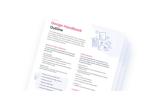
To get through bumps in the road, just keep trying things, seeing what works and what doesn’t, and communicating with the team. Be aware of how your workflows are going, and keep on modifying things as needed. Once you get into a rhythm of what feels good, don’t forget to document it so that you can spread that knowledge with everyone else.
If you have a strong feeling you need professional help, explore our UX Design Services and see if the offerings and approach resonate with you in your situation. Most companies can't afford to wait to have great design and need to give their product's design a decisive jumpstart to get going. 🏎️💨
Do a mini UX audit on your table views & find your trouble spots with this free guide.

Be the first to know about our upcoming release!


