

A new era of search is upon us! Let us designers and product folk move our gaze over to search experiences and remember they are a thing once again. No longer can you foist the responsibility of the experience upon developers, cross your fingers and hope for the best. Search deserves attention and care, just like all the experiences you craft.
Given that data is getting bigger and bigger and enterprise software is getting more powerful around serving up AI-generated insights and recommendations —which is great—even in our AI age, people still need to look for, find and discover information via search experiences.
At a high level, search experiences encapsulate users’ ability to step into their information environment, navigate through it, become familiar with it. It enables them to discover their own sense or intuition of the data world they are in. It’s a pretty special experience, discovering information. Let’s serve up relevant and interesting experiences for people to facilitate their learning, data-driven decision making and propel them forward in their workflow.
While designing your experience, here are some guiding things you might want to consider as you deep dive into the wide world of search UX.
What’s the state of your data?
What can be indexed, is the data in a good state to be effectively searched? Is there a data pro in charge of making sure your data is clean? Or is a lot of it in a bad state? This might limit your ability to make the experience awesome.
Is your product/data source big enough to need search?
There’s often a lot of enthusiasm to build search a little bit before we need it. Make sure you actually need it before jumping in.
Why are you building search?
Sometimes search is used as a cheap solution to bad UX – it’s one of many crutches found in enterprise software to put a bandaid over a yucky user experience. Don’t forget to ask yourself if a bad navigation is at the heart of your motivation to create search (see our article on navigation).
Search, then what?
Consider the entire flow all the way to the end. Once users find the result or results they want, then what do they do? How do you tie a bow on the experience and ensure it’s not a dead-end.
It’s important to devote a good chunk of your design process to understanding the use cases around the search experience that you’re creating. Understanding what your users want to get out of searching your product is key. It’s typically going to involve a proactive upfront approach (interviewing users, user test prototypes etc) and also an analysis phase as you see real search behaviour acted out in the live experience and can monitor the analytics to make future iterations.
It’s important to appreciate that there’s a difference between:
Ok friends, let’s analyze the moments and aspects of the search experience. It’s not just quickly typing in a thing, finding what you need and skipping off into the distance. Let’s slow things down to appreciate each moment as people flow through the experience of search.
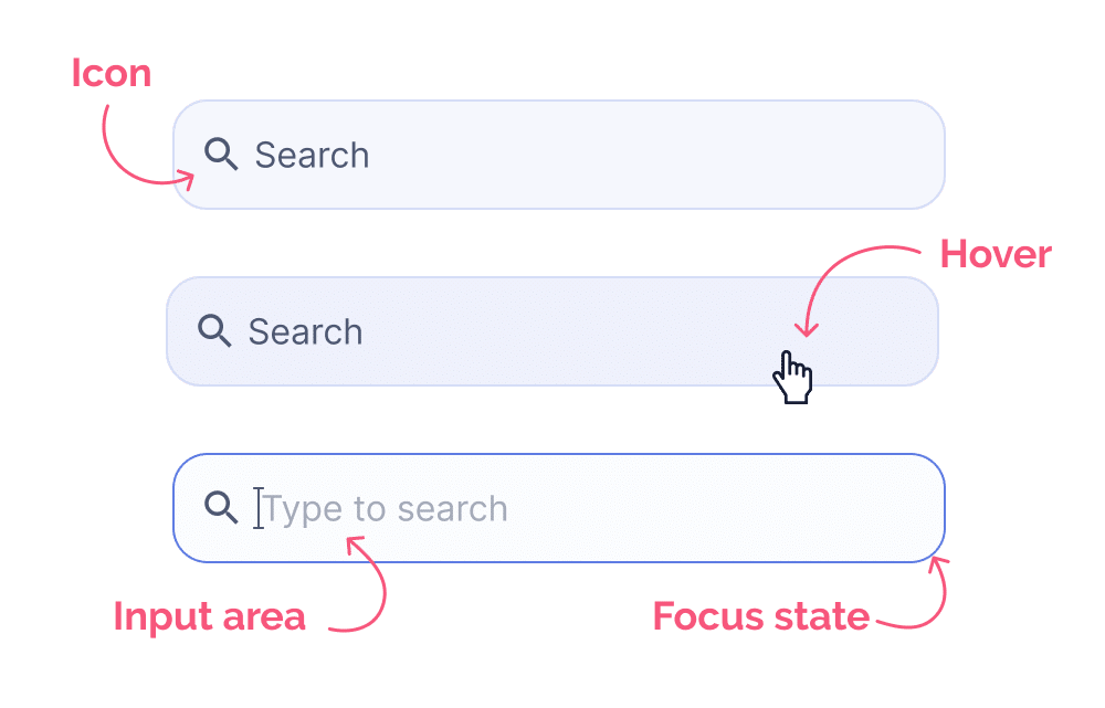
This is the part where someone hits the search input or search box. This is typically found in the top right corner in many experiences but they can be scattered around enterprise products especially surrounding lists, table views, etc. The complexity level fo your standard search box isn’t terribly high. Most of the interaction complexity comes later. But don’t downplay the importance of an excellent search input interaction, as it sets the tone for the test of your interactions in your search flow.
This experience often comes with a transition where the search area might increase in size to suit the input being manipulated and filled up.
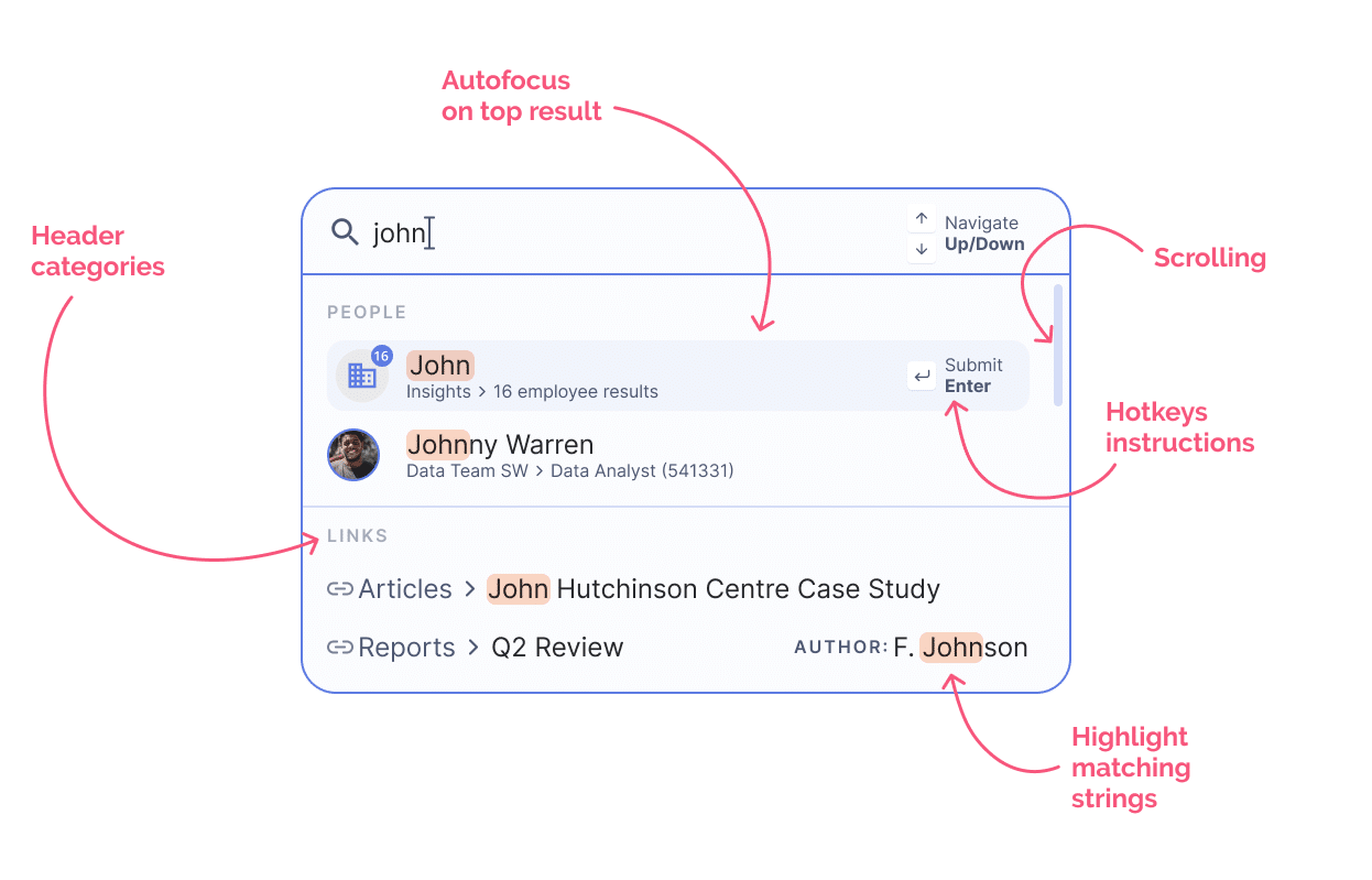
As users type, quickly (usually after 3 characters have been entered), we begin to see early matches arise in a dropdown below the search input. These early matches are often based on a technique called “fuzzy matching” AKA approximate string matching. Wikipedia’s definition states:
“In computer science, approximate string matching (often colloquially referred to as fuzzy string searching) is the technique of finding strings that match a pattern approximately (rather than exactly).”
Get the latest from the wiki page on fuzzy matching.
This phase consists of the user hitting submit and the results beginning to load – basically the computer “thinking”. Most search experiences need a second to load, unless you’re using a small dataset or have the snappiest computing in the west 🤠.
Search results screens aren’t always present, but in a quintessential search experience they are ;). This is where people can view, refine and discover what their query has resulted in. It’s often a page with a lot of structure to it, especially in situations where matches span different categories.

So there you have it friends, each piece of the search experience. From initiating the search, to typing your query and previewing results, to submitting your query, to viewing search results and narrowing them down. Those are all of the pieces that can be combined in a super robust search experience, you can see there’s a lot of places where you can miss out on essential interaction feedback or otherwise derail the experience.
We’ve described the anatomy of search, piece by piece, the micro-moments in your experience which inform, at a detailed level, how the experience is unfolding from moment to moment. This however isn’t the whole story. Within this world of search UX, there are distinctive types of search experiences within this umbrella, each having a particular emphasis, and with it, carrying unique challenges to overcome opportunities to impress, delight and mind blow! 🤯
Known on MacOS as “Spotlight search”, this kind of interaction brings up an instantly useful search dialog wherever you are in a product, or OS. This particular type of search interaction is gaining popularity and relevance as it is introduced more and more into all sorts of enterprise software tools.
This kind of search has unique traits compared to other search experiences:
Depending on your user group, you may want to seriously consider this as a primary interaction mechanism in your product. If your audience, for example, is heavily skewed towards coding and using tools which emphasize keyboard actions, this could be a great option. Often with point-and-click or UI-oriented experiences, say Whimsical (wireframing and flow charts) or Figma (high-fidelity UI design), you see hotkeys initiating an interaction or search dialog, but in general they are a secondary mechanism. However, coding tools aren’t oriented this way.

Advanced search involves entering specific logic into your query to specify where and how the system will index the database(s) to find you what you need. This kind of search takes more thinking up front to execute a query that works.
This kind of search has unique traits compared to other search experiences:
In a find style search, the user will typically initiate the search via CMD+F. This is a common pattern in browsers and many other tools as it allows a very fast search and navigation between hits.
This kind of search has unique traits compared to other search experiences:
Users get to know what’s inside your system in a lot of different ways, on of the ways they can suss out the quality of your product/website is by testing it via search. When they are faced with very “dumb” seeming results their faith will be (at the very least) diminished. Fortunately there are quite a few helpful out of the box tools these days and the help of modern technologies which make it so you don’t have to start from scratch.
Timing is important in a search experience because, as we saw in the anatomy section, this whole flow has a lot of microinteractions involved. There’s a lot of things that happen in quick succession. From the moment you type in your 3rd character, the fuzzy matches begin and update usually instantly. This means that selection within the dropdown and hitting hotkeys or submitting your query needs to be smooth, free of confusing and jarring lags. The situation where you’re trying to select something but at the very last second it moves and you click the wrong thing…argh!!! These awkward moments can be quite difficult to avoid because of this fun thing we call performance ;)…which devs and designers alike have nightmares about. One tip here is considering disabling certain functions while the user is mousing or tabbing around. Then the awkward misfire moments might be prevented in some cases.
Ever clicked on a search input and found yourself totally stunned…or engaged with a search input, hoping it’d help you our a little more? Look within yourself, and ask yourself honestly: do our users know what the data in the system consists of? There are lots of enterprise software cases where the answer is yes, and many more where the answer is nnnnaaawwtttt really. Discoverability is a key UX concept wherein we expose functionality at opportune moments or actively invite people to try new things in the software. However we often forget about how wide reaching this concept can be. In data-heavy applications (including dashboards), the data itself, how it’s structured and what’s in there, what’s new is the real meat of the experience. And yet… upon extensive searching, our team can find precious few patterns which bring the data to the surface. Seems like we expect people to immediately know what they want to search and of course how to phrase it.
We see a lot of search results where the matches aren’t communicated very clearly. When matches are communicated, like say in a lab software with samples, that the query “1232” matches a barcode, lot number, sample ID – these are pretty important distinctions. Also, that number in theory could also have been derived from numbers shown in an image. It’s important that we show matches and help people dismiss or zero in on one result above another. Either way, at minimum try to highlight where things match if at all possible.
A ginormous part of search is the actual search in the machine at work. It’s indexing away while you wait for the awesome results – this might take 0.00002s or 2 mins…or 20 mins (let’s hope not). At any rate, showing that this action is happening is a super important UI feedback. Please don’t forget your loading feedback, so people don’t think they broke the computer….related to that, don’t forget the empty states, if your search yields zero results.
As grizzled UXers, we’ve seen many crimes against users commited by even the most well-meaning people. One of these crimes is to use search as a bad navigation crutch. “Just tell people to search “blablabla” and they’ll find it”. With some enterprise worlds, they’ve had page after page created and have gotten really big and really confusing (ex. Intranets 🙀) . However, not everyone uses search as their primary means to get around. Users are diverse in their preferences and ways of working on computers, and searching can’t do the job of a solid navigation. We know it’s scary, but search as much a permanent solution to your nav problems as duct tape is to a leaky firehose. (p.s. If you need navigation help, our nav article might get your started <3).
AI and search are kind of best friends as we know. Modern search technology wouldn’t really be a thing without some advanced AI at play. The shear volume of data out there in enterprise applications and the interwebs at large makes it quite necessary. Whether we’re performing natural language processing (NLP) or image recognition AIs, we’re able to search objects we’ve never searched before in ways we’ve never seen before.
This is an area where we’re starting to see some interesting shifts in interaction patterns. For example, generative workflows. We might start off with a query, say in chat GPT – formulated like a question. As we proceed, we may see these searches turn into commands or ways to access information while simultaneously manipulating it.
What’s interesting is that more modern search functions, like Command search are starting to merge both information exposure with actual functions, which in an odd way is more like the original way we used to interact with computers, via the command line. Only now, that command line is less literal, allowing humans to speak more naturally.
Natural language queries deserve a mention here. This area still requires trust brought on by high quality accurate results. It feels a little bit like the disjoint between longer more intensive NLP engines and lighter weight ones is becoming more noticeable. The trust guage seems to vary wildly between experiences. Watch this space.
Overall in the landscape of AI as it’s evolving, the searching and seeking of information and execution of actions is becoming more interweaved and rich. Which seems like quite a natural evolution and may shake up the interaction model fundamentally for software out there. More starship enterprise type interactions than pointing and clicking in menus. The sky is the limit and we’re here for it. 🪐
How are you feeling after all that dear friends? It’s sort of a lot to think about, similarly to drag and drop, search has so many moment-to-moment interactions, so there are a lot of opportunities to miss the mark. What’s unique about this interaction pattern is that it’s closely aligned with the data in your system, similarly to dashboards, filters and data tables. You’ve got the beautiful marriage of data and interactions coming together to form a pretty significant featureset, but don’t let that intimidate you!
What can ground you in your efforts as always are the search use cases and value for your users. This will help you bite off a reasonable piece, when iterating on your current search or building it for the first time. Don’t forget to involve key people like back-end developers, data people and AI developers in your efforts, as this will help guide you to what’s possible and might even be a great opportunity to do some prototyping in code. As always, continue to user test and gather insights in the analytics for clues as you go forth and make top quality UX. We believe in you!
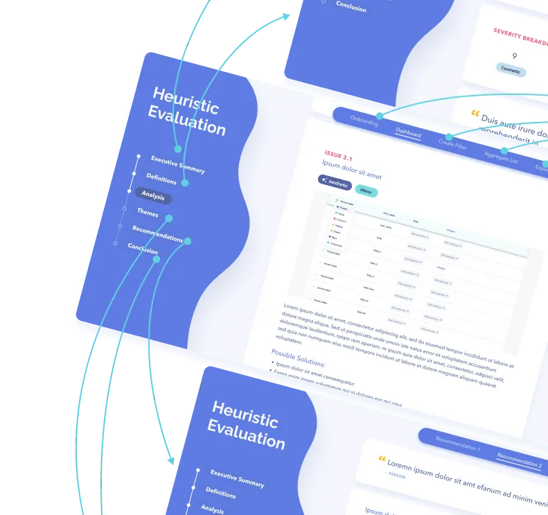
Spend your time and life force on capturing heuristics problems rather than endless visual fiddling. Meganne Ohata will guide you the whole way, so you can propel your work and become their most trusted advisor.
Do a mini UX audit on your table views & find your trouble spots with this free guide.

Be the first to know about our upcoming release!
.webp)

Receive an email when we publish a new article on design.


.webp)
.png)

