
A sub-optimal user experience was hindering this startup from scaling. They needed to find ways not just to improve the flow that was there, but also usher users through a daunting financial process that most people find terrifying. Our design challenge was a technical and emotional one. How could we make a highly financial and mostly digital experience friendly, human and understandable for anyone?
See our project process for more info.
Industry
Real Estate
Platforms
Desktop, Web, Mobile Web
Deliverables
UX Audit
Maps & Wireframes
Final Designs
Design System
Interesting UX Problems
Providing relevant value throughout the home buying journey
Pencil and Paper started with auditing the platform in combination with conducting user and stakeholder interviews. These uncovered goals and concerns from multiple perspectives. Our initial consultations revealed that users were running into problems with navigation and understanding where precisely they were in the process, the Perch team would have to instruct home buyers over the phone how to get around the platform, often taking up to an hour per person. It seemed as though your average home buyer was constantly disoriented from the experience.

The registration process was tedious and full of various steps and industry jargon. The initial onboarding steps gathered about 40 fields worth of data, before showing users the platform itself. They had to get through the entire process before extracting value from the product. Perch wanted to get their product to the next level. To do this, it was pertinent to resolve their usability problems as well as multiply user value as part of a holistic journey that facilitated home ownership.
We found that UX issues found in an emotionally charged context like this seem to almost have a ‘multiplication’ effect on the negativity the user perceives.

Through interviews, we found that the mortgage process wasn’t all users needed help with, it was actually the whole process of buying a home itself. Everything from figuring out if you can buy in the first place, to shopping for a home and finally securing a mortgage.
If we could take a first time home buyer through the process and have them feel calm and informed, we would have nailed the UX. The concept of ‘the home buying plan’ was formed as a comprehensive step-by-step tool to usher people through the process, keeping them informed of what’s happening at every stage.

Working with the information we had uncovered, we built out maps (with SMEs on the Perch team) for the different logic such as:
We used mind maps and user flows to diagram the different paths and branches that users could take in their journey. At this point we fleshed out the functionality and information being communicated to the user through wireframes, and with these interactive prototypes we conducted additional interviews to verify the designs with target users.

We knew our re-design had to be approached from multiple angles. Clarity in communication and navigation were at the forefront, which meant we needed to give overall context without overloading users with too many details at the wrong time. Keeping in mind that many users were overwhelmed, confused and hesitant, we wanted to build confidence through the experience. To do this, we created a home buying plan that guided users and showed them different possibilities so that even those who weren’t ready to buy a home could build a path to move forward and see the steps ahead of them.

Users were empowered to explore different scenarios and see how their home-buyers journey could play out by adjusting variables such as:
Users could use this tool and have transparency on what options would be available to them before making one of the biggest decisions in their life. The platform also served as portals for realtors, mortgage brokers and referral partners, and facilitated in a smoother and more efficient communication flow.

The new Perch platform set the company up for scaling at an unprecedented pace: since users could derive value from services without depending on support calls to decipher their next step, support could focus on added value and multiply their impact. A significant reduction in the number of support calls required to clarify user flow led to saving 1 hour per deal per day for the team, which subsequently led to a staff efficiency increase of 40%.
Additionally, significant growth in confidence and trust in the system were fertile grounds for users to continue coming back to review or update the variables in their home buyer’s plan until they were ready to purchase a home. This directly improved client conversion rates by 25%, and reduced customer drop off.
The UX Audit and discovery interviews were foundational in assessing the platform as it currently stood through a variety of lenses. Working with subject matter experts, we mapped out the variety of paths users could take and what that meant in terms of the support and information they needed at each point. Interactive prototypes were key in testing and verifying designs, and the resulting re-design improved user experience so significantly it caused a ripple effect in the company and contributed to 5-star ratings on Google. Perch didn’t only make an investment in user experience through their re-design, they also enabled themselves to scale at an exponential rate.
Spend your time and life force on capturing heuristics problems rather than endless visual fiddling. Meganne Ohata will guide you the whole way, so you can propel your work and become their most trusted advisor.
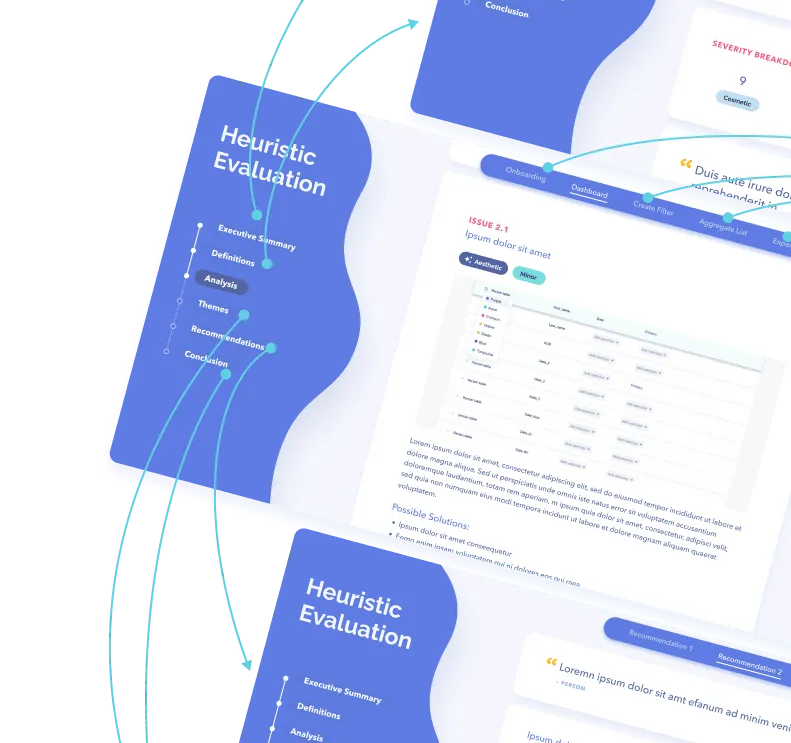
Do a mini UX audit on your table views & find your trouble spots with this free guide.

Be the first to know about our upcoming release!
.webp)

Receive an email when we publish a new article on design.


.webp)


.png)

