


Is it just us, or do all resources about filtering UX revolve around e-commerce? It might be “easier” to document the ins and outs of an interaction where you have control over the scope and labels, but that’s not what we’re here for.
In most enterprise applications, when filtering is needed, it’s because the data is complex and oftentimes user-generated. We’re typically dealing with long project titles, unpredictable custom fields, complex and additive variables, etc.
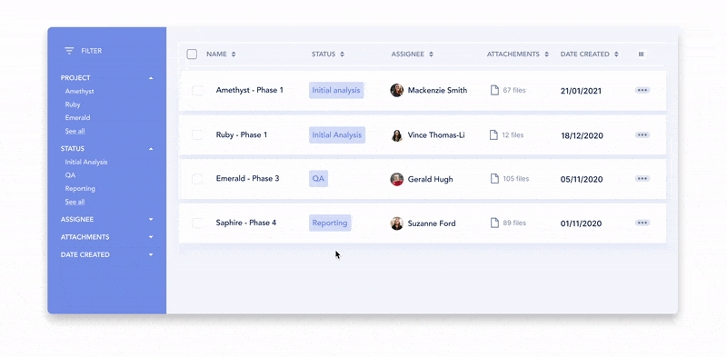
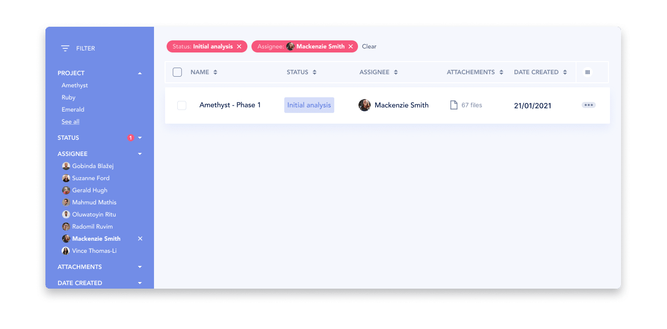
Filters are relevant for any screen where many of the same element can be found. This is true for data table interfaces, card-based views or any list-type page.
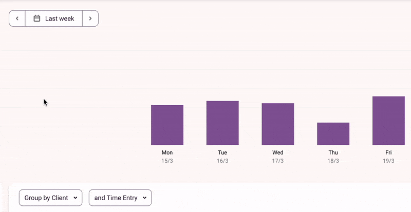
Filters are also necessary for analytics-type screens & dashboards. In these types of UIs, users won’t be filtering the number of items visible but rather the scope or type of data included in rendering the charts and graphs. Think timeframe, audience types, which metrics shown, value ranges, etc.
An excellent user experience for filtering means that users don’t have to ‘learn how to filter’. In fact, the smoother the filtering interaction, the more cognitive energy they’ll get to spend on identifying their ideal result(s). Let’s not waste their energy on an onerous interaction, let’s help them achieve their goals in the least taxing way possible.
Filters and their properties also double as discoverability agents that educate users about the data and what the overall system can offer.
When a filtering interaction is well designed and tailored to the type of data at hand, the experience feels intuitive and it allows users to feel in control and less overwhelmed.
What are your data made of?
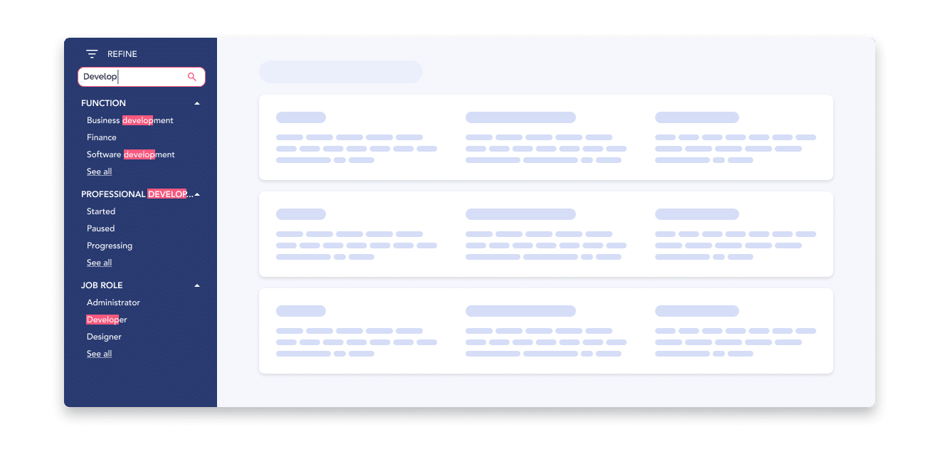
When building filters, you need to be very aware of your data structure. What’s made of a character string versus a boolean? What’s associated with a timeframe or date? Numerical values versus text strings, quantitative vs qualitative values, etc. These different types of data require different types of selection inputs.
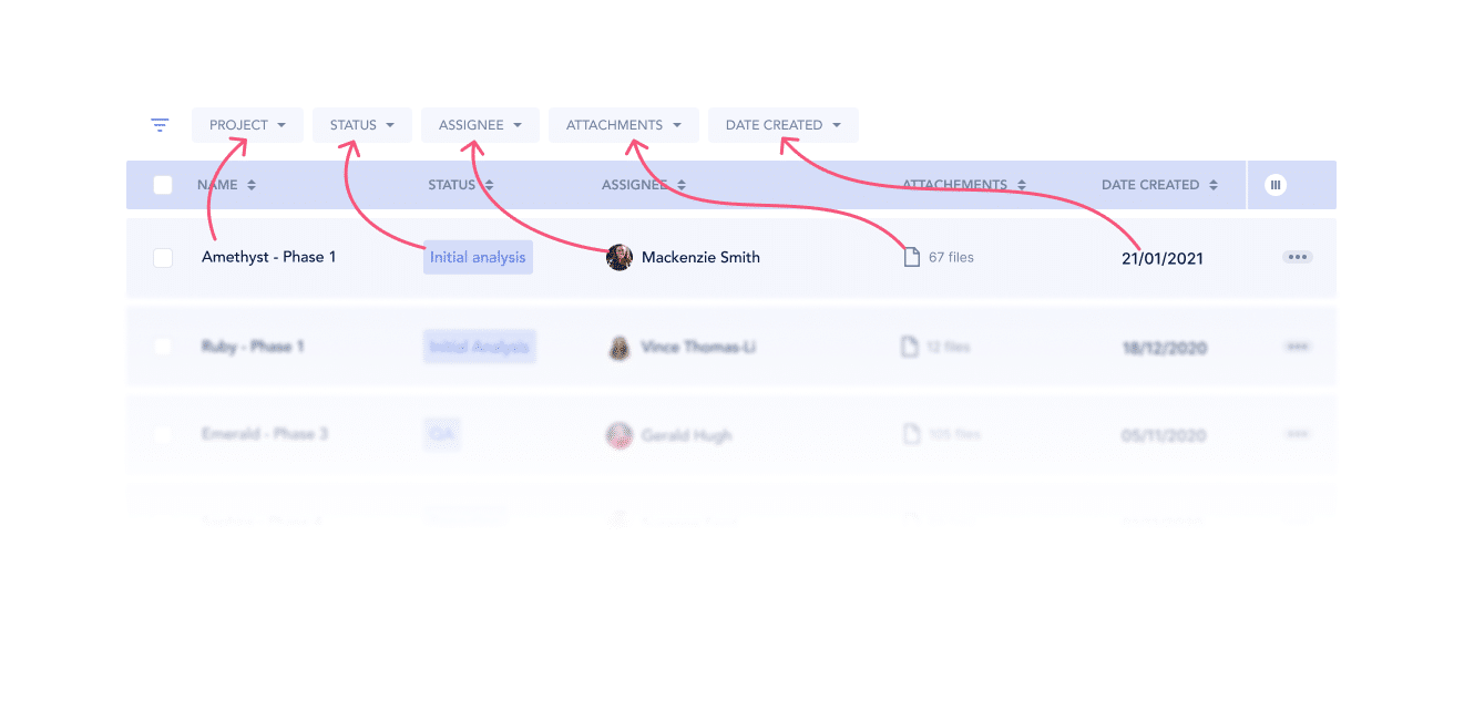
Mirror all data points
All your existing data points should be reflected in the filters. Ex. if you show “Last modified: Date” in the entry or list-item, your users will expect to be able to filter by modified date.
Understand your user’s priorities
Take some time to prioritize the order you’ll display your filters in. While it’s best to mirror all potential properties of your data, they don’t all share the same usability value in the eyes of your users. Which fields tend to be more looked at, modified most often? Those high-traffic properties deserve quicker access and higher visibility in your filter component.


.png)
Also note that last point stands for prioritizing your properties as well as prioritizing the values nested within. Now this varies greatly depending on how many values you need to show. With fewer values, you need to be pretty hands-on in deciding which comes first. With a greater set of values, you’re better off implementing a simple alphabetical order.
Know when to stop
You also need to come up with your own threshold where filters become overkill. Offering advanced filters to your users for a 10-item list might add unnecessary complexity to your interface. But you know your data and your users best, just make sure the depth of your filters reflects the depth and volume of the data itself.
How will your system handle fetching?
Or rather how fast can it be? This is important to be aware of because it will determine if your filters can be applied one at a time (directly after user input) or if the component needs a top-level ‘Apply’ button where all selected filters would be applied to the results at once.
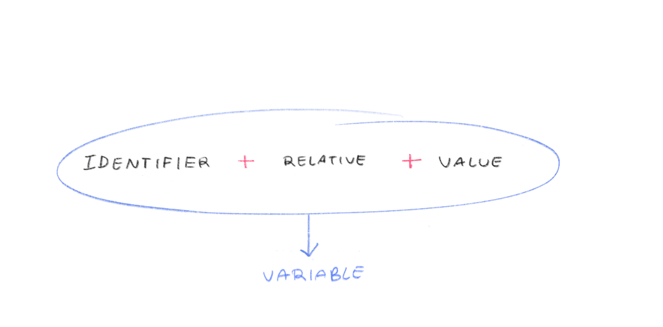
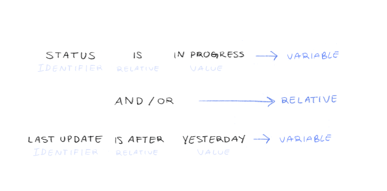
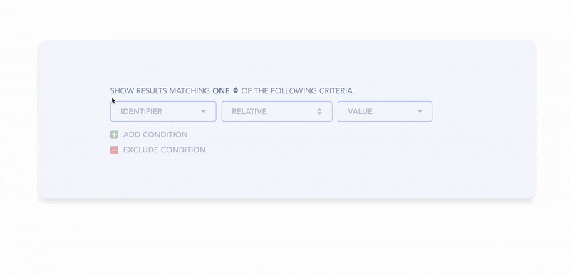
The identifier is the targeted property or category
The value is the specific value
of the property you are looking for (amount threshold, specific date)
The relative is the intended relation
between identifier and value (greater than, between value x and value y) or between variables (and/or)

The combo of identifier + relative + value creates a variable (a.k.a a condition or a criteria)
Selecting the relative is often not up to the user and therefore needs to be thoughtfully prescribed by the system, a.k.a you. The relatives are sometimes packaged in the form of preset options, which, when well thought-out, can be precious time-savers for your users
For example, Toggl offers multiple preset options in their date range picker:

Otherwise, if your users need that granularity, relatives can also be made available in the UI for them to tweak as they wish. We’ll be touching more on advanced filters below.
In terms of the positioning of your filters component, where it should be placed on the page, you basically have three options. It can either be as a left-hand vertical sidebar, directly inline with the content at hand, or as a horizontal filter bar. The decision depends on your context and scalability needs.
Level of context: 🔴 Low (Global: affects the whole page)
Scalability: 🟢 High
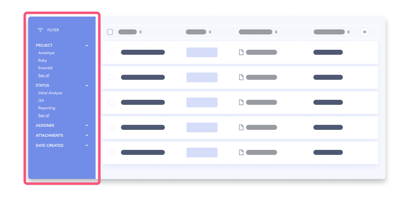
The left-hand sidebar is more scalable in terms of real estate, you can nest a greater number of values inside expandable sections that can scale vertically.
But this pattern affords that the filters affect the page as a whole. You need to make sure that every element on that page is effectively affected by the filtering options, otherwise, it risks creating confusion.
Level of context: 🟢 High (contextualized at the component-level)
Scalability: 🔴 Low
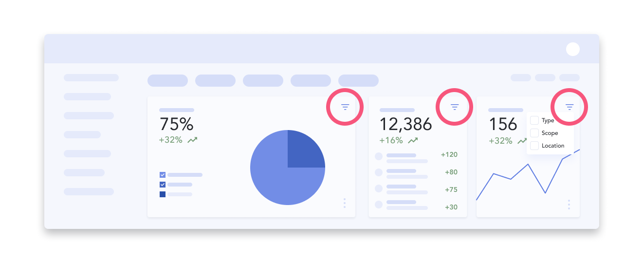
Filters can totally live at the component-level. Let’s say you have a dashboard made up of various charts, graphs and tables with discrepant data structures, you can’t have global filtering. The filtering component needs to be in-context. (p.s. we also have a UX pattern article on data dashboards).
You can also decide to keep some global filters at the page-level, but also provide smaller-scale filter mechanisms directly throughout the page. The downside here is that you can quickly run out of space. You need to stick to the essential.
Level of context: 🟡 Hybrid (can affect the whole page, or can affect one section at a time)
Scalability: 🟡 Medium

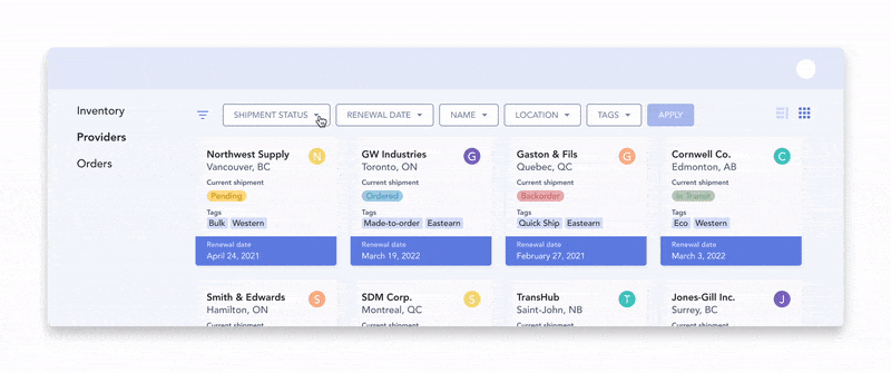
A filter bar can be placed above specific parts of the page, making it clear that only those items will reflect the filter input. This is a good option for pages made up of sections showcasing different data structures where global filtering could not work.
The horizontal bar option is a bit less scalable since it’s limited to the page width. That means the user needs to navigate across dropdown menus.
How do you know when to fetch? This depends on the amount of data at hand, the performance of your system and also the user expectations.
One option is to fetch results instantly. As soon as the user makes a selection, the data is refreshed and shows filtered results. This is expected for lower-stake interactions like selecting from a small list of filters. As soon as you’re dealing with multi-select filters or more complex inputs, you might need added friction like with a secondary trigger.

The intermediate option here is to apply the filters one at a time. If you let the user finalize their selection within, say a multi-select dropdown, they can search, scroll around, pick and choose what they need without the distraction of the results updating automatically. Then, when they’re done with that particular identifier, they can trigger the results. This can be done either by clicking out of and closing said dropdown, or by clicking an inline ‘Apply’ button.

A third option is to fetch the results only once. The user would navigate the various dropdowns, search and scroll away, and only when all their desired filters have been input, then they would click a global ‘Apply’ button. This method works best for very heavy datasets or low-performing apps.
For a filter sidebar, expandable sections are a go-to. You can have a few items visible by default and provide a “Show All” mechanism. This increases discoverability and if you’ve prioritized your values well enough, you’ll be saving your users some precious clicks by avoiding the need to dig into those nested levels.
You also have the option to place the “Apply” button at the section level, as well as at the top-level, depending on what fetching type your system can afford.

For filters laid out as a top bar, you’ll need to rely on dropdown menus to display additional options. Make sure the type of input reflects the type of data.
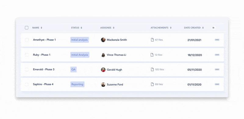
If you’re building filters for a table interface, an effective way to go about designing filters for a table view is to embed the mechanism directly at a per-column level. This way, you’re maintaining the highest level of context for your users as they see the results change directly under the input.
When you need your filters to be additive (remember relatives? That’s when we ask the system to add a variable on top of another and to exclude anything that doesn’t match the combined filter), lozenges or pills are a great way to convey that meaning.
Typically, those variables are pre-existing so users can select them from one or many dropdown menus and they should be easy to remove.
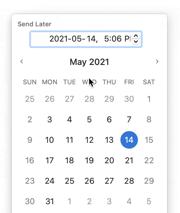
A lot could be said about what makes a good date picker but let’s just go with overall best practices. For a good date picker, you need…
No matter what pattern you decide fits your data and users best, don’t forget to include an easily accessible ‘Clear All’ option. ‘Clear All’ should be possible at the individual filter level and at the global level. From the user’s perspective, a ‘Clear All’ button is also a reminder that filters are applied.
If your product is targeted to highly technical users, you might need to invest some time in mapping out the flow for advanced filtering.
Advanced filters can take many forms, it’s up to you to cater the experience according to your data and your users’ expectations. You get to pick the level of granularity your filters can afford.
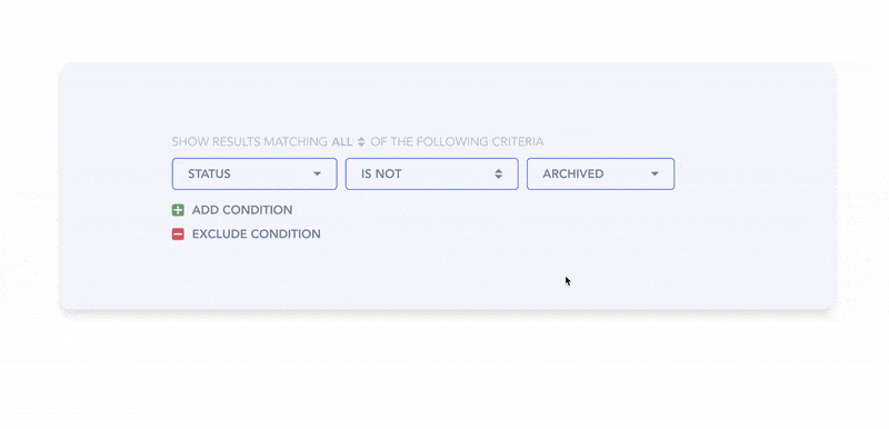
Typically, advanced filtering is when filters become additive formulas more than simply selecting a value per identifier.
In this situation, not only are you giving users control of the relative, you can also allow them to create complex formulas by adding or excluding conditions. The combination of identifier + relative + value becomes a condition the results have to meet in order to be displayed. A condition is a bit like an if/then statement:
if ‘identifier A = value x‘ and/or
‘identifier B is between value y and value z‘
then show me the results
Results should match all/one/none of the conditions
Identifier + Relative + Value
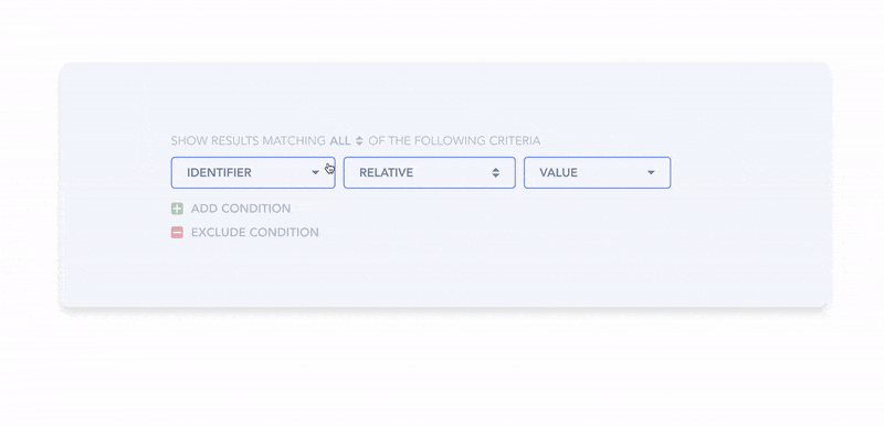
Add/exclude conditions
When communicating feedback in the context of filtering, you really should embrace redundancy. Once applied, the filter selections will likely be hidden away in their dropdown menus or their expandable sections. You need to give them more prominent visibility. Otherwise, it’s easy for a user to forget they even selected filters at all.
In short you need three things:
Number one is a given, just preserve the state of the filters, duh.
Number two is about giving a high-level reminder of where users have made a selection. You can make the label bold and add a numeric total indicator ex. “(3)” next to it. Here, you should decide on your maximum number to display in that indicator. If it’s possible for there to be 10,000 items selected, you might want to shorten your labels with a format like this: (1K+) to save some space.

Number three is where it gets tricky. I already know what you’re thinking; “What if there’s a multi-select filter and not enough room to list them all?!?!” That’s a very valid question.
In that summary section, you need to decide how much room to dedicate per filter. You can list out ‘Aristotle, Socrates, Plato, Epicurus’ and decide that 40 characters is the max. Or you can indicate ‘Authors (4)’ and let the user open the dropdown again if they really do need to view their selection again.
If it’s possible for the applied filters to spread to more than the space you have available, you need to plan the wrapping behaviour. It’s common to have applied filters wrap on 2 or even 3 lines. More than that? You might want to consider a show more/show less mechanism to avoid your page scroll to become unpleasant.
Now about the positioning of said summary section:
If filters are in a sidebar, you can
Show the summary of applied filters at the top of the sidebar (make sure it’s sticky and has its own scroll if it gets too long!)
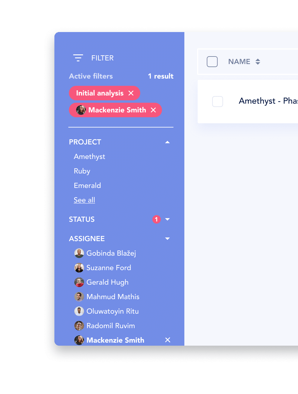
Or repeat them by bringing them in at the top of the page
If filters are in a horizontal bar,
Display the overview of applied filters below said bar, above the list items

If filters are inline, a summary would be overkill. When filters are inline, they’re already highly-contextualized and typically smaller in scope. A summary isn’t necessary.
Another key element in communicating feedback is to display the number of results (see more on results in search ux). This provides users with feedback as to how effective their input was to reduce the result list and save time.
As much as possible, you want to avoid displaying no results. That’s why it’s good practice to place indicators of how many results a specific property or value represents directly at the input level. That way, you reduce the chances of the user intentionally selecting an option which clearly leads to “0”.
You can also have smart filters that detect if the value the user is trying to input will conflict with another value, and just make that option become disabled.
However, if you do end up needing to display an empty state, refer to our empty state pattern analysis article where we break down what you need to consider when dealing with the UX of empty states.
In enterprise software, the shear amount of filters and fine tuned control users require can get unruly and potentially unmanageable. Think about the case where the software is connected to a HR database like SAP, these datasets are vast. As we look at filter panels with potentially dozens of choices, we need to consider some ways to optimize for this experience, even when it’s a “large” experience.
Adding search functionality into the filter panel itself can be very useful, especially for users who may know a fragment of the result that they want. Perhaps they want a filter “title” or perhaps they recall a value within a filter itself. Take both into consideration when creating your search experience.
If you’ve got a large dataset, considering the structure and defaults of your filters is paramount. Mapping all of the cases might be very difficult. We suggest you get a good default state which users can then deviate from. This means the main use cases are reflected in the filter panel, but the power to control that view on a per user basis can fill int he rest of the blanks for you.

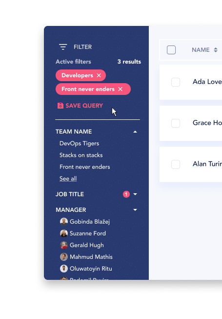
Users may regularly come to a page and perform a series of filters to find their ideal result. This may take a few steps and this may be something they repeat often. Either way, it qualifies as extra effort and wasted time if this must be done manually so over and over again. We suggest allowing users to save a query for use next time.
This and other flexible enterprise patterns are worth checking out, when you have lots of personas and use cases to design around. Check it out 😉
Whatever you end up doing, remember the purpose of filtering is to save your users time, to reduce complexity in data-heavy pages and to enhance discoverability as to what your system can offer.
The best filtering experience lives at the intersection of your system’s capability and your user’s expectations. You need a great awareness of those factors in order to make the right decisions.
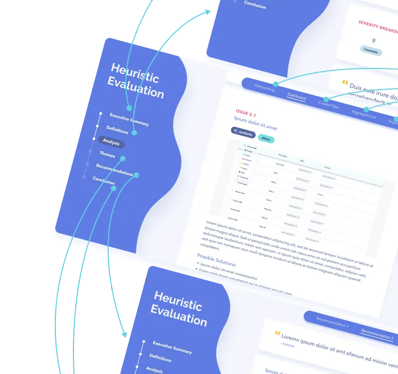
Spend your time and life force on capturing heuristics problems rather than endless visual fiddling. Meganne Ohata will guide you the whole way, so you can propel your work and become their most trusted advisor.
Do a mini UX audit on your table views & find your trouble spots with this free guide.

Be the first to know about our upcoming release!
.webp)

Receive an email when we publish a new article on design.


.webp)
.png)

